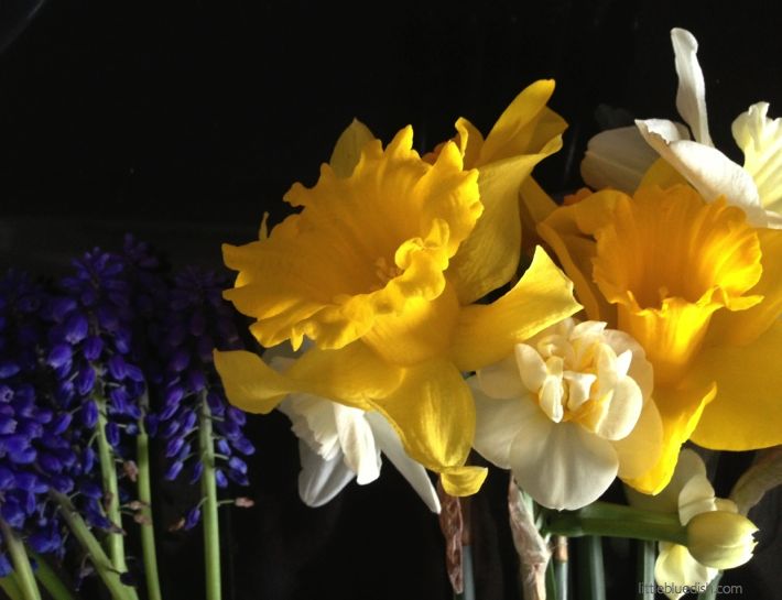
The daffodils have been blooming here in New York for the past week or so. I brought these in from my garden and laid them on my counter… and this beautiful still- life was begging to be snapped. I love when this happens, it so rarely does, especially on photo shoots- where you lay something down and just the natural way that you put it down is stunning; You don’t want to touch it- you just want to capture the image with a photograph. I wish I was a better photographer but that’s something I’ll have to learn from some of my photographer friends. For inspiring photographs check out my friend and colleague’s site Sang An. He shot all my images for my shop and we have worked together on editorial stories for many years together. Also check out Andrea Gentl‘s site. You might recognize her name from those gorgeous photographs of the salted cherry blossoms I featured of hers a few weeks back.
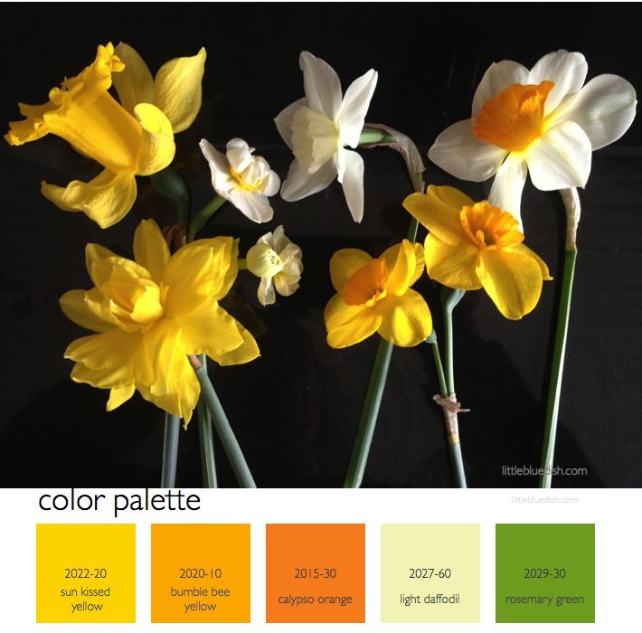
So like every Monday when we introduce a new color palette for the week I’ve selected Benjamin Moore paint colors to aid you. Their paint swatch cards are not only useful to select paint, but they can be used to carry around in your bag to match up colors for anything. It’s a walking color palette finder (old school, because there are apps for that now, like their Color Capture app).
For our new followers on the blog, welcome! Please follow along Monday thru Friday. Mondays we feature a color palette which inspires all our posts for the week. Tuesdays we talk about tabletop, Wednesdays- weddings & celebrations, Thursdays- interiors & design and Fridays we usually feature a recipe or our shopping finds. Let us know if there’s something you’re dying to see featured on our blog or something you’d like us to write more about. We really love your feedback! (Be sure to Like us on Facebook for more of LBD) – Lynn Butler Beling, Founder, Little Blue Dish
(Below-look how pretty a purple/blue goes with this palette)