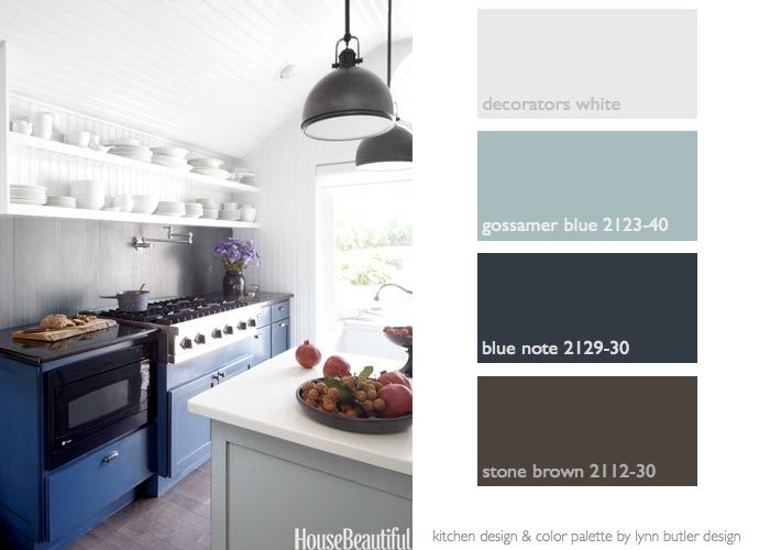
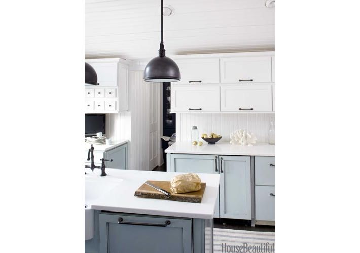
House Beautiful published my kitchen in their April 2013 issue. I’m honored that they chose it as their “Kitchen of the Month”. I thought I’d share with you the photos from the magazine & link you to the story so you can read it yourself. There are several tips for small spaces- like under-counter refrigeration and a vent for the stove that pops up from behind the range- freeing the space of a giant hood. I’d also like to share with you the Benjamin Moore paint colors of this kitchen in case you like the blues. Blue Note, a true deep navy blue is not only the blue of the cabinets but I also painted the wet bar area walls this color- and our family room this color. Although the blue in the photo looks a little lighter from the sunlight- the cabinets are really as dark as the Blue Note swatch. The gray-brown I chose for the palette above is what is very close to the gray maple wood floors that are in the kitchen. Decorators White is really white in person, even though it shows a bit gray here on the computer screen. If you have been following my blog you’ll know by now I love blues! This entire house is all in shades of blues, grays and whites. It’s fitting for this house too because it’s by the ocean. I’ll show you more photos of the kitchen and wet bar area later this week. Some comments about the open shelving were that it didn’t seem like their was enough storage in the kitchen. What you didn’t see in the story is that I took away a full bath off the kitchen and from that space made a powder room and a butler’s pantry with a lot more storage cabinets and a wet bar area. If you have any questions about the design of the kitchen or the colors please drop me a note! I’d love to hear from you. – Lynn Butler Beling
Note: all the sources are listed and linked on the House Beautiful website within the article.
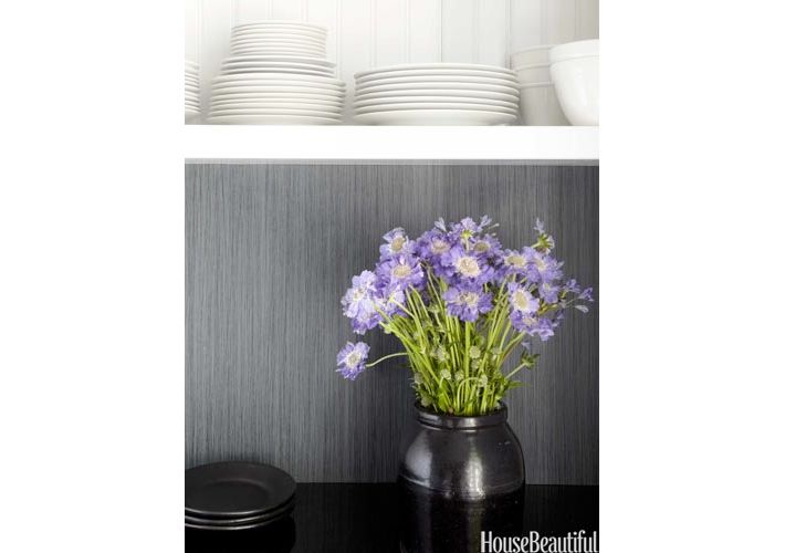
The Walker Zanger tiles are large 12″ x 24″ pieces that I ran vertically to give the illusion of a bit more height. The navy blue with black stripes almost looks textural in person. I also used black grout so that it looks like one seamless piece. The tiles tie the black granite counter tops and navy cabinets together visually. The granite is great for near the stove and the oven because you can place hot items directly on the granite and it will not harm it.
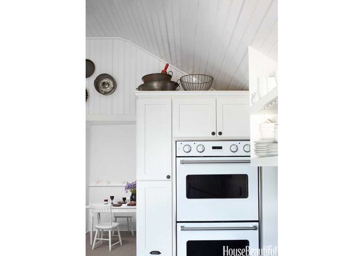
Note: I included a double oven in the kitchen, which I find necessary when hosting holiday meals. What you don’t see is that there is also a warming drawer for plates at the base of the ovens as well. I will show you more pictures throughout the week. The perspective is a little misleading, the doorway to the left leads into the dining room. Viking has many colors to choose from, here I chose white ovens to blend in more with the cabinets, but they have bright blues, reds etc. to choose from.
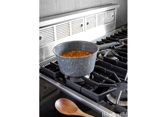
Viking makes a pop-up vent. Can you see the small key pad in the back right of the photo? It’s flush with the countertops and that is the panel that controls the vent. When not in use it just electrically moves back down flush with the stovetop- out of sight. The vent duct is connected underneath the stovetop and goes underneath the cabinets to the outside for ventilation.


