Archive for the ‘Oranges’ Category

July 26th, 2013 No Comments

anemone bouquet

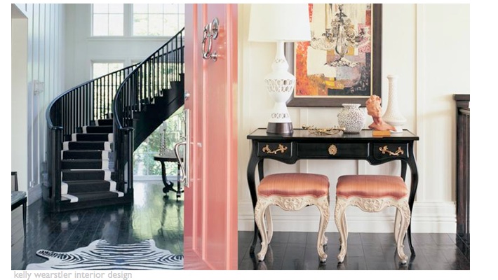
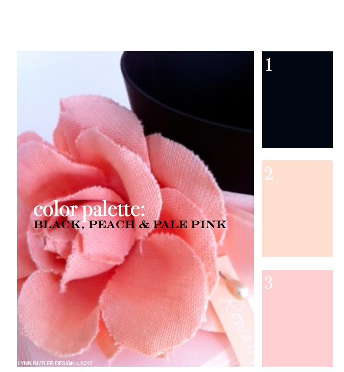
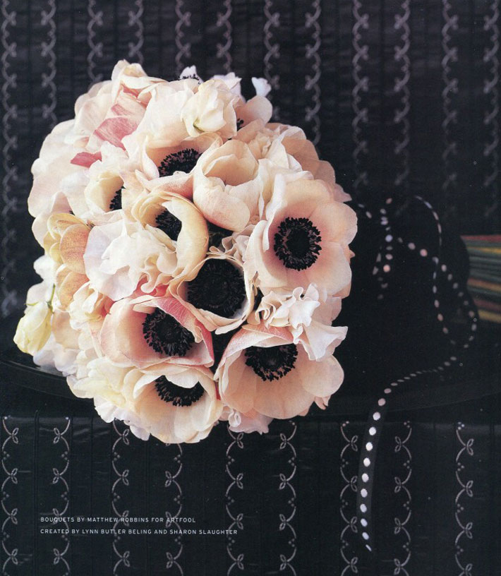
It is a nice idea to incorporate the same flower (or flowers) in your bouquet into the design of your cake or vise versa. This anemone bouquet I styled for Martha Stewart Weddings would make a wonderful compliment to the anemone cakes I posted. (Bouquet flowers by Matthew Robbins) Lynn’s TIP: having a color palette decided on in the beginning of your wedding planning process (or any celebration for that matter) is a great place to start. This will narrow down your decision making process when you are faced with thousands of choices. Black, peach, pale pink and … Read more

July 25th, 2013 No Comments

a colorful (high-gloss) painted door can make a big first impression

Designer kelly wearstler has several books that I often reference- Modern Glamour and Hue (available on amazon). I like her mix of colors and textures and her attention to detail. One of my favorite spaces designed by her is the restaurant BG at Bergdorf Goodman.  Above is an example of how she incorporates color through details at a residential home. She starts with basics and builds from there- white walls, a dark floor, select pieces of black furniture, but then layers in coral /peach upholstered stools, accessories, a gorgeous coral painted door- it all comes together effortlessly and her … Read more

July 24th, 2013 1 Comment

weddings: anemone cakes by elisa strauss of confetti cakes

(photographed by Monica Buck) I have collaborated and styled so many wedding cakes over the years and one of my favorites is a cluster of 3 little floral cakes I designed with the very talented Elisa of Confetti Cakes for InStyle Weddings. I had a craftsman make 3 black cake stands, varying in height. I was inspired by a vase and we worked from a snapshot I had taken of it. Usually you wouldn’t think of black cake stands for a wedding, but I think the light colored cakes and the anemone flowers with black centers keep it classic in style … Read more

July 23rd, 2013 No Comments

create a dramatic table setting with black, peach and pale pink

I love these black compotes and bowls that I have on my online store, little blue dish. (They are made by an Italian glass company called Nason Moretti.) I like to fill vessels with candy for quick and easy centerpieces and also fill the felt favors you see tied with black polka dot ribbon with candy as well for guests to take home. This color palette could really work for any season and any occasion- and for more formal gatherings add a calligraphed place card for each guest within the palette. I alternated black cards with cream calligraphy and … Read more

July 22nd, 2013 No Comments

let’s go back to the beginning… color palette: black, peach, pale pink

This was my first post back on April 9th, 2012 and since it was, there weren’t too many readers. It’s one of my favorite color combinations though, so I thought I’d re-post it for those of you who have now joined my blog. Thank you for your weekly support and I hope you keep coming back!  – Lynn Butler Beling I love this color palette. I keep coming back to this color combination because I think it’s both masculine and feminine. Chanel included this palette in their spring 2012 runway show. (see below) The flower in the photograph above is … Read more

June 28th, 2013 No Comments

orange sherbet punch, perfect for a hot summer day!

While looking for a sherbet punch recipe I came across this creative site called eighteen25. Created by three sisters born and living in Vegas, their name came about from the numbers hammered to their mailbox at the home where they grew up. They shared a simple punch recipe, that uses vanilla ice cream, orange sherbet, orange juice and ginger ale. For the complete post and recipe directions here is the link. I love this because both kids and adults can enjoy this summer treat. With 11 kids between the sisters they certainly know how to keep everyone cool and … Read more

June 27th, 2013 No Comments

kitchen cabinets don’t have to be white, we’re loving this gray kitchen with orange accessories!

They say if you are in the market to sell your home, that to appeal to the most people you should keep your kitchen neutral. Well, that is true, but grays are a great neutral too. If your home has a cohesive color palette and design the overall impact can be emotionally pleasing to a buyer even if it might not be their exact taste. Deciding on kitchen cabinets, which is a big expense, can be stressful. Even though this cabinet color may be a bit unexpected, the designer used a classic marble countertop and a nice simplified door style. … Read more

June 26th, 2013 1 Comment

an elegant southern wedding: kaminer haislip to matthew quinn, charleston, south carolina

A few months ago I introduced you to silversmith Kaminer Haislip. (read the full post here) She designs the most beautiful pieces so it’s no surprise that her wedding was elegant and sophisticated too. Kaminer and her husband, Matthew were married in the month of September in Charleston, South Carolina, so a color palette of gray, orange, creamy whites and blues was just perfect. (see our color palette this week that we introduced on Monday for your color guide) They were married at First Scots Presbyterian Church and held their reception at the William Aiken HouseRead more

June 25th, 2013 1 Comment

fashion illustrations on your table? yes! a daughter breathes new life into her mother’s passion in a very unexpected way

Liz Glasgow, daughter of fashion illustrator Hilda Glasgow was admiring her mother’s illustrations one day. After her mothers passing at age 91, Liz kept the illustrations all together in a white cabinet which she had moved to her Long Island home. Her mother was one of the top fashion illustrators from 1940-1970 for the likes of everyone from Vogue to Glamour to Saks Fifth Avenue. “The idea that people should enjoy Mom’s drawings again came to me out of the blue in June 2010. Her drawings had always been stored in the white cabinet in our (Manhattan) apartment. She … Read more

June 24th, 2013 No Comments

this week’s color palette: sea blue, gray and a nautical black-gray and orange

Last week we talked about a nautical color palette, but what most people would consider a more tradition palette of navy, creams, white and a little red. This week I wanted to feature a different nautical inspired palette based off this photograph of a boat and rocks and a more hazy sky. The colors I chose this week from Benjamin Moore all have a bit more red in them to compliment the orange in the palette better. Instead of a black- black the baby seal black looks different in different types of light.. sometimes it looks deep blue, others … Read more