Archive for the ‘Whites’ Category

July 23rd, 2013 No Comments

create a dramatic table setting with black, peach and pale pink

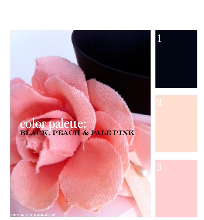
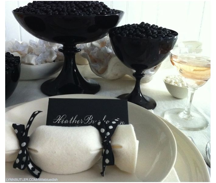
I love these black compotes and bowls that I have on my online store, little blue dish. (They are made by an Italian glass company called Nason Moretti.) I like to fill vessels with candy for quick and easy centerpieces and also fill the felt favors you see tied with black polka dot ribbon with candy as well for guests to take home. This color palette could really work for any season and any occasion- and for more formal gatherings add a calligraphed place card for each guest within the palette. I alternated black cards with cream calligraphy and … Read more

July 22nd, 2013 No Comments

let’s go back to the beginning… color palette: black, peach, pale pink

This was my first post back on April 9th, 2012 and since it was, there weren’t too many readers. It’s one of my favorite color combinations though, so I thought I’d re-post it for those of you who have now joined my blog. Thank you for your weekly support and I hope you keep coming back!  – Lynn Butler Beling I love this color palette. I keep coming back to this color combination because I think it’s both masculine and feminine. Chanel included this palette in their spring 2012 runway show. (see below) The flower in the photograph above is … Read more

June 18th, 2013 No Comments

tabletop: anchor your place setting

Simple wood anchors we found at Michael’s crafts bring a nautical feel to this place setting. Our linen napkins keep the table monochromatic, but a stripe napkin could also bring in a nautical feel. Another simple anchor napkin detail- Anchor Napkin Bands, $3 for 48 pieces from Oriental Trading. Or you could just cut pieces of the anchor paper we featured yesterday to make your own bands.

June 17th, 2013 No Comments

anchors are making a big splash, mostly in a classic navy & neutral color palette

Anchors are appearing everywhere this season-from gift items to tabletop to wrapping paper. We’re seeing most in a classic navy paired with leather, browns, creams, while some accessories are shown in bright red. This inspired our color palette this week with two classic paint colors above from Benjamin Moore. We’ll be covering anchors all week for weddings, interiors and paper but we thought we’d start you off with a few gift items. Above, Mark and Graham’s Anchor Canvas Tote which you can personalize and below their Anchor Key Fobs, Anchor Paperweights, Acrylic Tumblers and Napkins. … Read more

June 13th, 2013 No Comments

interiors: duravit introduces a wireless Sound System to their new bathroom series, combining luxury, style and sound

At the recent International Contemporary Furniture Fair (ICFF) show in NYC,  I made sure to stop at the Duravit booth. I love their design and quality. I love it so much I have a Duravit cabinet and sink in my own master bathroom (which was featured as “Bath of the Month” in House Beautiful’s November 2012 issue). Duravit had several new introductions at this show. One was really great for the music lover- their LED mirrored cabinets now have a Sound System option. Wireless speakers are tucked discreetly within the furniture cabinet. This system has been specially tailored to a bathroom’s … Read more

June 12th, 2013 1 Comment

weddings: a rustic, candlelit wedding in alaska

I showed you the canned salmon favors from this wedding the other week and thought I should share more from this wedding in Alaska with you especially since it’s primarily a white, cream and brown color palette (this week’s palette). Originally shot for Martha Stewart Weddings by Rick Lew and styled by me, this wedding was casual and inspired by the regional beauty. I hope you can draw some ideas and inspiration from these images! (Please remember though the photos are from my portfolio and if you pin the images they should be credited to Martha Stewart Weddings and photographer … Read more

June 11th, 2013 No Comments

tabletop: scrabble alphabet “place cards”

On a recent weekend I hosted guests I used wood scrabble pieces as place cards. The family I hosted also had two young boys, so these were great for both adults and children. I spread the pieces out on the table for the kids to spell out the names themselves. It involved them in the table setting and it was just a fun idea for a casual table setting. I found these alphabet pieces through Save On Crafts– 60 pieces for $3.99. I purchased five sets to make sure I had enough letters for everyone’s name. You could also … Read more

June 10th, 2013 No Comments

kitchens & baths: a neutral color palette and brass accents create a timeless style

Your kitchen and your bathrooms usually get the most return when renovating your home. It’s hard to know where to start when renovating your kitchen. But if you are planning to sell your home anytime in the near future you might want to consider a classic neutral color palette for your cabinets and countertops. Above, the kitchen has dark counters, while below the bath shows a neutral cream counter, showing you how both can be classic in style.  I mentioned before in our post “6 emerging kitchen trends” that brass was becoming more popular again for kitchen hardware. Now … Read more

May 28th, 2013 No Comments

add this week’s seashell color palette to your table this summer

This week’s palette may not be one you’d automatically think of when you think of summer entertaining. Sometimes these creams, tans, rusts and pinks are associated more with fall. But as you can see taking cues from the beach and seashells, this soothing palette is wonderful for summer tables. If you didn’t realize I have a shop too with tabletop, decor and garden items, all personally selected by me. If you haven’t already, please head over to take a look.  It’s my favorite items and vendors collected from all my years of editing and styling for magazines. Our Read more

May 27th, 2013 No Comments

this week’s color palette: seashell inspired tans, pinks & neutrals

As the official start of the summer season starts today we were inspired by seashells. Nature is a wonderful place to start when you are looking for a color palette. It can be from the colors in an object, like this shell, or a larger landscape in general- for instance if you are looking at the ocean you have the sky, the many colors of blue in the sea, the white or tan sand, the green or straw beach grass- these can all inspire a palette. We have selected Benjamin Moore colors to help you apply this palette to … Read more