Posts Tagged ‘color palette’

December 30th, 2013 No Comments

Color Palette: Blues and Neutrals in 2014

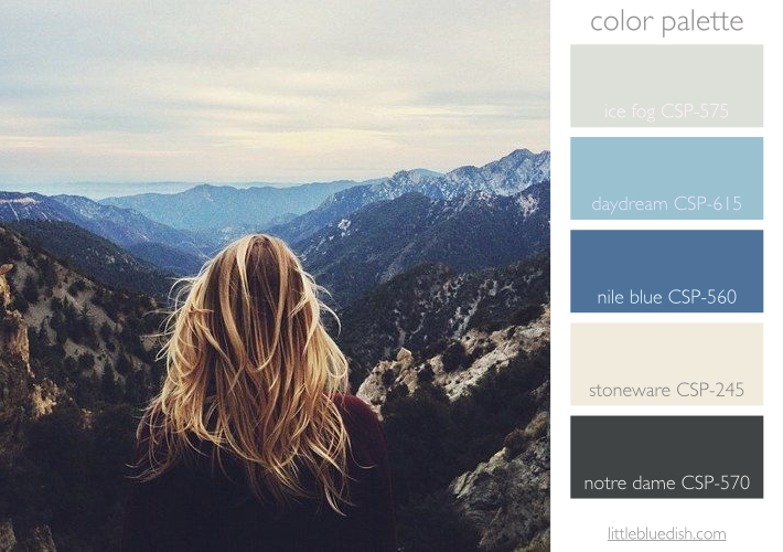
As we look ahead to 2014 this week, as far as color predictions, Pantone’s color of the year is “Radiant Orchid” while Benjamin Moore shows us the “New Neutrals” in soft shades of blues, violets, grays, tans and even pale peach- a bit similar to this inspiration photo above. My favorite color is blue but taking a cue from this photograph, folding in neutrals like gray and a creamy tan really seem to elevate it to a more sophisticated and very usable color palette when designing a home. The darkest color is wonderful for lower kitchen cabinets, bathroom … Read more

December 16th, 2013 No Comments

this week’s color palette: shades of red

Red is in the forefront of my mind with Christmas right around the corner. Here are Benjamin Moore’s picks for shades of red paint. And although I like red with deep forest green for a classic Christmas palette, I love red with a neutral tan, like in this berry wreath with burlap ribbon. If you are hesitant to paint a room red, because let’s face it, that’s a big commitment of color, why not paint your room a neutral tan (like Benjamin Moore’s Bleeker Beige HC-80) and let your accessories be the pop of red. Or try painting your front … Read more

December 9th, 2013 No Comments

this week’s color palette, inspired by oranges

This week’s color palette will be based around orange. I was inspired by this beautiful photograph on the shop Herriott Grace. Herriott Grace is a father-daughter company based in Canada that makes gorgeous wood spoons, rolling pins, pedestals etc.. Such special gifts for the baker on your list.  

December 2nd, 2013 No Comments

this week’s color palette, lavender for holiday entertaining and decorating

I always think of maybe rosemary or cinnamon for the holidays, but this season I have been drawn to lavender. The soft pale violet color can be woven into the classic Christmas color palette colors whether it be red or greens. (I would choose to put lavender with either reds or greens, but probably not red and green together.) Lavender garnishes for cocktails, cakes, or in wreaths and tucked in garland can add a fragrant touch to your holiday entertaining and decorating. I found this lavender vanilla cocktail rim sugar from the Etsy shop, dellcovespices. It’s $3.95 for 2.5 … Read more

November 18th, 2013 No Comments

this week’s color palette: golden yellows & green -perfect for thanksgiving

As the leaves fall and everyone is preparing for Thanksgiving there’s a transition in color palettes going on for the holidays. Most think of rust colors and oranges for October and Halloween. So a great transitional color palette for these weeks leading up to thanksgiving is a golden yellow and green. Fresh greens, herbs, wreaths can all adorn your home for Thanksgiving without looking like Christmas yet. Small punches of yellow or gold, with your glassware, a velvet ribbon tied around napkins etc. can elegantly adorn a November table setting or decor. The gold glasses I carry at the … Read more

November 11th, 2013 No Comments

this week’s color palette: modern southwest

This week’s color palette was inspired by the watercolor of Lourdes Sanchez, a Cuban-born artist whose work has been translated into fabrics for leading designers. Her work can be found at the Sears Peyton Gallery. The Benjamin Moore colors I’ve selected are from top to bottom: Arizona Tan 2162-50, Dusty Mauve 2174-40, Autumn Purple 2073-20 an Hale Navy HC-154.

November 4th, 2013 No Comments

this week’s color palette: shades of blues

I came across this little shop on etsy.com called Geninne that has these charming watercolor illustrations. With over 71 prints to choose from these could make unique holiday gifts or brighten up a corner in your home. Pictured above, “Blue” and pictured below, “ABC of Birds”. Every Monday we select a color palette along with paint chips as a guide for you, in case you like this palette. All colors can be found through Benjamin Moore. From top to bottom: Marlboro Blue HC-153, Whipple Blue HC-152, Van Deusen Blue HC-156 and Soot 2129-20.    

October 28th, 2013 No Comments

this week’s color palette: warm reds and neutrals

I love this photograph from inspiringtheeveryday.com. This blog has so many great seasonal recipes. And although these stone fruit tarts might be more of a summer recipe, take a peek at the fall and winter recipes like butternut squash, celeriac, parsnip and apple soup. With the weather getting colder and the holidays right around the corner this color palette seems so inviting and warm. As we do every Monday we’ve selected Benjamin Moore Paints to coincide with our inspiration photo.

October 21st, 2013 No Comments

this week’s color palette: shades of gray and a pop of orange

We’re bombarded with images of orange during the months of October and November but a sophisticated color palette to pair with orange is shades of gray. Using gray as your neutral and limiting the pop of color to your accessories, you can easily change accessories seasonally if you are a bit scared you’ll grow tired of orange.  Gray really goes with most any color- pops of red for the holidays, white or pink for winter, yellow or green for spring. The easiest way to change the look of your room is to change out pillows and throws. A neutral doesn’t … Read more

October 14th, 2013 No Comments

this week’s color palette: a painterly palette

I’m in love with the mood this photograph has created. It reminds me of an old oil painting with the dark background and the saturated colors of the flowers popping out. Painting a room dark has it’s dramatic appeal but it doesn’t necessarily mean to you have to go that route if you like this palette. This living room below is light and has incorporated the pops of color in book jackets, flowers and then grounded the room with dark woods and black shades. Above are Benjamin Moore paint colors I have selected from our inspiration photo to help guide … Read more