Posts Tagged ‘paint’

July 25th, 2013 No Comments

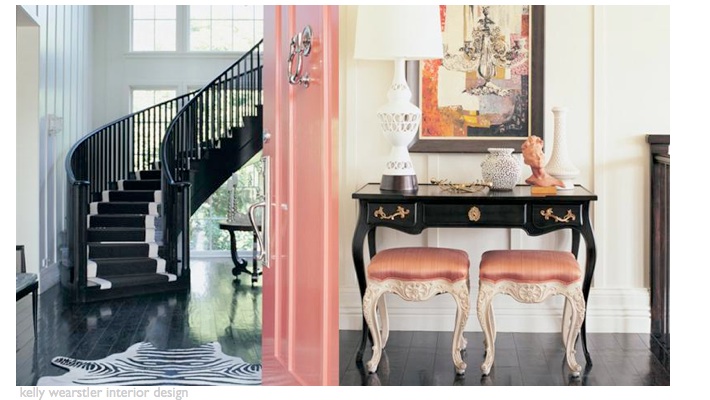
a colorful (high-gloss) painted door can make a big first impression

Designer kelly wearstler has several books that I often reference- Modern Glamour and Hue (available on amazon). I like her mix of colors and textures and her attention to detail. One of my favorite spaces designed by her is the restaurant BG at Bergdorf Goodman.  Above is an example of how she incorporates color through details at a residential home. She starts with basics and builds from there- white walls, a dark floor, select pieces of black furniture, but then layers in coral /peach upholstered stools, accessories, a gorgeous coral painted door- it all comes together effortlessly and her … Read more

July 22nd, 2013 No Comments

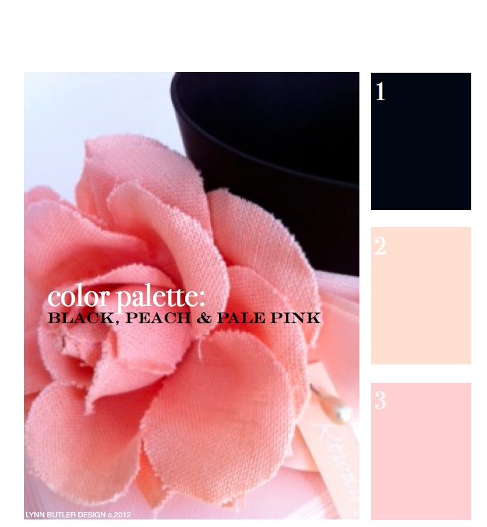
let’s go back to the beginning… color palette: black, peach, pale pink

This was my first post back on April 9th, 2012 and since it was, there weren’t too many readers. It’s one of my favorite color combinations though, so I thought I’d re-post it for those of you who have now joined my blog. Thank you for your weekly support and I hope you keep coming back!  – Lynn Butler Beling I love this color palette. I keep coming back to this color combination because I think it’s both masculine and feminine. Chanel included this palette in their spring 2012 runway show. (see below) The flower in the photograph above is … Read more

July 19th, 2013 No Comments

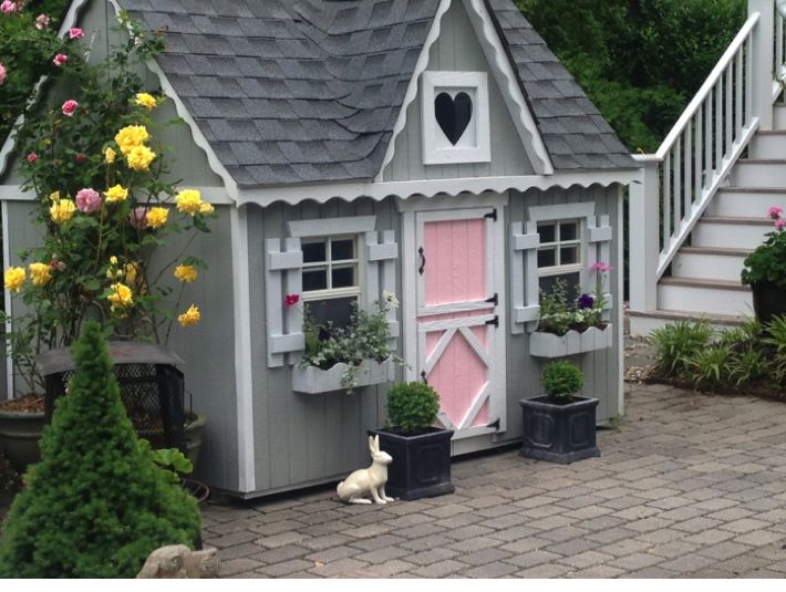
A backyard playhouse full of color and fun…from a kit made by a family business in ohio!

Take a peek at my girls backyard playhouse. I purchased this playhouse kit from the Little Cottage Company (a family owned business located in Ohio) for my kids and what a great find! My girls spend hours in this cottage, which is complete with 2 dutch doors (one for little ones and one for grown-ups), working windows with screens and even flower boxes. It took a friend and I about a day and a half to put the kit together and it was pretty easy to do. (the only thing really not included are roof shingles, but I used the extra ones … Read more

July 11th, 2013 No Comments

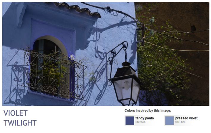
having trouble selecting a paint color? benjamin moore color stories can help you

It always seems a bit overwhelming for everyone, even when you work with paints all the time, to select a color for your own home. We all crave inspirational photos to help us decide what look we want to create. I’ve posted about a tool before called Color Capture App from Benjamin Moore. You can take a photo of your own and let the app tell you what paint colors are closest to the colors in your photo. But there’s another place I go on the Benjamin Moore site to inspire me and guide in my paint color selections … Read more

July 8th, 2013 No Comments

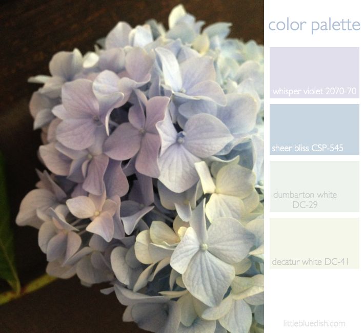
this week’s color palette inspired by faded hydrangea / And benjamin moore announces the winning 20 towns from their main street matters contest

Some hydrangeas are so vibrant in color and others are very pale, washed out blues and lavenders, which is what has inspired our color palette this week. We scatter ashes from our fireplace around the soil of our hydrandreas to change the PH balance and the color to more of a blue.  But most all of your questions about planting and growing hydrangea can be answered on the United States National Arboretum webpage. Above we selected Benjamin Paint colors for our palette that you can use as a guide. And speaking of Benjamin Moore, today they announced their 20 … Read more

June 10th, 2013 No Comments

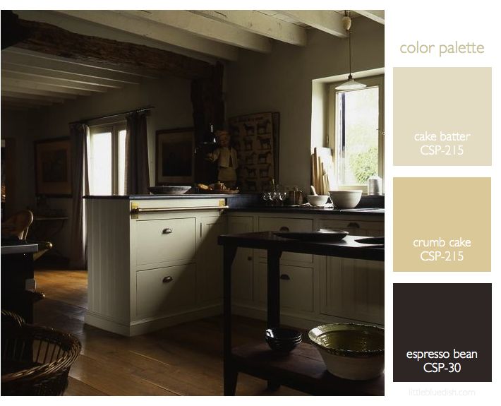
kitchens & baths: a neutral color palette and brass accents create a timeless style

Your kitchen and your bathrooms usually get the most return when renovating your home. It’s hard to know where to start when renovating your kitchen. But if you are planning to sell your home anytime in the near future you might want to consider a classic neutral color palette for your cabinets and countertops. Above, the kitchen has dark counters, while below the bath shows a neutral cream counter, showing you how both can be classic in style.  I mentioned before in our post “6 emerging kitchen trends” that brass was becoming more popular again for kitchen hardware. Now … Read more

June 6th, 2013 No Comments

interiors: this week’s color palette used in big splashes and small accents

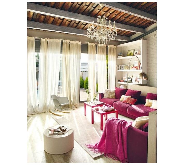
Sometimes there’s nothing better than just looking at inspirational photos to get ideas for your own home. A hot pink might be too much for your walls, but a sofa makes a big splash. Paired with shades of pink, coral and yellow pillows it brings this white room to life. (notice the gray stained beams.. part of our color palette this week with the pinks and yellows) Slip covers for you sofa are a great idea if you don’t want to invest in an expensive sofa in such a bold color. Below, sometimes just adding a bright comforter to a … Read more

May 17th, 2013 No Comments

Benjamin Moore introduces a new paint line: The Williamsburg Color Collection

Exciting news for paint and design enthusiasts. Benjamin Moore and The Colonial Williamsburg Foundation have collaborated on a new collection of paints, featuring 144 colors that were actual hues from the 18th and 19th century called The Williamsburg Color Collection. Together they researched historic paint production methods and relied on 90 years of paint research that has been done to recreate colors that appeared more than 250 years ago. Sales of the Williamsburg products support the preservation, research and educational programs of The Colonial Williamsburg Foundation, the not-for-profit center for history and citizenship. This foundation was responsible for the restoration … Read more

May 16th, 2013 No Comments

the blue book from house beautiful, 350 inspiring ways to decorate with blue

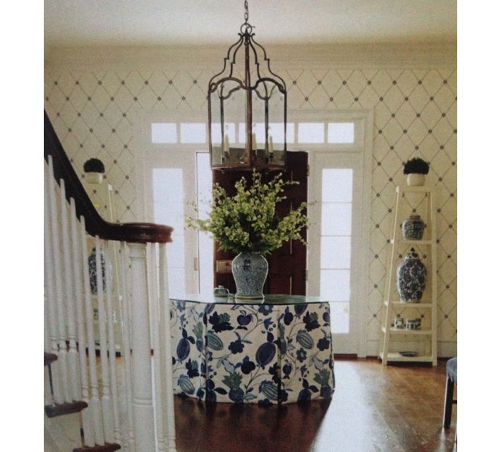
House Beautiful’s little BLUE book is a great decorating reference. Measuring only 5 1/2 inches by 7 inches in size, this a totable book that you can keep in your bag. It doesn’t just give you inspirational photos of rooms, but designer’s tips and paint suggestions that they have actually used. It also goes room by room on how to interject blues to their best advantage in every area of your home. Suggestions and examples of color pairings, like blue and yellow are also very helpful.  

May 13th, 2013 No Comments

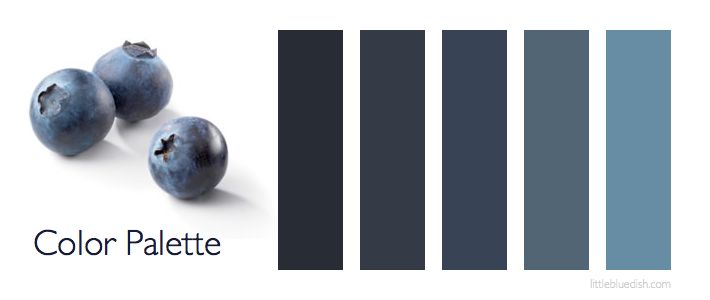
this week’s color palette: blueberry blues

Blue is my favorite color, so I love experimenting with blues. I think I mentioned my whole beach house is in shades of blues, whites and gray, with my dining room and TV room painted in Benjamin Moore’s blue note 2129-30, which you can see in my kitchen palette post. Shades of blue from room to room or dark blues used for doors or molding trim can be very striking. Consider outdoor furniture in blue too, it can look crisp and clean with white or a shade of blue cushions and less harsh than black patio furniture. My painter taught … Read more