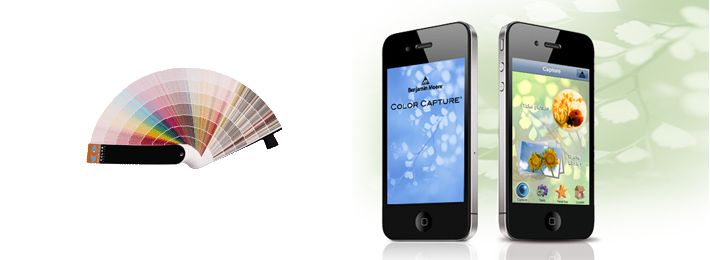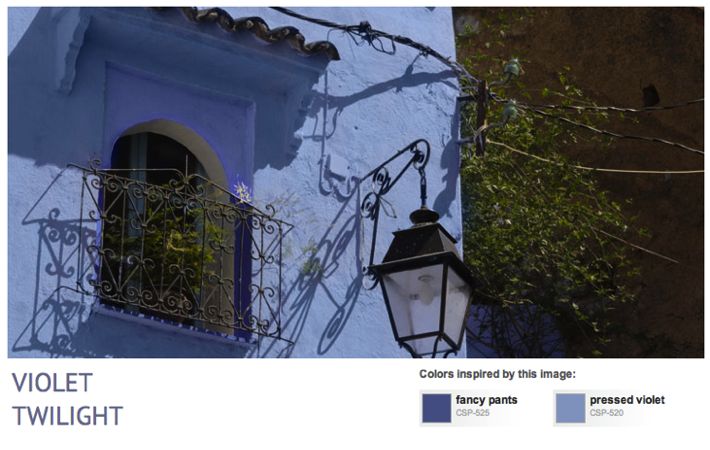
It always seems a bit overwhelming for everyone, even when you work with paints all the time, to select a color for your own home. We all crave inspirational photos to help us decide what look we want to create. I’ve posted about a tool before called Color Capture App from Benjamin Moore. You can take a photo of your own and let the app tell you what paint colors are closest to the colors in your photo. But there’s another place I go on the Benjamin Moore site to inspire me and guide in my paint color selections … Read more
Search Results for: benjamin moore
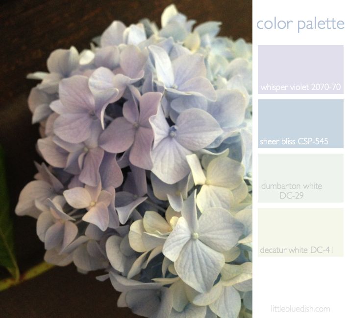
this week’s color palette inspired by faded hydrangea / And benjamin moore announces the winning 20 towns from their main street matters contest
Some hydrangeas are so vibrant in color and others are very pale, washed out blues and lavenders, which is what has inspired our color palette this week. We scatter ashes from our fireplace around the soil of our hydrandreas to change the PH balance and the color to more of a blue. But most all of your questions about planting and growing hydrangea can be answered on the United States National Arboretum webpage. Above we selected Benjamin Paint colors for our palette that you can use as a guide. And speaking of Benjamin Moore, today they announced their 20 … Read more
Benjamin Moore introduces a new paint line: The Williamsburg Color Collection
Exciting news for paint and design enthusiasts. Benjamin Moore and The Colonial Williamsburg Foundation have collaborated on a new collection of paints, featuring 144 colors that were actual hues from the 18th and 19th century called The Williamsburg Color Collection. Together they researched historic paint production methods and relied on 90 years of paint research that has been done to recreate colors that appeared more than 250 years ago. Sales of the Williamsburg products support the preservation, research and educational programs of The Colonial Williamsburg Foundation, the not-for-profit center for history and citizenship. This foundation was responsible for the restoration … Read more
interiors: 2 great paint color tools from benjamin moore
If you are planning on a renovation or just like to paint rooms, furniture etc. every so often, I find a very helpful tool to have on hand is the Benjamin Moore Color Preview Fan Deck. For $25 it can save you trips to your local store for swatches and keeps them all together by color family for years and years. Also available in Fan Decks are their Color Stories, Classics & Historical and Affinity collections. You don’t have to be a designer or set decorator to keep one of these on your desk! Another great tool is the … Read more
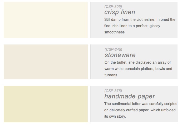
6 of my favorite new neutral paints from benjamin moore’s color stories line
As much as we talk about color and what the new ‘it’ color trend will be this year, I started talking about whites and creams at the beginning of the week to close the year. Neutrals are a great backdrop for these pops of color that all the shelter magazines endorse and realistically what most homes are painted. Not many people venture out to paint a room a bold red, or a cobalt blue or a sunflower yellow I have found during my work. Most people ask for a calming, perfect neutral color. And really, if you plan to sell … Read more
interior designer darryl carter creates 24 colors for benjamin moore paints
Interior designer, Darryl Carter, teamed up with Benjamin Moore Paints to create Darryl Carter Colors by Benjamin Moore. The paints start with DC-1 and go to DC-24. Darryl Carter frequently is featured in the major shelter magazines and has his own decorating books called “The New Traditional” and a new book launching this October titled “The Collected Home: Rooms with Style, Grace and History”. Both are available to buy and pre-order on Amazon. I wanted to include this paint collection in this week’s color palette of white, neutrals and browns because Darryl is an expert on these neutral … Read more
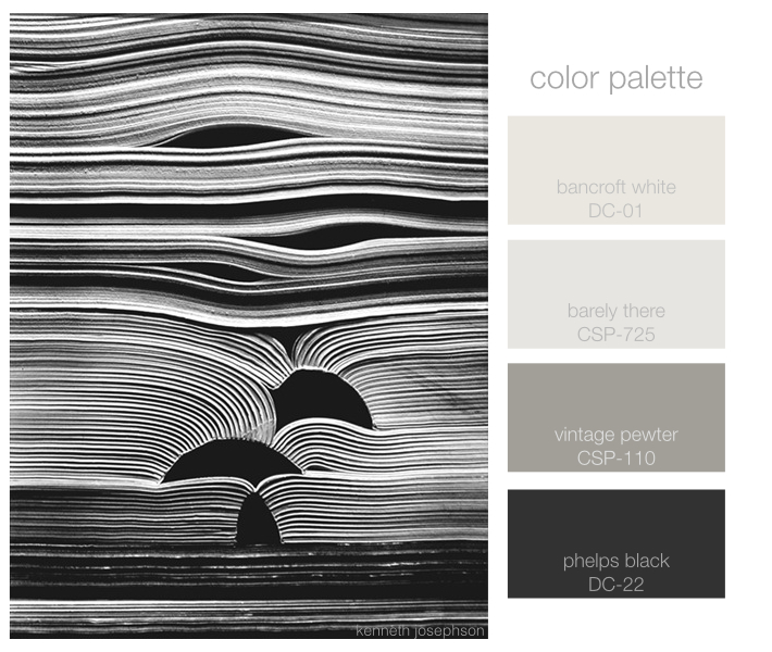
this week’s color palette, shades of gray & black
After a week hiatus we’re back and we’ve been inspired by the work of photographer, Kenneth Josephson. His series on paper and books is amazing and it finds beauty in the seemingly ordinary. His work can be found at the Yancey Richardson Gallery in New York City. Shades of gray and black paints listed above are from Benjamin Moore.
this week’s color palette: periwinkle blue, white and golden browns
This week’s color palette is based on periwinkle blue and natural golden wood or grass tones. Hawthorn green by Benjamin Moore has a mix of brown and yellow and green, like fall grasses might appear. They all work wonderfully together as a palette. We’re seeing periwinkle pop into spring palettes and we love revisiting this color. This palette could work for just about any room in your home as it’s both restful and classic.
this week’s color palette: blues, rust and buff
As winter starts to fade away and we’re seeing small signs of spring we were inspired by this image and a color palette fitting of a crisp climate. I personally love working with the 2129 family of paints from Benjamin Moore. Soot and Blue Note (2129-30) are a few of my favorite deep dark blues to use, for doors, dining rooms and media rooms. If you want a happy, feminine dressing room, girls room or sitting room the light peach shades are wonderful especially in a light drenched room. When we were looking at this palette, my team and I … Read more
this week’s color palette: spring greens, pinks and a bit of rust
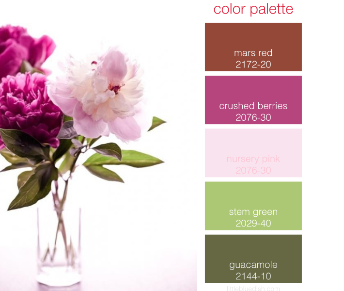
What can I say besides I think everyone is more than ready for spring to arrive. We had another palette ready for you but after this morning’s snow we decided on this palette inspired by peonies instead. We love the shades of green with the pinks and we drew the rust from the color of the pollen which seems to elevate the palette just a bit. All paint colors are from Benjamin Moore.