Posts Tagged ‘neutral’

February 13th, 2014 No Comments

neutral tiles in your bath don’t have to be boring and they won’t break your budget

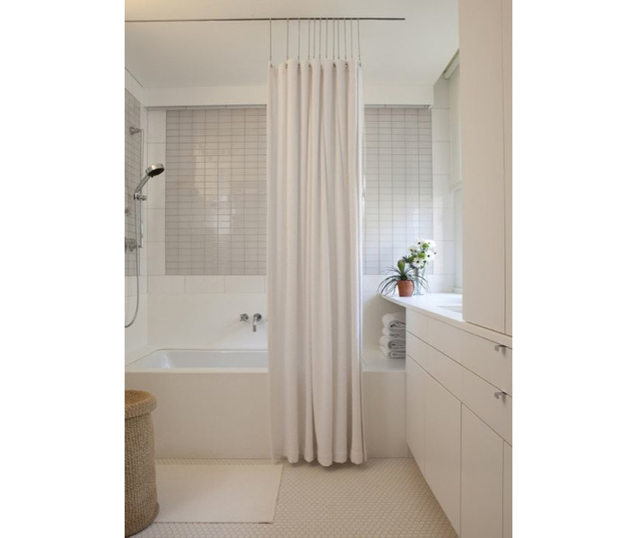
I think so many of us fear that we can’t renovate a room in our home, like the bathroom, the way we want without breaking the bank. But as far as tiles go, subway tiles and neutral porcelain and glass tiles in soft shades of neutrals can go a long way and they are very inexpensive. Here are a few tips to get the biggest bang for your buck. Choose an accent wall, a small pattern in the floor or just as a backsplash behind your sink for the more costly tile. Tiles come in lots of sizes, not just … Read more

February 11th, 2014 No Comments

our “mud australia” tableware is perfect for neutral table settings

If you aren’t familiar with the line of tableware we carry on the shop called Mud Australia I hope you’ll check it out. It’s glazed on the interior or tops of plates and bowls and matte on the outside. It’s beautifully minimal and goes well in most any setting, from a contemporary table to a rustic table. We carry the line in milk (cream) and slate (a deep gray, almost black) but there are many colors if you’d like us to special order another color. I love the shape of the bowls and the tiny lip on the plates. … Read more

January 7th, 2014 No Comments

use beeswax as a place card holder for cold winter dinners

A simple, but fantastic idea for place cards is to take a piece of beeswax and roll into an instant holder. Most taper candles come with a small sheet of plain beeswax to help secure the candles in your candlestick holder. We carry taper candles over on the Little Blue Dish Shop, which come with small rectangular beeswax sheets and the best thing is our tapers are all on sale! We have over 16 colors to choose from and they are all made in Kansas City. Use the coupon “freeshipping” at check out to save even more.  If you have … Read more

August 5th, 2013 No Comments

this week’s color palette: sandy neutrals

Creating a color palette for your home can be a bit easier if you choose something you are inspired by… like the sea, sand, a forest, even a farmer’s market. I always like to keep in mind the flow from room to room. As you are sitting in one room you will be looking into the adjacent rooms, so it’s a good idea to consider what colors are next to each other as you travel throughout your home. Pale shades of neutral colors for your walls are always a good investment and you can bring in color or keep within … Read more

June 17th, 2013 No Comments

anchors are making a big splash, mostly in a classic navy & neutral color palette

Anchors are appearing everywhere this season-from gift items to tabletop to wrapping paper. We’re seeing most in a classic navy paired with leather, browns, creams, while some accessories are shown in bright red. This inspired our color palette this week with two classic paint colors above from Benjamin Moore. We’ll be covering anchors all week for weddings, interiors and paper but we thought we’d start you off with a few gift items. Above, Mark and Graham’s Anchor Canvas Tote which you can personalize and below their Anchor Key Fobs, Anchor Paperweights, Acrylic Tumblers and Napkins. … Read more

May 30th, 2013 No Comments

create an outdoor room with this week’s seashell color palette

It can be overwhelming narrowing down the hundreds of options for outdoor furniture and accessories these days, but the good thing is that outdoor furniture is now available for every budget from low to high. We’ve selected a few things from the market to create a soothing outdoor room within this week’s seashell color palette. Remember an outdoor room can be defined by the furniture placement, outdoor curtains or a large umbrella or grouping of umbrellas, a permanent structure, planters or shrubs or a patio. Above, the Capri Collection from Restoration Hardware. Accessories like their amazingly large Clamshell can bring a sense … Read more

April 29th, 2013 No Comments

color palette: gray, greens & neutrals

Inspiration can come from anywhere. It can come from nature, a piece of fabric, art, fashion.. and in this case a little bit of all of those. Turning through magazines you might run into an ad that you just stop and stare at for a moment. When I turned to this Celine ad I immediately loved the color palette. First the strong gray paired with a neutral bag. Then as I studied a little more it was also the greens, both light and very deep that framed the model that I loved. As I selected Benjamin Moore paints that … Read more

December 27th, 2012

6 of my favorite new neutral paints from benjamin moore’s color stories line

As much as we talk about color and what the new ‘it’ color trend will be this year, I started talking about whites and creams at the beginning of the week to close the year.  Neutrals are a great backdrop for these pops of color that all the shelter magazines endorse and realistically what most homes are painted. Not many people venture out to paint a room a bold red, or a cobalt blue or a sunflower yellow I have found during my work. Most people ask for a calming, perfect neutral color. And really, if you plan to sell … Read more