Posts Tagged ‘cream’

February 24th, 2014 No Comments

this week’s color palette inspired by wild gazelle at the Natural History Museum

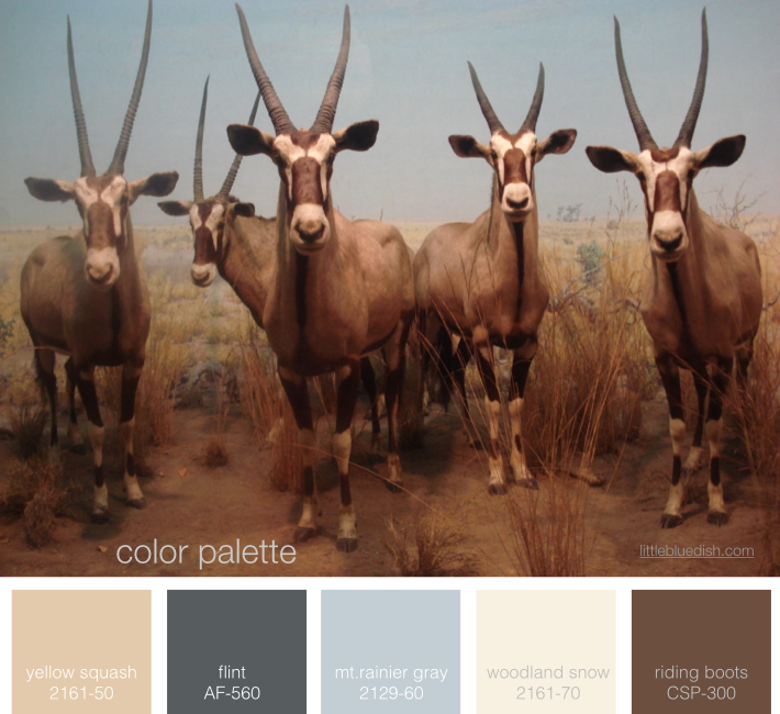
A trip to New York’s Natural History Museum inspired our color palette this week. The coloring on these gazelles was so stunning. I centered around Benjamin Moore’s Mt. Rainier Gray and Flint, part of their 2014 color trends and filled in the neutrals from there for one of our new favorite color palettes! (this photo was taken by Lynn Butler personally on her iPhone and it is NOT a stock photograph)

January 7th, 2014 No Comments

use beeswax as a place card holder for cold winter dinners

A simple, but fantastic idea for place cards is to take a piece of beeswax and roll into an instant holder. Most taper candles come with a small sheet of plain beeswax to help secure the candles in your candlestick holder. We carry taper candles over on the Little Blue Dish Shop, which come with small rectangular beeswax sheets and the best thing is our tapers are all on sale! We have over 16 colors to choose from and they are all made in Kansas City. Use the coupon “freeshipping” at check out to save even more.  If you have … Read more

October 10th, 2013 No Comments

create a neutral color palette with gray & green

When people think of neutrals most automatically think of tans and creams, but gray and green can be a nice alternative. Whether it’s light or dark gray, both shades are still very neutral. Green solids or patterned fabrics add dimension and texture like this upholstered headboard in Elizabeth Mayhew’s bedroom above or these solid green drapes in a dining room pictured below. Blending in cream or white balance the overall palette. This is an easy palette to work with in kitchens too since many appliances, finishes and flooring are all in the gray family.  And don’t forget your front door. … Read more

August 28th, 2013 No Comments

weddings: this week’s palette is a perfect marriage of color

This week’s color palette of creams, a peachy pink, blues with a touch of green is really a perfect wedding color palette. From bridesmaids’ dresses to flowers to table settings this palette is sure to please both the bride and groom and create a fantastical celebration. You can see from our post yesterday about the film Marie Antoinette how it can come together whether your wedding is indoors or outside in a beautiful garden. Accents of gold and even a deeper pink complete the palette. As my advice has always been for any couple, choose a color palette that you … Read more

August 26th, 2013 No Comments

this week’s color palette: cream, peach, blues.. with a dab of green and gold

I’ve had this inspirational color palette on my pinterest page for awhile now and I just keep coming back to it. I love the layering of color and pattern of creams, a peachy pink and shades of blue. To me as a stylist that pop of green in the book is a great reminder… a reminder that a little pop of bright color in an otherwise very tight color palette is that layer that makes this a very interesting palette rather than a quiet, pretty palette. All colors listed above are Benjamin Moore Paints. Gold and brass… over the … Read more

August 6th, 2013 No Comments

check out my shop’s collection of mud australia plates and our unique accessories- all the tableware you see here can be found at the little blue dish shop

I really love these plates and bowls that I have at my shop. They are from a collection called Mud Austalia (made in Austalia) and it has to be one of my favorite lines of tableware. The inside is glazed and the outside is matte. We carry them in cream and a slate color. Paired with our Belgium linens from Libeco and our stainless steel accessories from Alessi, you can see how a table setting can come together with them. Felt accessories like our bunny egg cozies are sure to bring a smile to … Read more

August 5th, 2013 No Comments

this week’s color palette: sandy neutrals

Creating a color palette for your home can be a bit easier if you choose something you are inspired by… like the sea, sand, a forest, even a farmer’s market. I always like to keep in mind the flow from room to room. As you are sitting in one room you will be looking into the adjacent rooms, so it’s a good idea to consider what colors are next to each other as you travel throughout your home. Pale shades of neutral colors for your walls are always a good investment and you can bring in color or keep within … Read more

July 12th, 2013 No Comments

a southern wedding chocked full of ideas to inspire you all weekend long

Photographer Liz Banfield and event planner Tara Guerard teamed up to bring us these beautiful images of a Mount Pleasant, South Carolina wedding just full of beautiful details. We usually feature weddings on Wednesdays but we thought we’d give you an inspirational celebration to start your weekend off early. This bride and groom carried their monogram throughout their entire wedding from the programs to the cake. All printed materials are from The Lettered Olive. Liz and Tara have two wedding books available here. For more monogram ideas for your wedding or celebration check out our post on Read more

June 17th, 2013 No Comments

anchors are making a big splash, mostly in a classic navy & neutral color palette

Anchors are appearing everywhere this season-from gift items to tabletop to wrapping paper. We’re seeing most in a classic navy paired with leather, browns, creams, while some accessories are shown in bright red. This inspired our color palette this week with two classic paint colors above from Benjamin Moore. We’ll be covering anchors all week for weddings, interiors and paper but we thought we’d start you off with a few gift items. Above, Mark and Graham’s Anchor Canvas Tote which you can personalize and below their Anchor Key Fobs, Anchor Paperweights, Acrylic Tumblers and Napkins. … Read more

June 12th, 2013 1 Comment

weddings: a rustic, candlelit wedding in alaska

I showed you the canned salmon favors from this wedding the other week and thought I should share more from this wedding in Alaska with you especially since it’s primarily a white, cream and brown color palette (this week’s palette). Originally shot for Martha Stewart Weddings by Rick Lew and styled by me, this wedding was casual and inspired by the regional beauty. I hope you can draw some ideas and inspiration from these images! (Please remember though the photos are from my portfolio and if you pin the images they should be credited to Martha Stewart Weddings and photographer … Read more