Archive for the ‘Grays’ Category

March 31st, 2014 No Comments

this week’s color palette, shades of gray & black

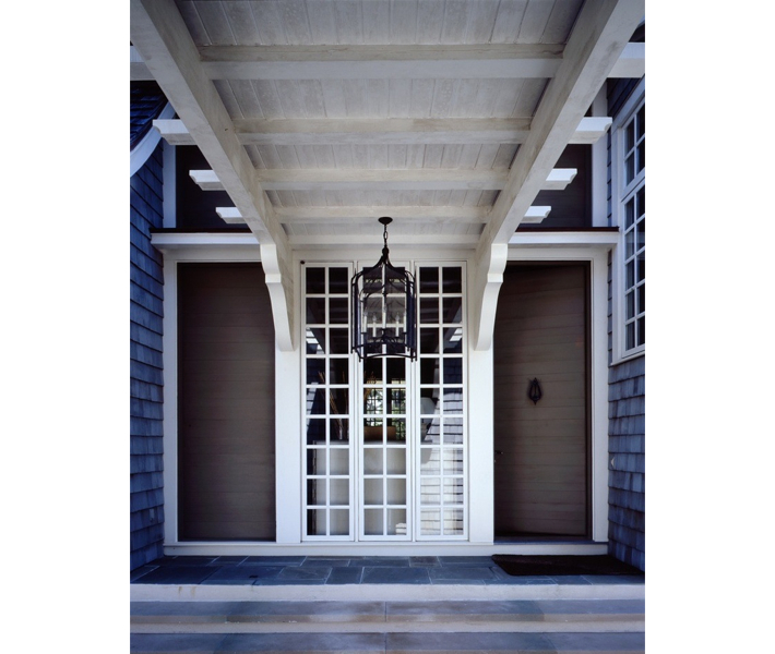
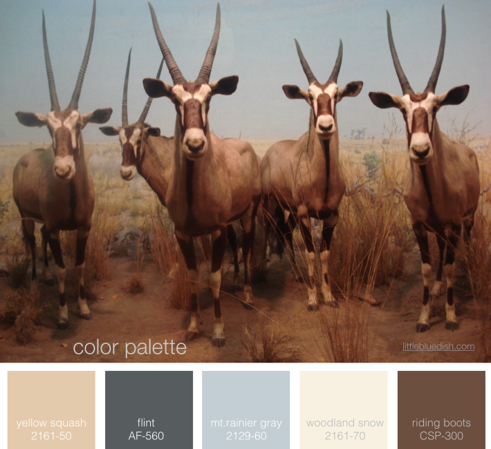
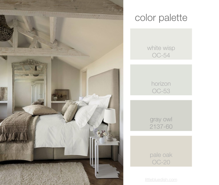
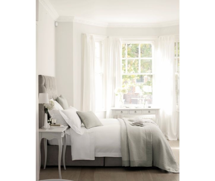
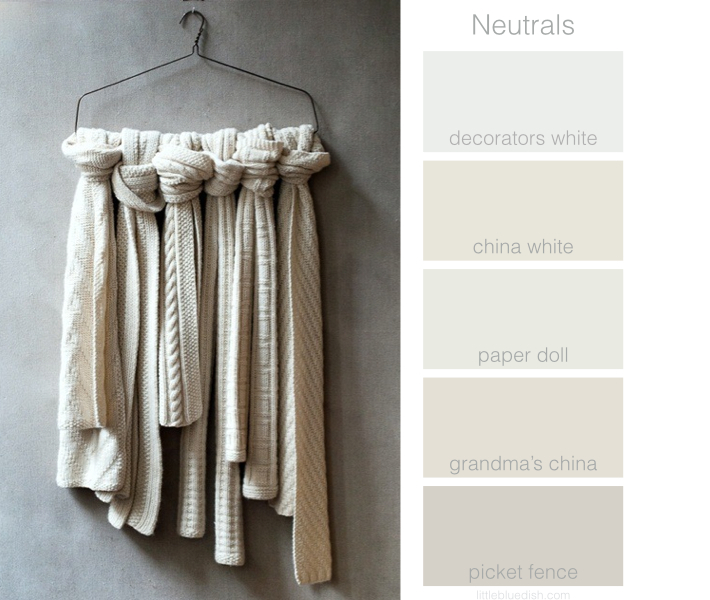
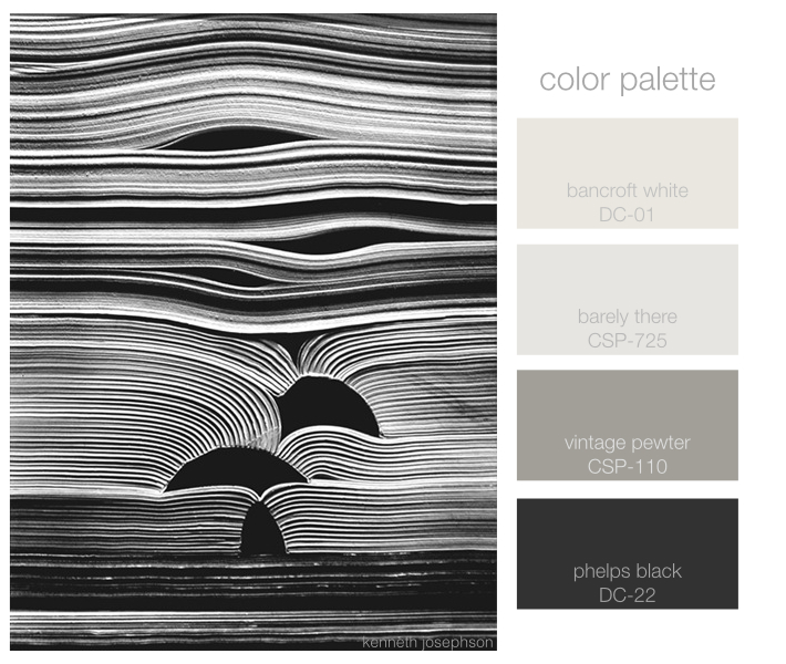
After a week hiatus we’re back and we’ve been inspired by the work of photographer, Kenneth Josephson. His series on paper and books is amazing and it finds beauty in the seemingly ordinary. His work can be found at the Yancey Richardson Gallery in New York City. Shades of gray and black paints listed above are from Benjamin Moore.

March 10th, 2014 No Comments

this week’s color palette: blues, rust and buff

As winter starts to fade away and we’re seeing small signs of spring we were inspired by this image and a color palette fitting of a crisp climate. I personally love working with the 2129 family of paints from Benjamin Moore. Soot and Blue Note (2129-30) are a few of my favorite deep dark blues to use, for doors, dining rooms and media rooms. If you want a happy, feminine dressing room, girls room or sitting room the light peach shades are wonderful especially in a light drenched room. When we were looking at this palette, my team and I … Read more

February 27th, 2014 No Comments

If you love design, you’ll love pouring over McAlpine Tankersley’s work

Although I’ve always heard of the firm McAlpine Tankersley and seen them in all our favorite shelter magazines like Architectural Digest, Elle Decor, Veranda etc., I didn’t intently peruse their work on their website until I was recently researching porte cocheres for a home I was consulting on in Southampton. Insead of giving you a long history of their firm and accomplishments, I urge you just to go over to their site and devour their work. Make sure you have a large cup of coffee and sit back and get ready to be completely and utterly inspired. – Lynn … Read more

February 24th, 2014 No Comments

this week’s color palette inspired by wild gazelle at the Natural History Museum

A trip to New York’s Natural History Museum inspired our color palette this week. The coloring on these gazelles was so stunning. I centered around Benjamin Moore’s Mt. Rainier Gray and Flint, part of their 2014 color trends and filled in the neutrals from there for one of our new favorite color palettes! (this photo was taken by Lynn Butler personally on her iPhone and it is NOT a stock photograph)

February 10th, 2014 No Comments

this week’s color palette: pale neutrals

I was working with a client this weekend, beginning to discuss the color palette for the interior of his new beach home. We decided on this pale neutral palette to start and as we go on we can interject some deeper colors or soft blues but this was a great jumping off point. He wanted to go a bit more gray than brown. Above are the Benjamin Moore paint colors I selected for him as an overall base palette.  When you are faced with deciding on colors for an entire house it’s always good to pull out photo tears from … Read more

February 6th, 2014 No Comments

temporary decorating solutions for walls

Whether you are renting a space that you can’t do anything to the walls or your child needs a visual lift to their dorm room there are a few temporary decorating solutions that you may want to explore. One is a trick I did on photo shoot sets. Take a 4′ x 8′ piece of Gator Board (which is more sturdy than foam core) and wallpaper it. Then lean it up against your wall or behind a piece of furniture (like you see above). Wallpaper several boards for a larger effect. Gator Board also comes in 4′ x 12′ if … Read more

January 10th, 2014 No Comments

quick tips for freshening up your home

Feel like making a fresh start in the new year? Here are some quick changes you can do to freshen up your home. Above, Invest in crisp white sheets for your bed, then layer in soft neutrals like grays or creams with your blankets and throw pillows. I have some beautiful Belgium linen duvet covers, pillow cases and blankets on my shop. If your bedroom feels too dark, try a fresh coat of Benjamin Moore’s China White for the walls- it’s a great neutral white with a bit of gray in it. Below, something as simple as treating yourself … Read more

January 6th, 2014 No Comments

this week’s color palette: neutral whites

Continuing with neutrals this week I have selected some of my favorite whites that all have a bit of gray in them- even though the computer doesn’t show the colors as they really look. The exception would be Picket Fence which is a darker neutral. These shades of white change throughout the day when they are in your home. Decorators White is my go-to white when I need a clean white for cabinets, moldings etc.. All paint swatches are from Benjamin Moore Paints. Above are some beautiful neutral knitted scarves from Purl Soho, a wonderful shop in New York City … Read more

December 30th, 2013 No Comments

Color Palette: Blues and Neutrals in 2014

As we look ahead to 2014 this week, as far as color predictions, Pantone’s color of the year is “Radiant Orchid” while Benjamin Moore shows us the “New Neutrals” in soft shades of blues, violets, grays, tans and even pale peach- a bit similar to this inspiration photo above. My favorite color is blue but taking a cue from this photograph, folding in neutrals like gray and a creamy tan really seem to elevate it to a more sophisticated and very usable color palette when designing a home. The darkest color is wonderful for lower kitchen cabinets, bathroom … Read more

November 7th, 2013 No Comments

meet johana molina, felting extraordinaire from Calera De Tango, Chile

I still can’t get over how amazing these felt animals are, handmade by Johana Molina, a 25 year old artist living in Chile. Her shop FeltingDreams on etsy.com has small collectable felt animals that range from about $40-$100. For the holidays these would make sweet additions to the tops of wrapped presents, or make your own magical holiday town display complete with traveling mice. But just on their own I love them.  She started sewing at the age of 7 and in 2010 she discovered fiber art and started creating wire skeletons that she could cover in wool felt. … Read more