Archive for the ‘Blues’ Category

March 19th, 2014 No Comments

periwinkle wedding details, something blue

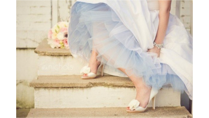
I know many brides have trouble fitting in that ‘something blue’, especially when they might not have blue in their color palette. But here are a few ideas to get that blue in your wedding. Above, periwinkle blue tulle. You can buy tulle at your local fabric store and have a local seamstress make a simple crinoline for under your dress. Below, embroider your 3 letter initials on your bouquet ribbon (your initial on the left, the last name in the middle and his initial on the right) or have the inside of your dress embroidered with your date and … Read more

March 18th, 2014 No Comments

explore pinhole press

We’re loving the site Pinhole Press. They not only do stationery suites for weddings, birthdays and baby announcements, they have unique items like photo memory card games you can personalize with your own photos, to photo books, labels, coasters etc.. This is one site to explore if you have an upcoming party to plan or just photo memories to organize.

March 17th, 2014 No Comments

this week’s color palette: periwinkle blue, white and golden browns

This week’s color palette is based on periwinkle blue and natural golden wood or grass tones. Hawthorn green by Benjamin Moore has a mix of brown and yellow and green, like fall grasses might appear. They all work wonderfully together as a palette. We’re seeing periwinkle pop into spring palettes and we love revisiting this color. This palette could work for just about any room in your home as it’s both restful and classic.

March 12th, 2014 No Comments

nautical and rope wedding details

Again our inspirational photo from Monday’s post is influencing us. We love these nautical and rope inspired wedding details, like this cake with a sugar rope detail at it’s base or these oars that act as menu displays. Knot table and place cards from Karensweddingshop via Etsy.com Use a boat as a cooler for drinks. Most rental companies have unique props like this, it’s worth it to actually go to the rental company and look around at what they have. These type of one-of-a-kind items are not always on their website. Rope chair markers for the bride and groom, … Read more

March 10th, 2014 No Comments

this week’s color palette: blues, rust and buff

As winter starts to fade away and we’re seeing small signs of spring we were inspired by this image and a color palette fitting of a crisp climate. I personally love working with the 2129 family of paints from Benjamin Moore. Soot and Blue Note (2129-30) are a few of my favorite deep dark blues to use, for doors, dining rooms and media rooms. If you want a happy, feminine dressing room, girls room or sitting room the light peach shades are wonderful especially in a light drenched room. When we were looking at this palette, my team and I … Read more

January 3rd, 2014 No Comments

we’re loving…dipped wooden accessories

We love unique tableware and right now we love these dipped bowls and spoons from Wind and Willow Home. Of course you know we are partial to the blues and whites but they also come in yellows, pinks, reds etc.. Whether you need a little burst of color in your kitchen accessories or you simple love the bowls as a beautiful piece of art, these certainly add new life to simple wood. -Lynn Butler Beling

January 2nd, 2014 No Comments

shades of blue in wedding & party details, for winter or summer

Our color palette this week of shades of blues and neutrals is perfect really any time of the year for any climate. It’s a perfect choice for seaside weddings and celebrations. Or pair blues with crisp white and silver, which as you saw on Tuesday’s post how it can be beautiful for winter celebrations too. Above, a collection of blue bottles makes a stunning centerpiece. Take time to gather a collection to use for a larger celebration when there are multiple tables. Many brides and event planners collect bottles, vases and containers in the months leading up to the celebration. … Read more

December 31st, 2013 No Comments

Crisp White with Navy for New Years Celebrations

Whether you celebrate on the eve of New Years or on New Years Day, white flowers are always a favorite of mine for table settings. Like a clean slate, white symbolizes a fresh start to the new year. Adding in crisp Navy in seating cards or menu cards adds a little depth and masculinity. Another beautiful option is to stay with the deep reds and burgundies of the holidays. You can tone down the all-red holiday look by using neutral or flax colored linens. To elevate a buffet, place labeled cards in front of food dishes. You might have fun … Read more

December 30th, 2013 No Comments

Color Palette: Blues and Neutrals in 2014

As we look ahead to 2014 this week, as far as color predictions, Pantone’s color of the year is “Radiant Orchid” while Benjamin Moore shows us the “New Neutrals” in soft shades of blues, violets, grays, tans and even pale peach- a bit similar to this inspiration photo above. My favorite color is blue but taking a cue from this photograph, folding in neutrals like gray and a creamy tan really seem to elevate it to a more sophisticated and very usable color palette when designing a home. The darkest color is wonderful for lower kitchen cabinets, bathroom … Read more

November 14th, 2013 1 Comment

Yippee Ki Yay, Rocketbuster Boots!

One of the best things about working in the design industry is meeting such creative people, like Nevena Christi of Rocketbuster Boots. Nevena and I worked at Nicole Miller together for a short time and Nevena certainly made an impression on me. I remember one of my first days on the job, Nevena had decorated Nicole’s office for her birthday with about 100 potato chip bags hanging from the ceiling and the design team would just reach up and grab a bag as they worked into the wee hours on a new collection.  Margaritas sent in from Virgil’s and … Read more