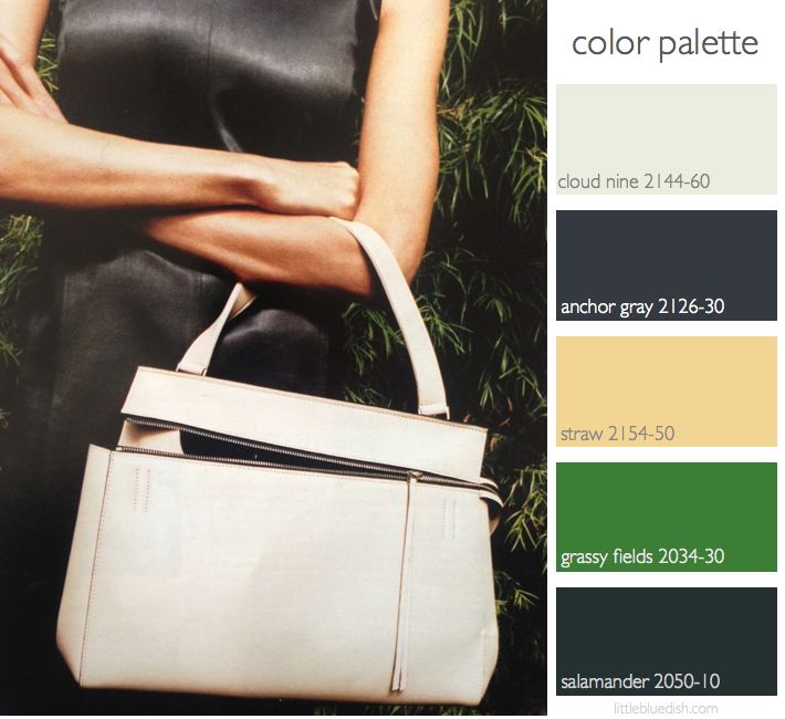
Inspiration can come from anywhere. It can come from nature, a piece of fabric, art, fashion.. and in this case a little bit of all of those. Turning through magazines you might run into an ad that you just stop and stare at for a moment. When I turned to this Celine ad I immediately loved the color palette. First the strong gray paired with a neutral bag. Then as I studied a little more it was also the greens, both light and very deep that framed the model that I loved. As I selected Benjamin Moore paints that could make up this palette, I want to remind you that the paint swatches on the computer screen are a bit different than in real life. Gray I think is one of the hardest color paints to choose. They can look very different in direct sunlight, having huge tint ranges from brown, red, purple, blue. Anchor Gray when seen in daylight looks a bit on the blue side, but when it’s in direct sunlight you can see there are undertones of red/purple. This would look so beautiful on walls as a room color. Though this kind of metal gray color could also come into your room in metal furniture. Cloud Nine although it may look like your standard cream color, has a touch of green in it which picks up on other greens in the palette. The deep Salamander green is very dramatic and could be used in an accent piece like a chair or as an adjoining room color. The Grassy Fields I brought in as a brighter accent and I think it makes the more traditional colors seem a bit more fresh and modern. The Straw is a great neutral anchor- I’m picturing it in drapery, carpet, pottery, pillows or sofas. I remember there was a show on TV, though I’m sorry to say I can’t recall the name of it, but anyway the designer would come in a have the client select 3 pieces from their closet that they absolutely loved. If you are stuck on what colors you might love in your home, this is a great idea. -Lynn Butler Beling


