I had the privilege to speak with Dru Hilty, Trend Manager at Talbots, for an insiders special peak behind the company’s process of forecasting and selecting colors and styles for each season.
Here’s our discussion…
LB: Dru, How does a collection actually come together at Talbots? Where do you begin when you start researching for a new season?
DH: A few of us work with the SVP of Design, Chris Jackson, to help create the concepts behind the collections. He leads the team, and ensures our seasonal concepts are both inspirational and support the brand-vision. Diane Basile, our VP of Creative Services, brings an expertise in print and color to the table. And I assist with trend.
First and foremost, we look to our brand’s own rich history- our passion for the classics and our love of the unexpected. Our New England heritage informs every collection, we are always striving to create timeless, classic and chic pieces that surprise and delight. We achieve this in several ways…first finding inspiration…
LB: Where do you go to find inspiration?
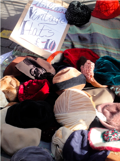
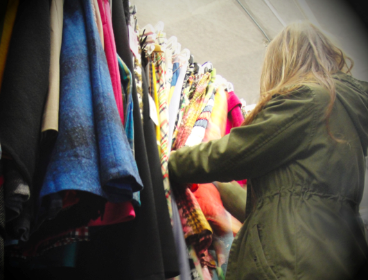
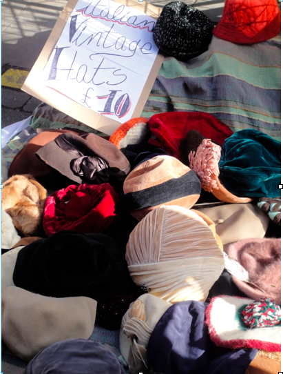
DH: We love shopping vintage markets and archives for inspiration.
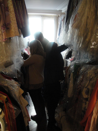
DH: Here our team sorts through a vintage archive in Paris
DH: We also look at the big picture- what’s going on in art, culture, design etc. Often, Chris will be inspired by somewhere he has travelled. For example, this summer he was inspired by a road trip he took to Palm Springs. So when he returned, we started pulling colors and images that represented that lifestyle, the landscape, the mid- century modern houses, the chic approach to leisure.
LB: Was there any specific photographers or books you turned to for images?
DH: Yes, We looked to the photographs of society photographer Slim Aarons, his glamorous hostesses and ladies lounging poolside as inspiration. So the overall color palette was inspired by fresh fruits and tropical cocktails, lush palm-tree greens and the vibrant vintage hues of the 1960’s.
(LB: for those of you who aren’t familiar with Slim Aarons’ photos, here’s an example…)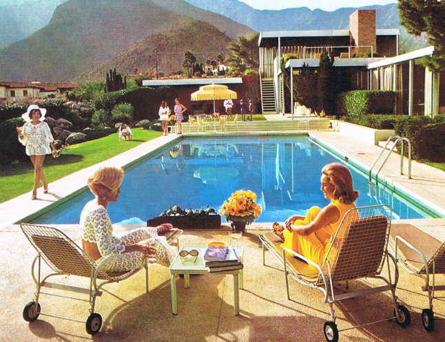
LB: So once you’ve chosen a color palette and the inspiration what’s next?
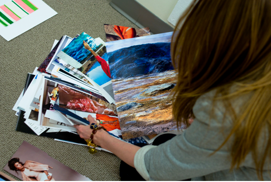
DH: After an initial idea is landed, we start shaping and building it, always ensuring we remain true to the brand vision- chic, modern, classics. Here, I’m sorting through some images (for Spring 12) to choose the ones that best capture the vision…
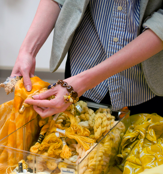
DH: We develop our color palettes in conjunction with our concepts. They inform each other. We may love the yellow in a vintage dress, for example, and we will try to match it with our yarns.
LB: Do vintage items inspire fabric prints too?
DH: We also look to vintage oftentimes for print-inspiration. Here, high on a ladder, Diane finds a plaid skirt that may become (with a little help from our CAD artists) the plaid for a wool coat or jacket.
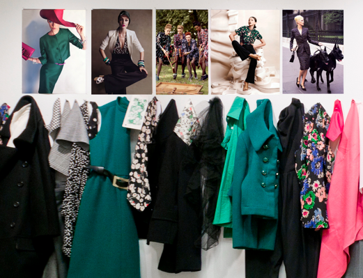
LB: How do you visually bring it all together? At the magazines I worked for we always pinned color print outs of our photo shoots onto the office walls so we could see how the magazine was coming together. When we all looked at the images next to each together, we called these meetings ‘wall meetings’. Do you do something similar?
DH: We create ‘concept walls’ that bring all these elements together and tell a story. This is part of one below, for this coming September…a sneak peek of what to expect. We were loving 40’s inspired dark-ground florals, black and white graphic prints and checks, clean lines and pops of color.
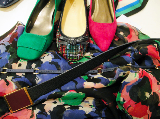
DH: Our fantastic designers then design into these concepts, bringing them to life. This culminates in a seasonal presentation when samples arrive. Here are some accessories samples waiting to be sorted….
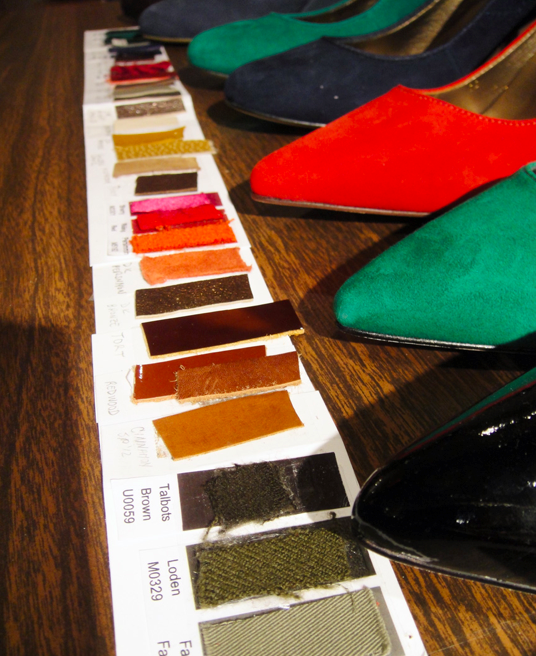
DH: You can also see how our shoe designers have chosen specific leather colors that may not be in our initial palette, but remain true to the feel of the collection.
DH: And that’s pretty much how the creative process works here in our NY studio.

