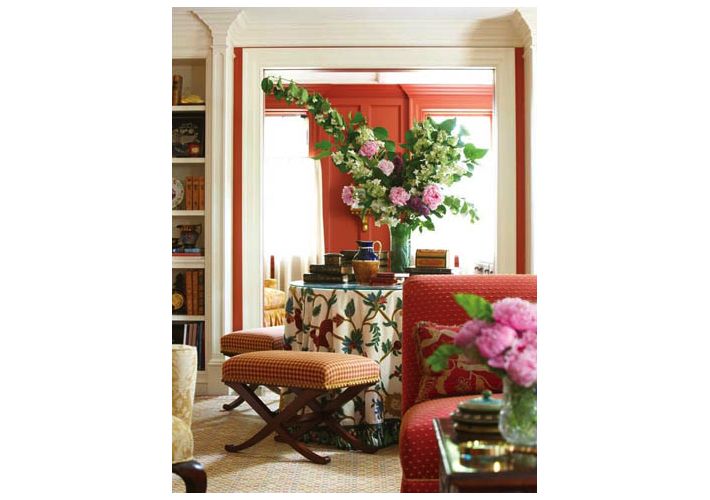
As a New England based designer, Nancy Serafini has over 38 years of experience. She has received several prestigious awards for her work and her most recent was an induction into the New England Design Hall of Fame. Nancy’s own style is relaxed, comfortable and elegant, creating warm and gracious interiors. Today she shares 5 design tips to help you with those designer details that can make all the difference in your home.
1. Divide and Create Nooks with Color and Patterns– Above, Nancy took a long narrow living room and divided it to allow for a small cozy library. “A vibrant color on the walls diminishes the sense of the narrow width and the abundance of color and patterns keeps the eye moving.” ,Nancy explains.
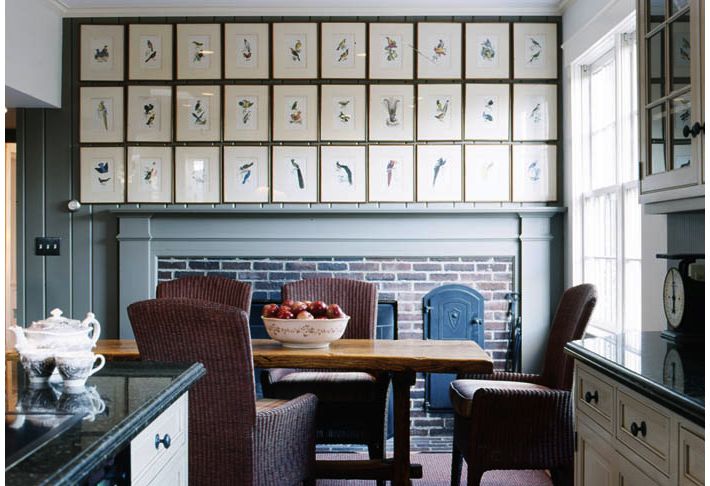
2. Showcase Collections at Eye Level– Below, Nancy’s client had purchased 30 antique bird prints from Trillium in Nantucket. She grouped the collection above a brick fireplace and when this photo was featured in New England Home there was a tremendous response from readers. “They love the simplicity of the structure of prints against the old world blue and brick fireplace. There is no need to ornament the mantle. My best advice is the know when to ‘put the period in’. Not everything in a room can be a rock star- edit, edit, edit. I still adore antiques but not clutter. Mounting collections is a great way to unify a space and make it more interesting. I find the biggest mistake people make in mounting art or articles is that they place them too high; Hanging them at eye level is the best way to start.” With the bird collection below Nancy says, “I centered the furniture on the wall and then centered the mirror over the table. The top two birds were placed first and then the next four were centered in two rows and the bottom bird lined up with the top. It was a challenge but what a fun and warm, whimsical way to start your day with a cup of tea.” (To see more of this home, it appeared in the September issue of New England Home, titled “All Due Respect”.)
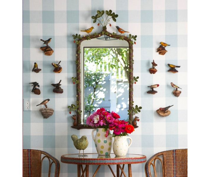
3. Wallpaper (or paint) Wall Switches. In this same photo with the bird collection notice Nancy had the light switch wallpapered to match the wall. Small details like this can make all the difference. Your eye goes to the collection and not a utility outlet. Wallpaper by Schumacher.
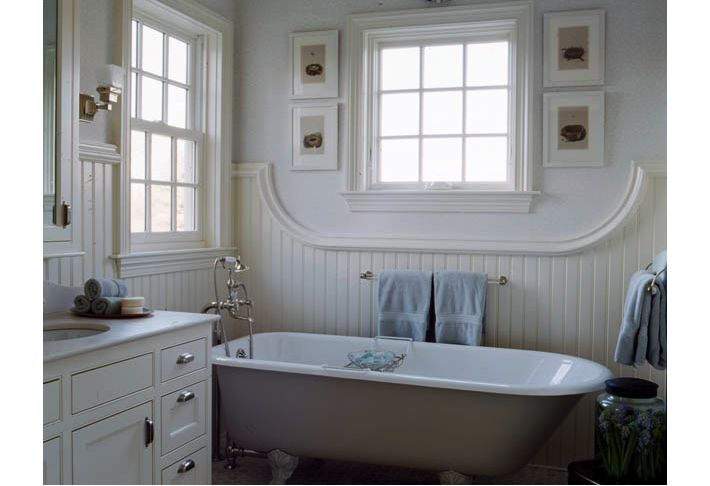
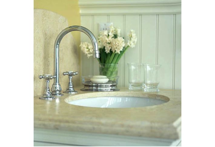
4. Add a Custom Detail Like Arches or Curves– In the master bath below Nancy decided that straight bead board is so overdone, so she added a curve in the woodwork above the tub. “We decided we wanted to add a little life and happened upon the “u” shape from the end of the tub.” Custom woodwork by Neil Blackwell and Mark Howland. All fittings and accessories are by Waterworks. Nancy also loves the idea of a curved backsplash like you see behind the sink below.
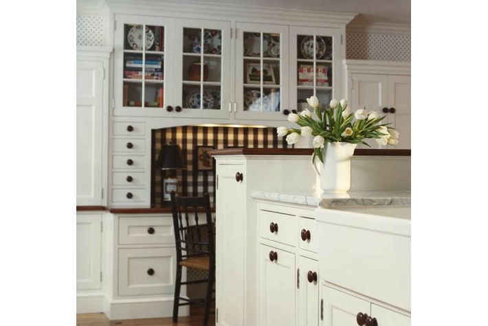
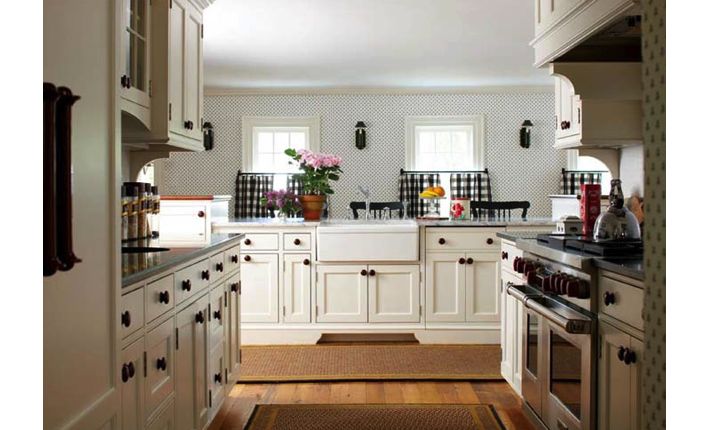
5. Double Duty Decorative Details– Pictured below, Nancy had a homasote board upholstered in a black and white check fabric remnant from Calico Corners. It is a decorative detail behind the kitchen desk but it also pulls double duty as a bulletin board. Neil Blackwell and Mark Howland also helped Nancy with this entire kitchen renovation to a 1787 Connecticut home. All the cabinets are custom including the wooden knobs.
Note: All photos via Nancy Serafini Interior Design. If you like an image and decide to “pin” it to Pinterest, please credit Nancy’s firm. Thank You!


