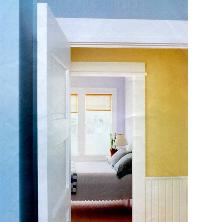
I have to apologize for this photo – it’s a magazine page I had pulled from Martha Stewart Living and posted on my inspiration board (yes the old fashioned way vs. Pinterest) and it’s showing all the wrinkles of wear. But it perfectly fits our color palette this week of yellows, blues and lavenders- so I decided- what the heck- I’ll post it (even though I’m still cringing as I look at the condition) Anyway….
It’s always a good idea to think about your view from room to room when selecting paint colors. There’s really no right or wrong if YOU love it, but consider to think about your home as a whole when selecting your paint palette. I usually take my favorite paint chips I’ve selected from the paint store and scramble them to see what looks best together. For my most recent renovation I did all shades of blues, grays and whites. And a trick I learned from my painter, Tony, was to take a gallon of white paint- and then add one drop of your color into the paint to create a light shade of the color. For example, the dining room is painted in Benjamin Moore’s “Blue Note”, but the more casual breakfast room (adjacent) is painted with “Decorator’s White” paint with one drop of “Blue Note”. Throughout the day it changes with the light and I love it. Sometimes it looks gray, sometimes almost white and other times a soft hazy blue. Though you don’t always have to stay within a color family or shades of a color and this photograph is a perfect example of how three different colors can look so well together as you move from room to room. (By the way, Martha Stewart’s paints are now available at Home Depot)


