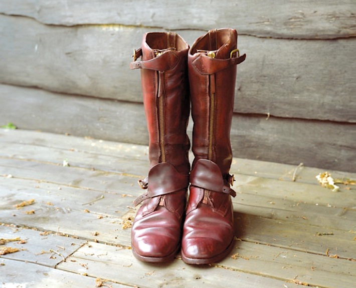
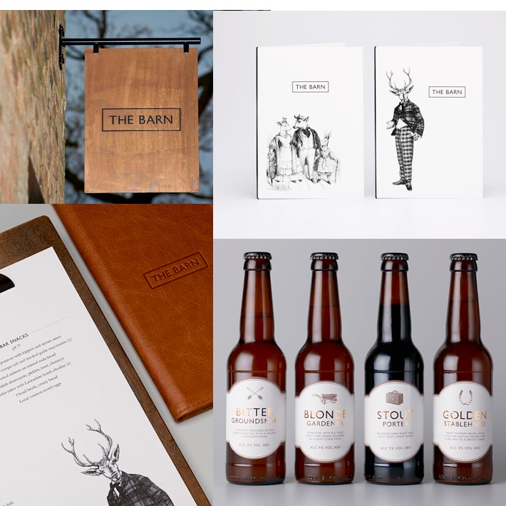
I’ve had this photo on my inspiration board for months now so I thought I should include it in a color palette. While searching the internet one day I came across this design firm called &SMITH based in London. I love the print design they did for a restaurant called “The Barn” at Coworth Park in England. I also liked that they put the menu on an old fashioned clip board- a great idea too for a wedding or party to display a table name, number or the dinner menu. The details they did like the sign, illustrations and beer labels also showcase their creativity and the client’s identity. (see photos below)
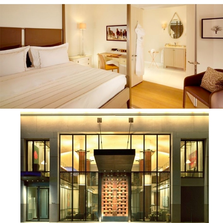
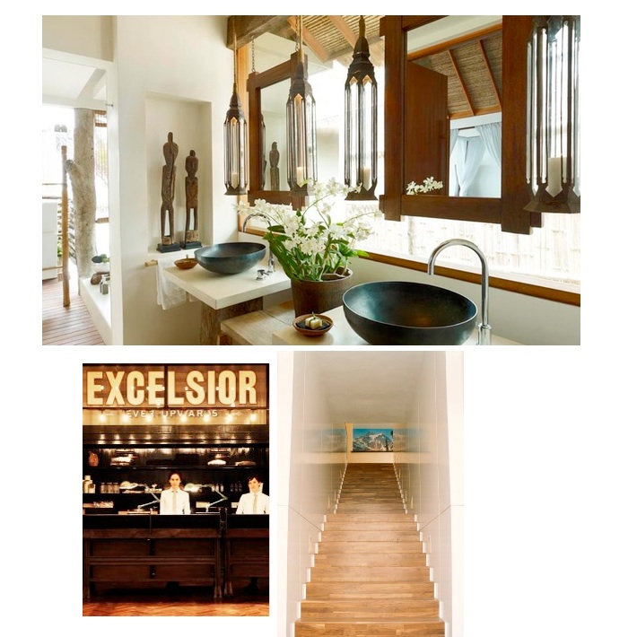
This is a color palette I’m constantly drawn to for interior spaces- a combination of white, neutrals (like linen, sail cloth, sea salt, sand), dark metals, deep brown woods and leather. This color palette seems crisp, clean, comfortable and a bit historical to me. A lot of boutique hotels also design with this color palette if you ever noticed. For a few examples..see below. (Top to bottom: CoworthPark, Chambers Hotel, Song Saa, Ace Hotels)
Hotels pictured below: A room at Coworth Park & the entrance of Chambers Hotel, New York City
Hotels pictured below: A bathroom at Song Saa, the front desk of Ace Hotel New York and stairwell at Ace Hotel Portland.


