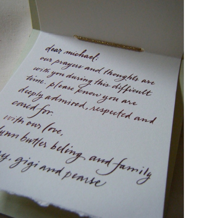
I love calligraphy. I use calligraphed cards for dinners and parties whenever I can. I usually call on one of the best in the country to do my calligraphy… Gail Brill of Gail Brill Design. Gail has beautiful scripts and handwriting and most importantly Gail is very consistent with her lettering. I would always use Gail if I needed calligraphy on a photo shoot because I knew it would be perfect and all her letters would be consistent. Consistency is so important when you are lining calligraphed seating cards together in alphabetical order for a wedding or a party. Black ink on white cards is most commonly used but inks come in a lot of colors so you can get rather creative with your color palette. I would usually send Gail a Pantone chip or color swatch of the color ink I would need and Gail would match it perfectly. Gail also does maps, menu cards, invitations etc….and most recently she did the most beautiful calligraphed silk fabric banner for an ill friend in the hospital and I also had her write a note for me to send with the banner. I love receiving calligraphed envelopes and cards, so I hope my friends do too! (see photo below)
For this table setting above I had Gail use a white ink on black card stock for a striking place setting. Black and white table settings are always classic whether it’s a formal setting or a more casual setting like I’ve done here. I think you can get creative with your flatware and glass placements on your table when you are entertaining for close friends and family. But if I were entertaining for a formal event or for a work setting I would follow the classic table setting with forks on the left and knives and spoons to the right of the plates. I always follow Peggy Post/ Emily Post’s etiquette books. They are good reference books to keep on hand. Below is a guide to setting a formal table for you to print and keep on hand if you’d like.
Credit note: White plates, linen napkin and Serie 40 black handled flatware all available from my shop, The Product Gallery.


