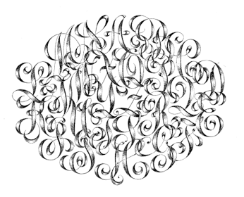
This monogram (below) of the alphabet was drawn by JM Berling around 1908. He was a great monogram designer and lettering artist.
I love monograms. To me they are the lyrical coupling of beautiful letter shapes. They can be style specific, like Art Deco or Romantic, they can be simple and stark or elaborate with iconography and symbols. Unlike a family crest they are totally accessible and available to anyone. Everybody that has a name has one. Monograms are evocative of a time when manners mattered and social stationery was essential.
Now don’t get me wrong. There are a lot of ugly monograms out there. I spent some time doing a little research and there seems to be a lot of folks that think sliding 3 letters from a font together makes a monogram. That might be true in a very literal way, but it isn’t a thing of beauty. It is NOT a melodic coupling of beautiful letters, at least not in my (humble) opinion. Making a monogram by hand allows you to coax the letters together; you can find the space between the letters that feels right and bring them all together in the most harmonious way.
As a hand lettering artist and calligrapher, creating a monogram is one of my favorite things to create. An individual’s monogram is lined up like this: first name initial first, last name initial next, middle name initial last. Married monograms can be the first initials of your first names only, or if you are a bride taking your spouse’s name; your first name initial, the initial of you new married last name and the initial of your maiden or middle name. If you are taking your spouse’s last name, your joint monogram could be your first initial, your spouse’s last name initial and your spouse’s first name initial.
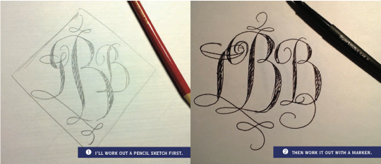
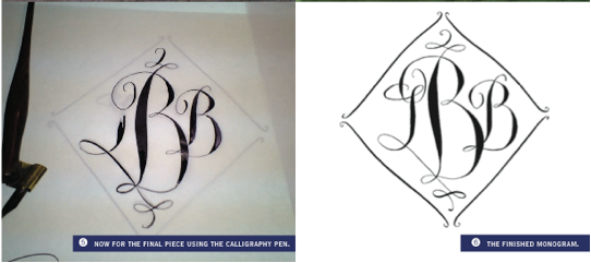
I’ve been working on a monogram for Lynn and wanted to share the process. Step one is about getting a feel for the letter shapes together and how they can “embrace” each other.
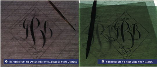
This is really the most crucial step and often involves a lot of erasing and redoing. In the following steps I use the light box. The light box lets me work off of the previous design. Moving to the calligraphy pen in the final rendering allows those graceful thicks and thins to emerge.
So now that you have a monogram, what’s next? There are so many things you can do with a monogram. Let’s talk about weddings first! Tradition says that the brides’ monogram should appear on the invitation, not the married monogram. It’s considered bad luck to have the married monogram on the invitation before the wedding, but fine for the menu card and of course, the thank you cards.
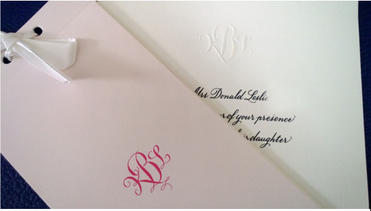
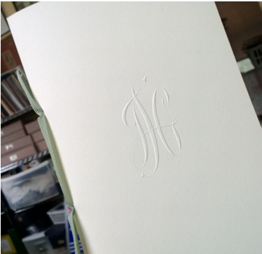
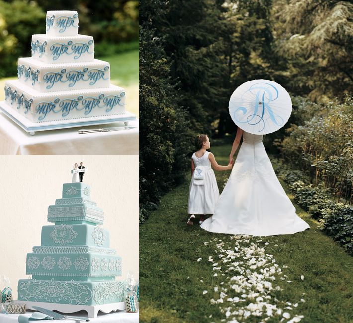
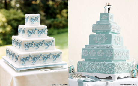
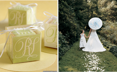
They can also be used on the wedding cakes and more. Here is a collection of monograms I designed that were incorporated into various items. All these images were seen in Martha Stewart Weddings.
Or on favors and umbrellas!
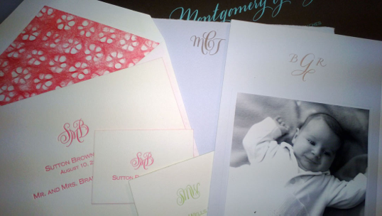
For several clients, I have created a monogram for each one of their children. I converted the monograms into rubber stamps, so as the children grow older, they could have fun with their very own logos!
I’ve painted monograms on silk for pillows, designed a monogram tattoo, painted a large monogram on a seven foot banner and have several current projects that I will reveal shortly that are all about the monogram! So stay tuned and if you want to talk monograms with me, I’d love to hear from you! If you visit my website at www.gailbrilldesign.com, you can see a monogram I designed for Kate Spade which she used on several handbags. Call me anytime at 518-586-1063.
Thank you Lynn for allowing me to be your guest Wednesday Weddings blogger this month. I’ve had a blast! – Gail Brill
Keep linked to Gail Brill on our Little Blue Dish shop under paper & calligraphy… and coming soon an exciting collaboration between us and Gail! We’ll keep you posted here on the blog, on Facebook and Twitter! If you haven’t “Liked” our Little Blue Dish page on Facebook please do so, we’d love you as a friend! And you can follow Lynn on Twitter @lynnbutlernyc

