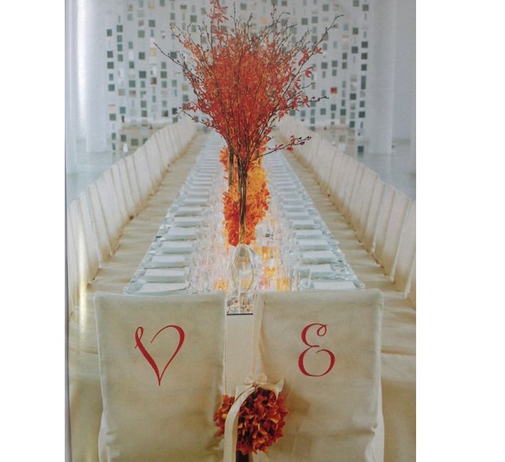
I almost forgot that I used this week’s palette a number of years ago in collaboration with Antony Todd, so I thought I’d share it with you today. We worked on a story together for Martha Stewart Weddings, transforming the giant open space in the middle of the Starrett-Lehigh offices which was photographed by the very talented Victor Schrager and art directed by visionary Ellen Burnie. When planning a party, celebration or even a wedding it’s always best to start with a color palette. Then as you begin to decide on your decor an easy trick of the trade for centerpieces is to use multiples of like objects, vases or even lanterns and repeat- either down a long table like we did here or clustered symmetrically in the center of a table. The consistency creates a bold visual impact. With this table we used orange and gold hued orchids, alternating high and low vases. Then the red in the palette came in with the details like the monogrammed chairs of the couple’s initials that you see above (keep scrolling to see more). To add a little more reflection and drama to the basic neutral table cloth we placed square mirror tiles to cover the tabletop (An easy to remove self adhesive helped keep the mirrors secure to the tablecloth).
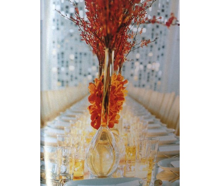
Above, Short gold votives illuminate the table and the light bounces off the mirrors and the glassware. By keeping the vases glass the table is full of reflective pieces and keeps it all almost etherial. If we had chosen a solid vase the overall table could have appeared too heavy and stagnant.
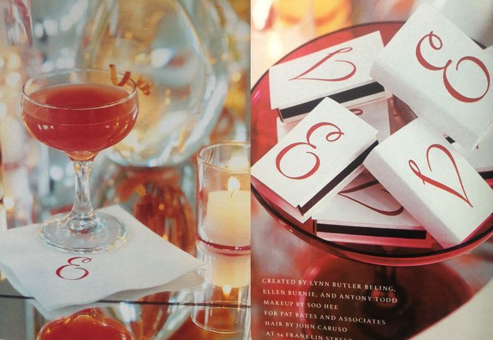
Monogrammed cocktail napkins and matchbooks with the couple’s initials in red carry the palette throughout. Details like a signature drink at cocktail hour in your color palette is not only fun and visually cohesive but by having a signature drink it can save you money. By selecting one or two drinks to be served vs. a full open bar it can keep the alcohol costs down. Discuss with your caterer or planner exactly what type of glasses you would like the cocktails served in as well. Notice that even the compote for the matches was a red glass to tie into the overall color palette. These tiny details are worth the effort. While you are selecting your rentals look for small specialty pieces like this- that’s why starting with a color palette can make everything much easier when designing an entire event.
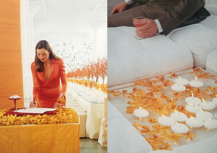
Lucite trays allow the orange orchids to appear floating. Left, the guest book station was placed at the entrance to the event. A riser box covered in red fabric acted as a solid flat surface for guests to write on and it was surrounded with loose orchids. Take care in all the details right down to the pens that are used to sign the guest book. I found unique glass pens at a specialty stationery store. Right, in the cocktail area ottomans surround lucite trays atop cocktail tables filled with floating candles and orange orchids.
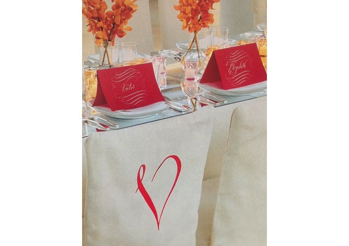
Large folded red cards with white calligraphy make dramatic place cards and again bring in that touch of red in the overall color palette.
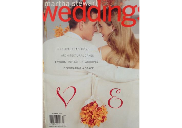
Happily our story made the cover that issue. The bride’s bouquet which hangs from the chair is a ball of orchids with a long satin ribbon, almost like a small purse.
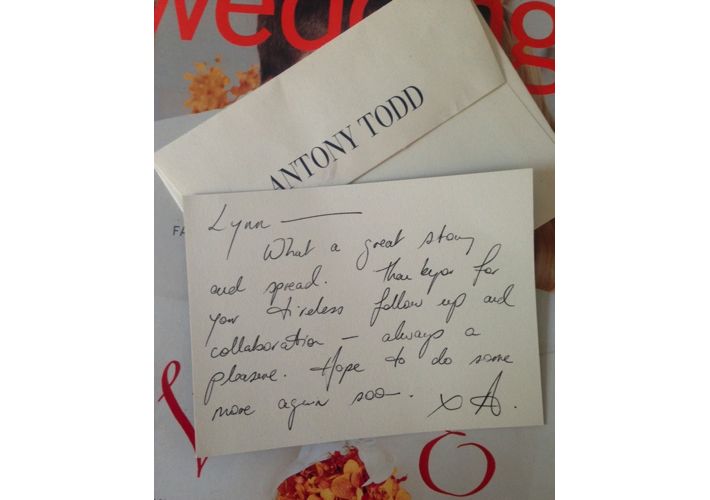
As I was getting out this story from my archives a note fell from the pages from Antony- always a gentleman and so stylish is Antony Todd. – Lynn Butler Beling
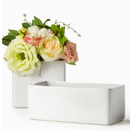
Extra, Extra! Another example we found… not styled by Lynn, but an easy one to recreate for sure, using roses in low white containers (which we found similar ones for you to buy, see credit below).
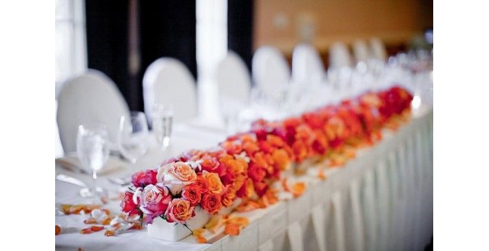
To recreate this look, below are low White Ceramic Vases, cube or rectangles, $11-12 each (also available by the case), from Jamali Garden.
(note: photo with pink, orange and red roses via bing images)

