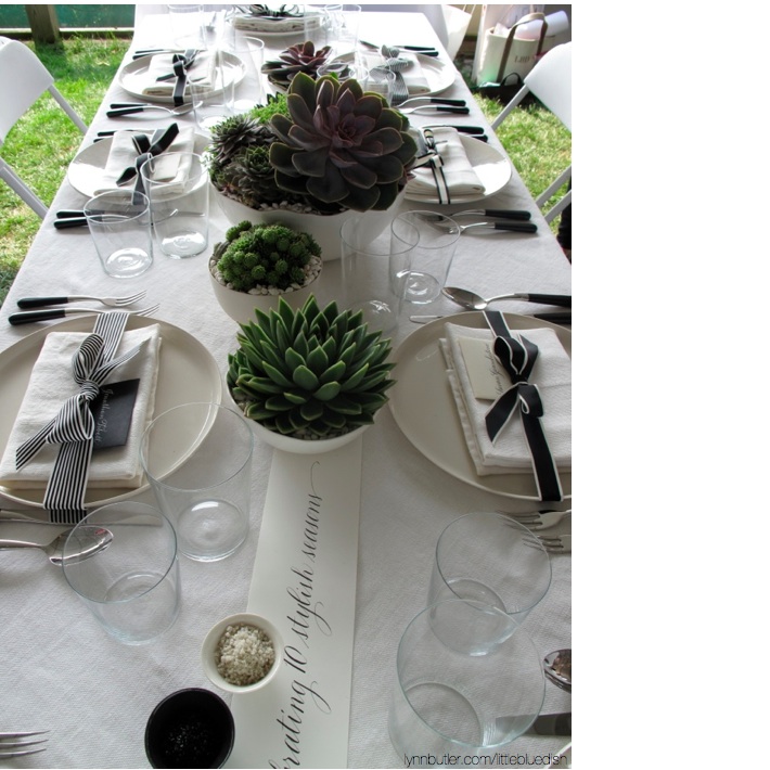
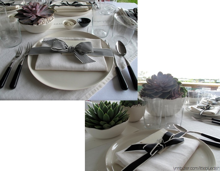
I was asked to design a table for Hampton Cottages and Gardens for the Hampton Classic (an equestrian competition). It was very last minute and the event was outside in very hot, humid temperatures. Traditional flowers might not hold up in the heat- so I chose to use different varieties of succulents, so I was sure it would look crisp and clean. I used different sized Jars bowls and Mud Australia bowls (available from my store) to plant the succulents in and topped off the dirt with small white seashells to finish the centerpieces. The tables were all long and rectangular in shape, so choosing a ‘running’ centerpiece down the center is a great option. Also keeping the arrangements low allows guests to see each other and easily converse.
Black, white and cream are a nice palette to mix in with the greens and teals of succulents. I mixed in some black salt cellars with black salt and cream salt cellars with sea salt on top of a neutral cream linen tablecloth & napkins, cream dinnerware, black handled flatware and clear, simple tumblers for wine and water to keep the table airy. The magazine was celebrating 10 years, so I commissioned Gail Brill to calligraph long paper banners for each end of the table to call this out. I mixed black seating cards with cream calligraphy and cream cards with black calligraphy for each place setting, as well as vintage black and cream ribbons from France in different widths and stripes.
Stylist Tip: The secret to keeping the table looking clean and crisp in design is that the base tablecloth, napkins, dishes and bowls as the centerpiece containers were all one color- a neutral cream. That way the greens and teals popped and the black was another layer of ‘neutral’ to bring in some visual interest at each pacesetting.
If I had more time to plan and gather resources for this project, I would have loved to bring in some succulent favors and/or horseshoes- something about horses to really detail the table. But it all worked out and the editor and publisher seemed happy with the results.


