Archive for January, 2014

January 16th, 2014 No Comments

bold patterns are perfect for a pink & green palette

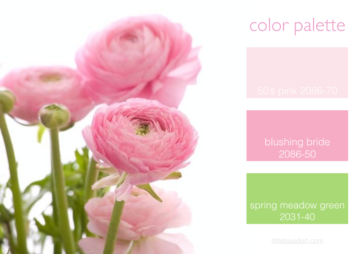
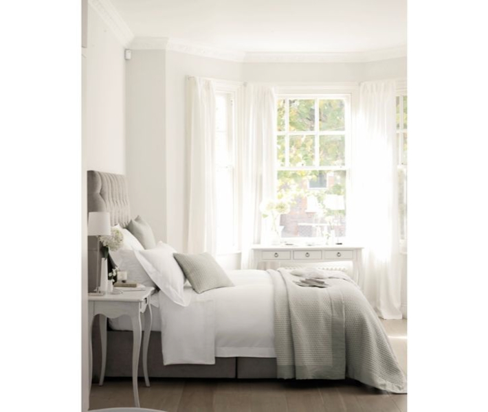
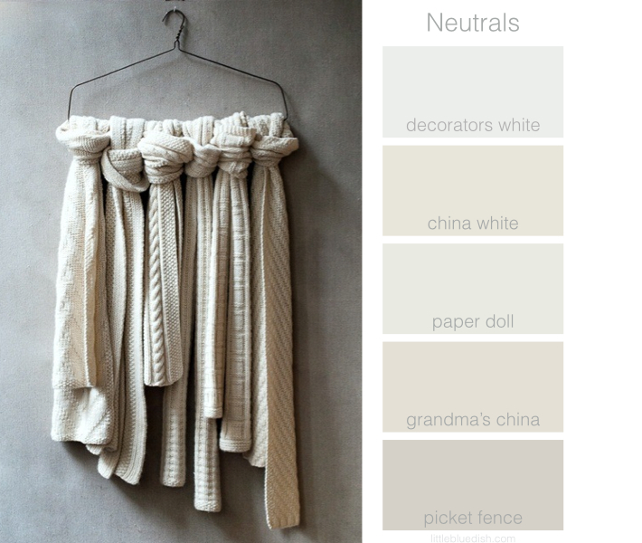
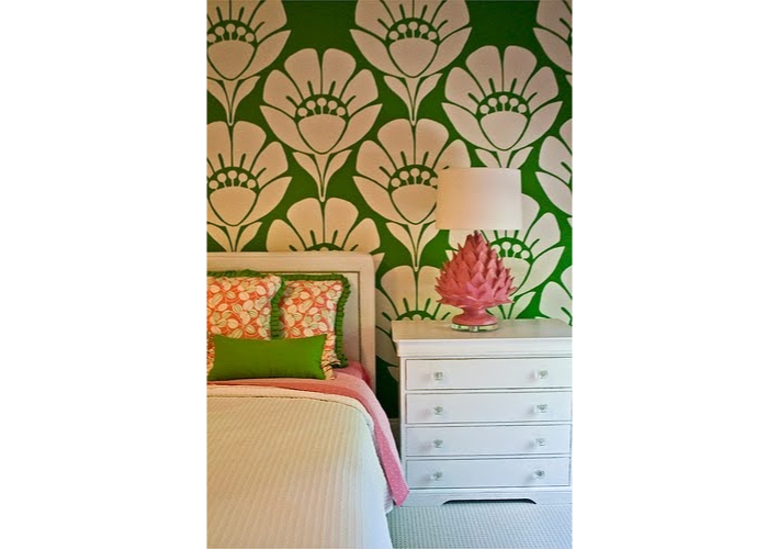
Monday I mentioned if you go with a pink and green color palette, it is just one of those color combinations that it seems like you go bold, or go home. Bold patterned fabrics and wallpapers lend themselves to bright green and bring a room to life. Pair those with pink and wow! What a statement. Here are a few examples of how these two colors can work in a room. It’s certainly inspiring us here in the office this week for some spring and summer decorating projects by the beach.  Would you like to do a room in pink … Read more

January 15th, 2014 No Comments

jen huang photography & her gorgeous blog

Although I have worked with many photographers that we have featured here on my blog, there are of course so many great photographers out there that I haven’t worked with and there is one lately I keep coming back to- Jen Huang. I love her style and that she can capture both the details, the essence of a location and the people (not so many photographers are good at both). Her main site has a handful of featured weddings and celebrations so you can see her overall style, but I love her blog. She posts many more shots there … Read more

January 14th, 2014 No Comments

monograms off madison, I’m loving this store

A few years ago a friend of mine took me to a new store called Monograms Off Madison, located in a beautiful old townhouse off Madison Avenue on 93rd Street in New York City, and I loved it! I recently went back and they have even more fun things for kids and wonderful gifts for men, women and the home. Although they don’t offer very many things online, if you are in New York it’s worth the trip up town to see this shop. There of course are lots of pink and green and preppy items like tote bags, … Read more

January 13th, 2014 No Comments

this week’s color palette: pink and green

As much as you all know I love blue color palettes, I keep coming back to pink and green. I think it conjures up a fantasy world of sunny days by the ocean, coming straight out of the pages of a Slim Aarons photograph. It’s a palette that I think you dive into and go with 100 percent or it doesn’t quite work. Above are a few true pinks with red undertones from Benjamin Moore Paints as well as a stem green called Spring Meadow Green, not to be confused with just Spring Green which is much more dull … Read more

January 10th, 2014 No Comments

quick tips for freshening up your home

Feel like making a fresh start in the new year? Here are some quick changes you can do to freshen up your home. Above, Invest in crisp white sheets for your bed, then layer in soft neutrals like grays or creams with your blankets and throw pillows. I have some beautiful Belgium linen duvet covers, pillow cases and blankets on my shop. If your bedroom feels too dark, try a fresh coat of Benjamin Moore’s China White for the walls- it’s a great neutral white with a bit of gray in it. Below, something as simple as treating yourself … Read more

January 9th, 2014 No Comments

behind the scenes with danny seo

I usually post all week about a specific color palette, but I’ve been shooting with Danny Seo this week at my home and wanted to share a few behind the scenes shots of the team. Danny is going to introduce several exciting things in 2014 and we’re working hard on a new project of his. Above, Danny creating new recipes and ideas in my kitchen. Below, amazingly talented photographer, Armando Rafael editing his shots. Food stylist Corey Belle perfecting all of today’s dishes. Prop stylist, Nidia Cueva placing the props and styling the sets. What a fun … Read more

January 8th, 2014 No Comments

message in a bottle, a clever seating card idea

We love this “neutral” seating card idea. Sand and creams are a gorgeous color palette for a wedding or celebration and these creative messages in a bottle will be sure to make your guests smile. On the outside, the guests names and on the opposite side of the paper, the table number. Just make sure the guests’ names are visible and it’s best to put them in alphabetical order so they can easily find their name. This can also work for a small gathering as well like you see in the photo above. For a large event, glass or lucite … Read more

January 7th, 2014 No Comments

use beeswax as a place card holder for cold winter dinners

A simple, but fantastic idea for place cards is to take a piece of beeswax and roll into an instant holder. Most taper candles come with a small sheet of plain beeswax to help secure the candles in your candlestick holder. We carry taper candles over on the Little Blue Dish Shop, which come with small rectangular beeswax sheets and the best thing is our tapers are all on sale! We have over 16 colors to choose from and they are all made in Kansas City. Use the coupon “freeshipping” at check out to save even more.  If you have … Read more

January 6th, 2014 No Comments

this week’s color palette: neutral whites

Continuing with neutrals this week I have selected some of my favorite whites that all have a bit of gray in them- even though the computer doesn’t show the colors as they really look. The exception would be Picket Fence which is a darker neutral. These shades of white change throughout the day when they are in your home. Decorators White is my go-to white when I need a clean white for cabinets, moldings etc.. All paint swatches are from Benjamin Moore Paints. Above are some beautiful neutral knitted scarves from Purl Soho, a wonderful shop in New York City … Read more

January 3rd, 2014 No Comments

we’re loving…dipped wooden accessories

We love unique tableware and right now we love these dipped bowls and spoons from Wind and Willow Home. Of course you know we are partial to the blues and whites but they also come in yellows, pinks, reds etc.. Whether you need a little burst of color in your kitchen accessories or you simple love the bowls as a beautiful piece of art, these certainly add new life to simple wood. -Lynn Butler Beling