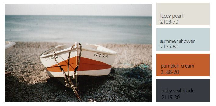
Last week we talked about a nautical color palette, but what most people would consider a more tradition palette of navy, creams, white and a little red. This week I wanted to feature a different nautical inspired palette based off this photograph of a boat and rocks and a more hazy sky. The colors I chose this week from Benjamin Moore all have a bit more red in them to compliment the orange in the palette better. Instead of a black- black the baby seal black looks different in different types of light.. sometimes it looks deep blue, others a gray black and in low light it looks more true black. It’s perfect for the changing light found by the sea. The light blue and gray lend a calmness to the palette against the bold orange and black. This is a great palette for an entire house including the kitchen. Because you have both bold colors and softer colors, if you wanted to keep some rooms lighter, like your bath for instance the lighter colors are perfect. For the kitchen you could go with a dark cabinet, gray or white counters and just use orange and pale blues in your accessories. If you like lighter cabinets then you could use a black counter and dark hardware to make a great contrast. The possibilities are endless. -Lynn Butler Beling
PS- To my father who reads the blog daily… Happy 80th Birthday!!! We love you!


