Search Results for: gold glass

November 18th, 2013 No Comments

this week’s color palette: golden yellows & green -perfect for thanksgiving

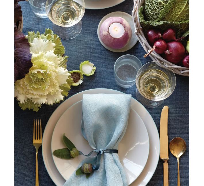
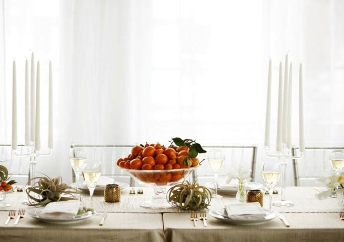
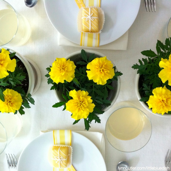
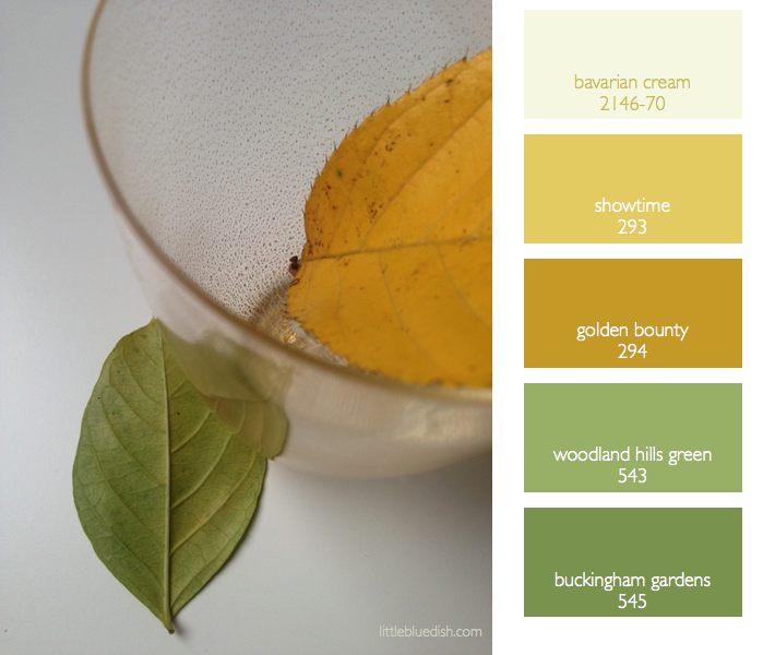
As the leaves fall and everyone is preparing for Thanksgiving there’s a transition in color palettes going on for the holidays. Most think of rust colors and oranges for October and Halloween. So a great transitional color palette for these weeks leading up to thanksgiving is a golden yellow and green. Fresh greens, herbs, wreaths can all adorn your home for Thanksgiving without looking like Christmas yet. Small punches of yellow or gold, with your glassware, a velvet ribbon tied around napkins etc. can elegantly adorn a November table setting or decor. The gold glasses I carry at the … Read more

August 20th, 2013 No Comments

summer table settings made up of bountiful vegetables (and where those glasses should actually be placed)

This table setting caught my eye. As I noted yesterday golds are still making a showing for tabletop items, from candles to candle sticks to flatware. It’s slowly been folded into the trend market for the past 5 years and it’s still holding tight. But let’s talk about summer vegetables for centerpieces, votives and even salt cellars. How creative this is to use lettuce as individual salt and pepper cellars- and a radish hollowed out for a votive holder. These are clever ideas and using vegetables as your centerpiece in late summer certainly can be elegant and seasonal. Using a … Read more

December 11th, 2013 No Comments

fruit can take the place of flowers for your centerpieces

Compotes or bowls of fruit can be beautiful centerpieces. Forgo the costly floral arrangement and pick up a fruit that coincides with the color palette of your wedding or celebration. Clementines, oranges and kumquats (which symbolize good luck in Asia) are a perfect choice this time of year. Above clementines and kumquats are paired with succulents for a chic table setting. Mixing gold, silver and glass as neutral elements allow the orange to pop. Having a lot of guests for the holidays? Rental companies don’t just do weddings and really large events, consider contacting your local rental company about chairs, … Read more

September 23rd, 2013 No Comments

this week’s color palette: muted fruits & foliage colors for casual outdoor entertaining

It’s officially fall. But while it’s still warm why not continue to entertain friends and family outside. Creating a casual afternoon of cocktails and bite sized food doesn’t have to be as daunting as you might think. I’ll be sharing my tips all week for casual entertaining so I hope you’ll follow along today through Friday. Pictured above is this week’s color palette which I introduce each Monday and my paint chip picks from Benjamin Moore.  Colors chips from top to bottom: Pearly Gates 190, Pearl Harbor 2165-50, Golden Gate 033, Palace Pear cw-650 and Sweet Pear 389.  It’s a … Read more

April 22nd, 2013 No Comments

trick of the trade: use multiples and repetition with centerpieces for a dramatic presentation (along with a tight color palette… of course)

I almost forgot that I used this week’s palette a number of years ago in collaboration with Antony Todd, so I thought I’d share it with you today. We worked on a story together for Martha Stewart Weddings, transforming the giant open space in the middle of the Starrett-Lehigh offices which was photographed by the very talented Victor Schrager and art directed by visionary Ellen Burnie. When planning a party, celebration or even a wedding it’s always best to start with a color palette. Then as you begin to decide on your decor an easy trick of the trade for … Read more

April 4th, 2013 No Comments

gray and yellow color palette inspiration

Gray rooms, kitchens and even a studio space like we saw Monday have been very popular of late. Adding pops of yellow in accessories and flowers brings the gray to life. Here are a few inspirational rooms and tabletops using a gray and yellow color palette. (Image above from Crate and Barrel)  Notice how even natural materials like a concrete tabletop, the aluminum on the chairs and even gravel can be the gray in your color palette. Soft touches of gray like the painted woven pattern on the celing bring in small amounts of gray and add visual interest. Even … Read more

January 15th, 2013 No Comments

tabletop: mix old & new, metallics with black & white to create a very personalized setting

Pull out your favorite things from your cabinets….maybe even your grandmother’s china that’s been boxed in the attic to create an eclectic mix of old and new. Look around your house too, maybe you have a collection of small boxes, a gold leaf plate on your nightstand that holds your earrings- pull it all together to group on your table or sideboard. That little dish could now hold candy or sugar cubes, boxes could hold tea bags.. and so on. Black and white are so classic that the color palette is a great cohesive glue to allow you to combine … Read more

January 11th, 2013 No Comments

6 emerging trends in kitchen design

Most of the past decade has been filled with images of minimal kitchens with sleek white cabinets, granite counter tops and stainless steel appliances, but over the past several years new trends are slowly emerging into the market of kitchen design. Phrases like “having a soul”, “radiating warmth”, “textural”, “decorative diversity”, and “casual and lived in” may give you a preview of what’s on the horizon.  Here are six emerging trends I’ve pulled out for you. 1. Personalization. Consumers seem to finally want to add a bit of their own personality into their kitchen design and forgo the cookie cutter … Read more

June 5th, 2012 No Comments

tabletop: whites, creams & metallics

Since summer is upon us, using coral and starfish for a centerpiece seems appropriate and so pretty in a white, cream and metallic color palette. I love using natural objects like the coral vs. flowers sometimes because I can set the table in advance and not have to worry about the centerpiece wilting or dying too early before my guests arrive. This coral piece and starfish I had as accents around my home and I just moved them to the table for a quick and easy centerpiece. Calligraphed place cards and a menu card, always make a table setting elegant … Read more

May 8th, 2012 No Comments

an easy table setting idea for mother’s day

Yesterday I talked about simple table settings for Mother’s Day using monochromatic flowers and baked goods. Here’s a very easy centerpiece and table setting that will be sure to make mom smile and she’ll have flowers to take home and enjoy or plant outside. I started with a simple white tablecloth and white china so the yellow accents would pop. I picked up small white flower pots and yellow marigolds at my local nursery (pots about $6 each) and lined them down the center of the table.  I wrapped striped yellow and white ribbon from Hyman Hendler around the plate … Read more