Search Results for: dark gray

October 21st, 2013 No Comments

this week’s color palette: shades of gray and a pop of orange

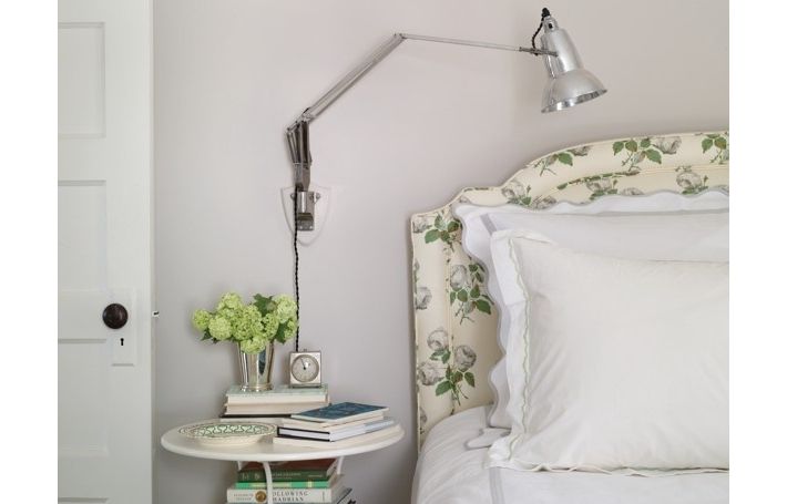
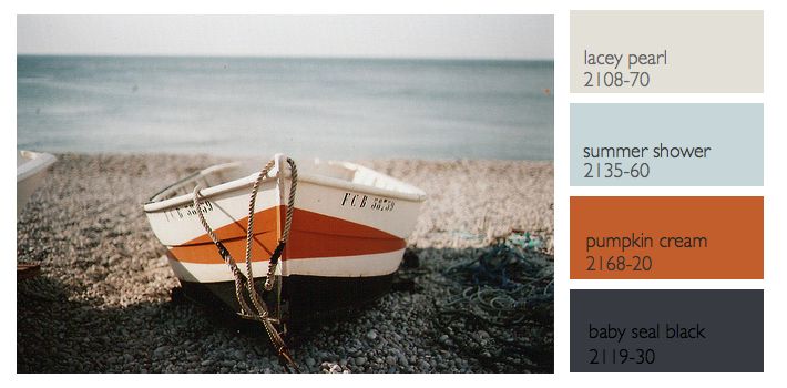
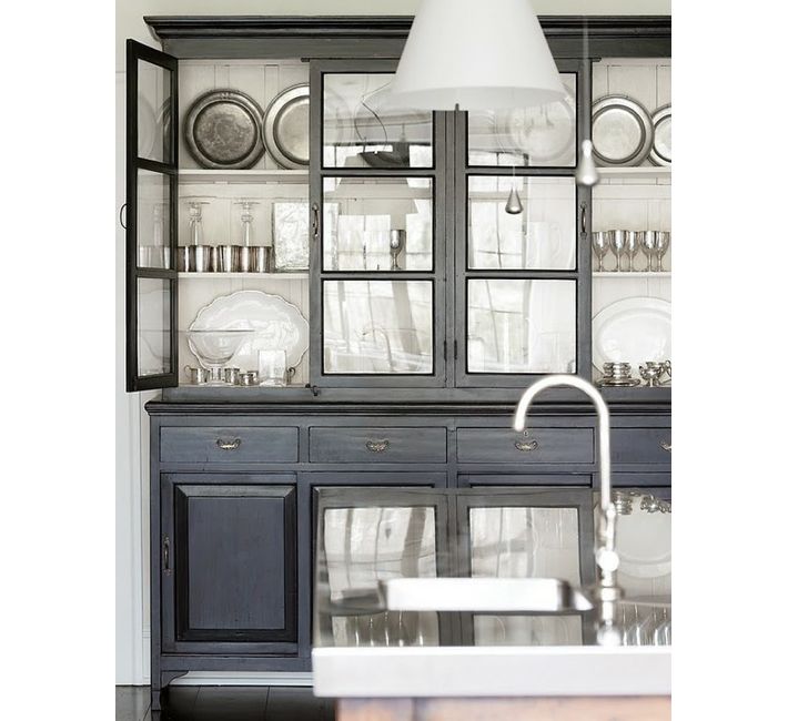
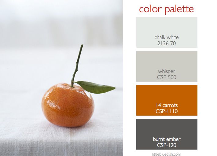
We’re bombarded with images of orange during the months of October and November but a sophisticated color palette to pair with orange is shades of gray. Using gray as your neutral and limiting the pop of color to your accessories, you can easily change accessories seasonally if you are a bit scared you’ll grow tired of orange.  Gray really goes with most any color- pops of red for the holidays, white or pink for winter, yellow or green for spring. The easiest way to change the look of your room is to change out pillows and throws. A neutral doesn’t … Read more

October 10th, 2013 No Comments

create a neutral color palette with gray & green

When people think of neutrals most automatically think of tans and creams, but gray and green can be a nice alternative. Whether it’s light or dark gray, both shades are still very neutral. Green solids or patterned fabrics add dimension and texture like this upholstered headboard in Elizabeth Mayhew’s bedroom above or these solid green drapes in a dining room pictured below. Blending in cream or white balance the overall palette. This is an easy palette to work with in kitchens too since many appliances, finishes and flooring are all in the gray family.  And don’t forget your front door. … Read more

June 24th, 2013 No Comments

this week’s color palette: sea blue, gray and a nautical black-gray and orange

Last week we talked about a nautical color palette, but what most people would consider a more tradition palette of navy, creams, white and a little red. This week I wanted to feature a different nautical inspired palette based off this photograph of a boat and rocks and a more hazy sky. The colors I chose this week from Benjamin Moore all have a bit more red in them to compliment the orange in the palette better. Instead of a black- black the baby seal black looks different in different types of light.. sometimes it looks deep blue, others … Read more

August 22nd, 2013 No Comments

selecting colors for kitchen cabinetry & islands, my tips for a cohesive design

I’ve been working for several months now on a custom home for a client.  From the beginning it was decided to keep the kitchen light and bright with white cabinets and a marble countertop. But my suggestion has been to have the large island be a dark gray/blue color (similar to the color pictured above) as a beautiful contrast to the white. The overall house color palette will be soft shades of white, gray and pale blue. So this week we are selecting the color for the island. We also are having a custom wet bar designed and need to … Read more

July 27th, 2012 No Comments

free shipping all summer on my shop!

Here are some of my picks for blues, grays and lavenders from my shop. Enjoy Free Shipping all summer long! Visit www.theproductgallery.com or connect right through the blog by clicking the arrow flag in the upper right corner or on my ad to the right for The Product Gallery. No codes are needed to receive Free Shipping. Jars Feathered Soup Plate, $40 each, Blue Felt Placemat, $22 each, Pair of Linen Oven Mitts in Cafe Noir, $48, Linen Napkins, in dark gray, $22 each, Celebration Candles, $16 per box of 12, Blue Gift Card & Envelope, … Read more

June 25th, 2012 No Comments

color palette: sea blues

This is one of my favorite prints by John Dolan. It hangs in my entranceway and it makes me so happy all year, especially during the winter months. Believe it or not this photo was not taken in the Caribbean- which is where I think of when the phrase ‘sea blues’ is uttered. It was taken at a lake in Ireland, where coincidentally, generations back my father’s family lived. I love that the sea has so many shades of blues in the warm months and moves into grays when the clouds become overcast in the colder months. For the … Read more

March 10th, 2014 No Comments

this week’s color palette: blues, rust and buff

As winter starts to fade away and we’re seeing small signs of spring we were inspired by this image and a color palette fitting of a crisp climate. I personally love working with the 2129 family of paints from Benjamin Moore. Soot and Blue Note (2129-30) are a few of my favorite deep dark blues to use, for doors, dining rooms and media rooms. If you want a happy, feminine dressing room, girls room or sitting room the light peach shades are wonderful especially in a light drenched room. When we were looking at this palette, my team and I … Read more

February 13th, 2014 No Comments

neutral tiles in your bath don’t have to be boring and they won’t break your budget

I think so many of us fear that we can’t renovate a room in our home, like the bathroom, the way we want without breaking the bank. But as far as tiles go, subway tiles and neutral porcelain and glass tiles in soft shades of neutrals can go a long way and they are very inexpensive. Here are a few tips to get the biggest bang for your buck. Choose an accent wall, a small pattern in the floor or just as a backsplash behind your sink for the more costly tile. Tiles come in lots of sizes, not just … Read more

February 10th, 2014 No Comments

this week’s color palette: pale neutrals

I was working with a client this weekend, beginning to discuss the color palette for the interior of his new beach home. We decided on this pale neutral palette to start and as we go on we can interject some deeper colors or soft blues but this was a great jumping off point. He wanted to go a bit more gray than brown. Above are the Benjamin Moore paint colors I selected for him as an overall base palette.  When you are faced with deciding on colors for an entire house it’s always good to pull out photo tears from … Read more

January 10th, 2014 No Comments

quick tips for freshening up your home

Feel like making a fresh start in the new year? Here are some quick changes you can do to freshen up your home. Above, Invest in crisp white sheets for your bed, then layer in soft neutrals like grays or creams with your blankets and throw pillows. I have some beautiful Belgium linen duvet covers, pillow cases and blankets on my shop. If your bedroom feels too dark, try a fresh coat of Benjamin Moore’s China White for the walls- it’s a great neutral white with a bit of gray in it. Below, something as simple as treating yourself … Read more