Since we started off the week yesterday with an image from one of my favorite floral books (Bringing Nature Home) I thought I’d continue the week with my favorite books for inspiration. I’ve always been a fan of Carolyne Roehm and I often go to her book “At Home with Carolyne Roehm” for seasonal table setting and decorating inspiration. Although my tables are usually a bit more minimal I love her over the top parties and gorgeous setting of her home. It reminds me a lot of the Ralph Lauren aesthetic. What is so nice about this book is … Read more
Archive for the ‘Blues’ Category
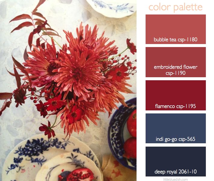
this week’s color palette: rusty reds & royal blues
One of my favorite floral inspiration books is called Bringing Nature Home. Photographed by the amazing Ngoc Minh Ngo, whom I’ve had the pleasure to work with several times on projects, and floral arrangements by Nicolette Owen. Broken up into the four seasons it not only has breathtaking florals with sometimes unexpected pairings but it has beautiful calming interior shots. This is an amazing book to give as a gift or just to treat yourself. – Lynn Butler Beling As we do every Monday we have selected Benjamin Moore paint colors which are listed on the color … Read more
weddings: this week’s palette is a perfect marriage of color
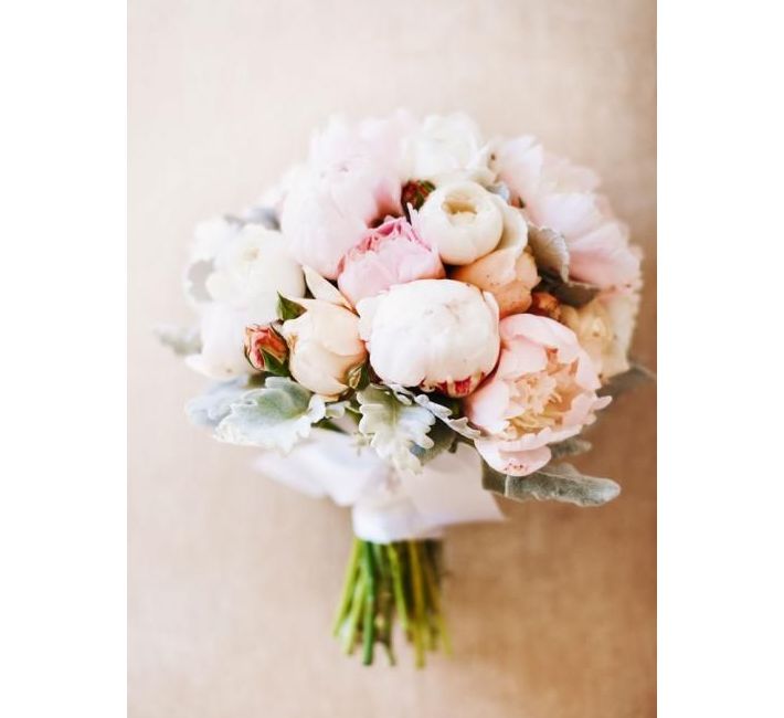
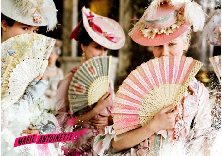
This week’s color palette of creams, a peachy pink, blues with a touch of green is really a perfect wedding color palette. From bridesmaids’ dresses to flowers to table settings this palette is sure to please both the bride and groom and create a fantastical celebration. You can see from our post yesterday about the film Marie Antoinette how it can come together whether your wedding is indoors or outside in a beautiful garden. Accents of gold and even a deeper pink complete the palette. As my advice has always been for any couple, choose a color palette that you … Read more
sofia coppola’s marie antoinette carries a gorgeous color palette throughout the film
Sofia Coppola’s film, Marie Antoinette (2006) was overall a gorgeous movie, with actress Kirsten Dunst playing Marie Antoinette. And like a beautiful editorial spread, or a gorgeous home- when you dissect it a bit you realize a color palette was chosen at the beginning of the production and carried throughout. Everything from the stunning gowns to the furnishings to the flowers followed a color story and the result is magical and beautiful. If you have never seen this movie I’d highly recommend watching it. Sofia Coppola weaves modern day nuances and music into the historical movie to make it more … Read more
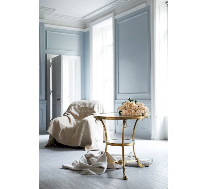
this week’s color palette: cream, peach, blues.. with a dab of green and gold
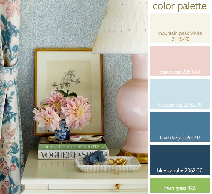
I’ve had this inspirational color palette on my pinterest page for awhile now and I just keep coming back to it. I love the layering of color and pattern of creams, a peachy pink and shades of blue. To me as a stylist that pop of green in the book is a great reminder… a reminder that a little pop of bright color in an otherwise very tight color palette is that layer that makes this a very interesting palette rather than a quiet, pretty palette. All colors listed above are Benjamin Moore Paints. Gold and brass… over the … Read more
selecting colors for kitchen cabinetry & islands, my tips for a cohesive design
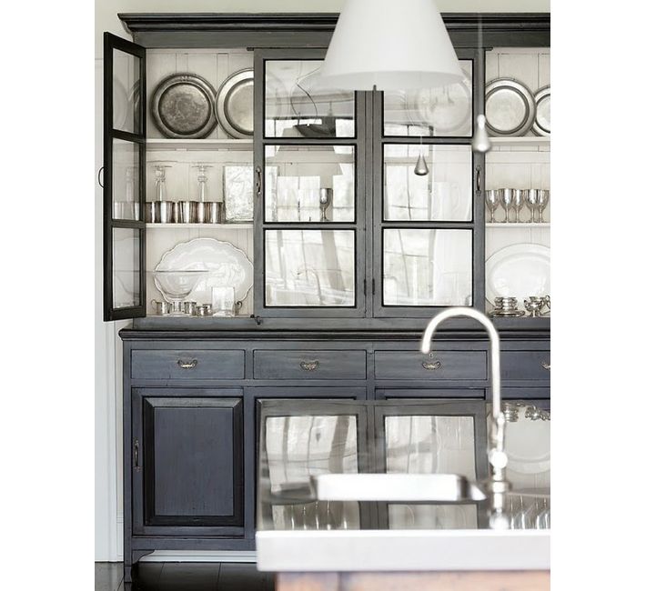
I’ve been working for several months now on a custom home for a client. From the beginning it was decided to keep the kitchen light and bright with white cabinets and a marble countertop. But my suggestion has been to have the large island be a dark gray/blue color (similar to the color pictured above) as a beautiful contrast to the white. The overall house color palette will be soft shades of white, gray and pale blue. So this week we are selecting the color for the island. We also are having a custom wet bar designed and need to … Read more
weddings: marrying your style to your location- here are our tips for a happy union
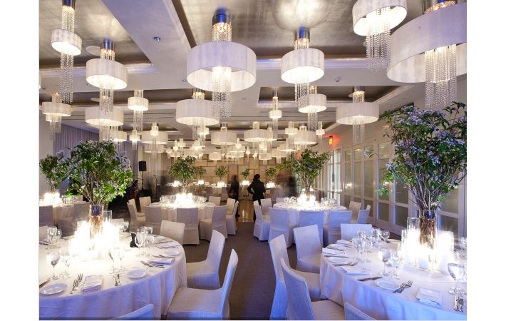
Sometimes trying to decide on the decor of a location for a celebration can be very tricky. The obvious is have the decor mirror the design aesthetic of the building but the location might not represent your style 100%. Here is an great example of a modern location but with natural branches as centerpieces- the opposite of what you might expect. By keeping the centerpieces all the same and all the table decor in a neutral color palette the execution is more modern in feel but the organic silhouette of the branches softens the modernity of the space. Simple hurricanes … Read more
summer table settings made up of bountiful vegetables (and where those glasses should actually be placed)
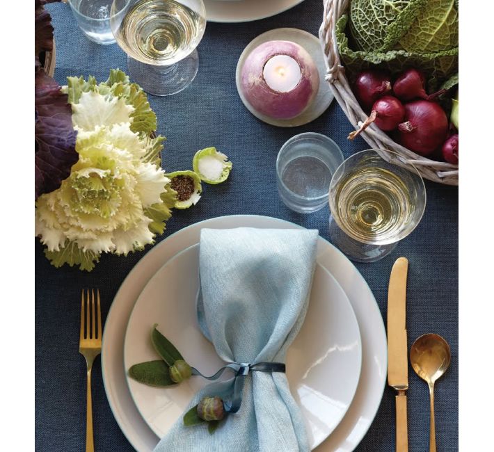
This table setting caught my eye. As I noted yesterday golds are still making a showing for tabletop items, from candles to candle sticks to flatware. It’s slowly been folded into the trend market for the past 5 years and it’s still holding tight. But let’s talk about summer vegetables for centerpieces, votives and even salt cellars. How creative this is to use lettuce as individual salt and pepper cellars- and a radish hollowed out for a votive holder. These are clever ideas and using vegetables as your centerpiece in late summer certainly can be elegant and seasonal. Using a … Read more