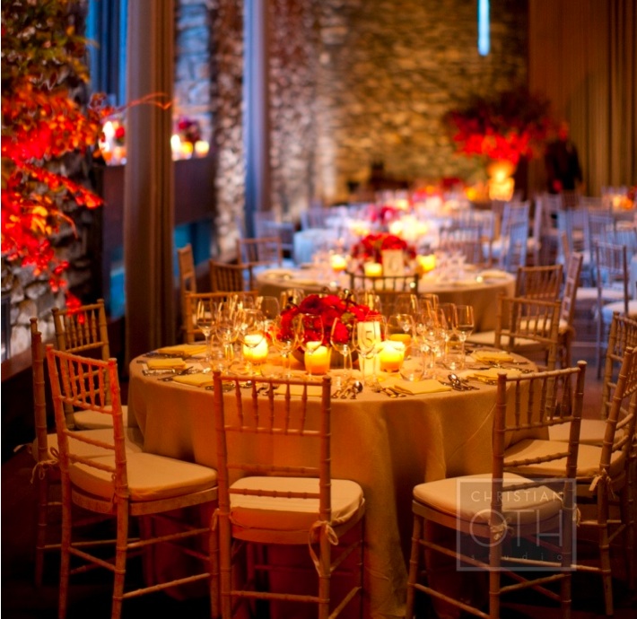
“Red is often a color we all shy away from or we completely embrace. There isn’t much compromise when it comes to this vibrant color. I love red tones but don’t always enjoy going the typical route of pairing red with other jewel tones. A great way to bring a welcoming, friendlier edge to this intense color is to pair it with softer, lighter tones and accents as I did here. Instead of a deep, rich table linen I chose a textured, golden wheat tone. The dinner napkins were also an elegant golden yellow tone and even the votive candles were contained in a range of these gorgeous warm neutral tones. The secret to success with this look is to really concentrate on a monochromatic mix of red in the flowers so they don’t become to heavy with contrasting tones or too busy for the table. I mixed in textural elements in very neutral, organic tones so the centerpieces connected effortlessly to the natural quality of the table linens and other accessories. Don’t be afraid to lighten things up when using red tones. Strong, vibrant color looks incredibly chic when framed by lighter fabrics, surfaces and textures.”
–Matthew Robbins, author of Inspired Weddings: Designing Your Big Day with Favorite Objects & Family Treasures, event designer and contributor to Martha Stewart Weddings magazine and The Huffington Post


