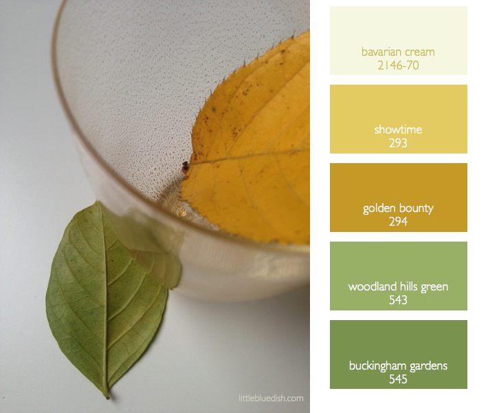
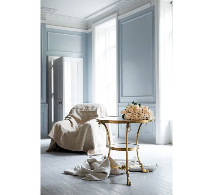
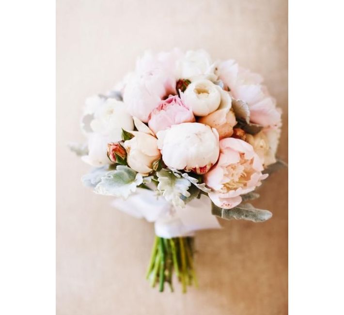
This week’s color palette is based on periwinkle blue and natural golden wood or grass tones. Hawthorn green by Benjamin Moore has a mix of brown and yellow and green, like fall grasses might appear. They all work wonderfully together as a palette. We’re seeing periwinkle pop into spring palettes and we love revisiting this color. This palette could work for just about any room in your home as it’s both restful and classic.