Posts Tagged ‘paint’

December 27th, 2012

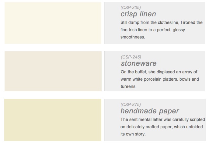
6 of my favorite new neutral paints from benjamin moore’s color stories line

As much as we talk about color and what the new ‘it’ color trend will be this year, I started talking about whites and creams at the beginning of the week to close the year.  Neutrals are a great backdrop for these pops of color that all the shelter magazines endorse and realistically what most homes are painted. Not many people venture out to paint a room a bold red, or a cobalt blue or a sunflower yellow I have found during my work. Most people ask for a calming, perfect neutral color. And really, if you plan to sell … Read more

November 23rd, 2012 No Comments

Bright Holiday! jewel tones for gifts or home

Whether you are searching for bright jewel tones to wear or for your home, Ralph Lauren has some bright ideas for your holiday shopping. The Canvas Ricky Tote, $995 for her or the Suede O Ring Belt,$295 for him are great gift ideas. Want to brighten a bedroom or paint a focus wall a jewel tone this winter? Try Ralph Lauren Paints. Below are a few suggestions from his Lifestyle Colors Collections.

October 11th, 2012 No Comments

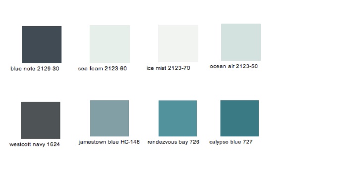
beach house color palette

Throughout the beach house I used Benjamin Moore’s, Blue Note, Westcott Navy, Seafoam, Ice Mist, Ocean Air, Gossamer Blue, Jamestown Blue, Rendezvous Bay and Calypso Blue. The formal dining/living/family room is painted in blue note- it’s warm and cozy and the black flat screen tv disappears against it. You almost feel like you are in a movie theatre. The casual breakfast room is painted in decorator’s white but the painter dropped about 2 drops of blue note into the white to make a beautiful blue gray. The hallways are painted in sea foam. The kitchen and … Read more

September 20th, 2012 No Comments

the st. regis hotel inspires us to decorate with “tiffany blue”

Last year the Tiffany Suite at the St. Regis Hotel in New York City was redesigned. It’s a 1,700 square foot suite on the 14th floor overlooking Fifth Avenue and Central Park.  The St. Regis was originally built in 1904 by John Jacob Astor and both the St. Regis and the Tiffany & Co. buildings are landmark buildings on Fifth Avenue. The suite has jewel inspired references and uses the ‘Tiffany Blue’ color as an accent color throughout. Above is a photo of the dining room and the team at Benjamin Moore especially selected these three colors for … Read more

September 13th, 2012 No Comments

interiors: purple haze

Designer David Kaihoi’s apartment which was featured in House Beautiful has creative ideas for small spaces. Here you can see using color can still be done in a small space. He used Benjamin Moore‘s “Purple Haze” on the walls and for the floor he painted a pattern to look like a rug with “Hale Navy”. His deep color corner banquette also makes the most use of his small space, and he had storage built-in underneath. To see more of the apartment click here for the slideshow. Ngoc Minh Ngo photographed the story (don’t forget- I mentioned Ngoc has … Read more

September 6th, 2012 No Comments

interiors: statement pieces & painted accents in honey gold

Upholstered chairs or sofas in a honey gold fabric (especially a cotton velvet) is a gorgeous way to bring in this color palette to your living spaces. This sofa pictured at Hostler Burrows is a great example. (Hostler Burrows is in the process of moving to their new location at 51 E. 10th Street in New York City. But you can find their collection of mostly twentieth century Scandinavian design pieces on 1stdibs.com.) “Bee” color paint, from Sherwin-Williams is another way to bring this color into your space- perfect for moldings, doors or for painting furniture …like say a … Read more

August 30th, 2012 No Comments

interiors: pops of color

To bring in pops of color here’s what talented photographer, Amy Neusinger did in her Laurel Canyon home. Amy painted her walls blue and beams red while keeping bedding, window treatments and floors more neutral. Try Ralph Lauren’s “Dressage Red” or Sherwin-Williams “Gulfstream” for floors, moldings, doors or details. Of note: We covered Amy’s wedding in Martha Stewart Weddings and we worked with Amy a lot on photo shoots while I was at Martha Stewart Living. Amy hosted us for dinner in her California home before it was renovated. She and her husband were excited talking about what … Read more

August 23rd, 2012 No Comments

Fall forecast: is eggplant the new black in color trends?

If you are looking for a perfect shade to paint your dining room, media room or library so it feels cozy and sexy here are a couple shades you might want to try…Farrow&Ball’s Brinjal #222 and Benjamin Moore’s Caponata #AF-650. That’s what I’m seeing for fall. In fact Pantone color experts forecast a deep, darkened red similar to eggplant for men’s fashion #19-1652 and a ‘sea fog’ #16-3304 (a soft lavender/blue for ties and shirting) and for women they forecast a more quieting shade of purple called ‘rhapsody’ #16-3817, like the 5th color down on our color palette this week, … Read more

August 16th, 2012 No Comments

Succulent inspired paint colors

Here are some suggested paint colors from Benjamin Moore pulled from our inspirational succulent color palette this week. Deep Teals look fantastic in dining rooms and studies. Faded green-grays you find in succulents are wonderful for kitchen cabinet colors, living spaces that have a lot of sunlight or restful bedrooms. Blue-greens also work well in living spaces, bedrooms and especially baths.

July 26th, 2012 No Comments

interiors: consider your view from room to room when selecting paint colors

I have to apologize for this photo – it’s a magazine page I had pulled from Martha Stewart Living and posted on my inspiration board (yes the old fashioned way vs. Pinterest) and it’s showing all the wrinkles of wear. But it perfectly fits our color palette this week of yellows, blues and lavenders- so I decided- what the heck- I’ll post it (even though I’m still cringing as I look at the condition) Anyway…. It’s always a good idea to think about your view from room to room when selecting paint colors. There’s really no right or wrong if … Read more