Posts Tagged ‘color palette’

March 18th, 2013 No Comments

this week’s color palette: citrus- orange, lemon & lime…with gray

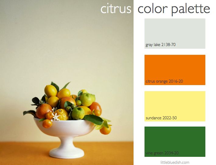
This week’s color palette was inspired by a story I styled for Martha Stewart Weddings about citrus. Photographer Sang An shot this beautiful image. We used a slightly pale gray background to allow the bright colors to pop. Which just as in a room, a neutral color is always a good base to allow bright colors to shine. These Benjamin Moore paint color selections are very true to the vibrant citrus. I chose Gray Lake because it has a slight green tint to it and works within this color family. I’ll keep sharing the citrus story I styled this … Read more

March 11th, 2013 No Comments

this week’s color palette: mint & basil greens

If you’ve been reading my blog you might know I love the Donna Hay cookbooks. Her book Flavors might be one of my favorites. It takes you through classic flavors and devotes an entire chapter for each one, like vanilla, salt & pepper, chocolate…and this week’s inspiration- mint & basil. She has so many creative recipes for these flavors, I highly recommend her books. The photography by Australian photographer Petrina Tinslay is gorgeous and the recipes are simple and clear. As I do weekly I select Benjamin Moore paint colors to coincide with our inspirational photo & color … Read more

March 4th, 2013 No Comments

this week’s color palette inspired by a bacon & zucchini tart

I am loving this site that I found called Daisy’s World (.net). Bacon has become so popular in foods over the past couple years and this is a traditional pairing of flavors. Daisy’s site is clean and clear in design and the photographs are really beautiful that accompany the recipes. She has several bacon recipes… her bacon macaroni looks delicious too!  Visit Daisy’s site for all original recipes and content, but I’ve shared the bacon and zucchini tart recipe here to save you time.  Let me know if you try it! -Lynn (Note: as usual I’ve selected the names of Read more

February 25th, 2013 No Comments

this week’s color palette: neutrals & blues/ personalizing with monograms, today a monogrammed mortgage button

This week we’ll explore the ways to personalize your home & celebrations with monograms. Today I thought I’d share with you something I did in my own home when we renovated. We needed to add a new staircase (since years ago the interior staircase had been removed to make two separate apartments) and while on a frequent trip to Nantucket I came upon these “mortgage buttons” made of ivory in the Nina Hellman antiques store. I had just read about these and was ecstatic to have found them! The legend is when a mortgage was paid off there was … Read more

February 18th, 2013 No Comments

this week’s color palette: rosy pink, yellow & peach, inspired by spring fashion

The editorial in Town & Country has been so beautiful lately. I love this color palette for spring that I saw in their March issue.  It’s from within a fashion story called “Artist In Residence” which was shot at Frank Lloyd Wright’s Taliesin West in the Arizona desert by Bettina Lewin. Of course the setting is amazing, but I like the unexpected colors together and as you go on in the story- I love seeing burgundy wine for spring and black and white (which we saw a lot of at the Golden Globes) which is also a great neutral … Read more

February 4th, 2013 No Comments

this week’s color palette: candy heart hues

I thought it would be fun to talk about the colors of candy hearts this week, since we talked about Valentine red and pink all last week. The pastel palette of the candy hearts is showing up everywhere with spring right around the corner. Uniqlo, a Japanese clothing retailer that has stores in the US and a shop online has all of these colors for men, women and children. If you haven’t heard of them before, I hope you’ll check them out- we’re big fans of Uniqlo. Cashmere blend scarves are on sale for under $10, cashmere sweaters for … Read more

January 28th, 2013 No Comments

this week’s color palette: reds & pinks

Since Valentine’s Day is coming up fast, I thought we’d talk about reds and pinks this week. These silk flowers in the photo are actually pins from Dulken and Derrick. They are great to wear on a lapel to add a bit of color. For interiors, even though I pulled out these Benjamin Moore paint colors- it doesn’t mean you have to paint your walls these colors. I personally like reds and pinks in splashes of color in accessories.  The softer pinks are wonderful for walls, but the bold colors can be great to paint end tables, chairs etc. to … Read more

January 7th, 2013 No Comments

color palette: blues, grays, off-white & bleached wood

This is by far one of my favorite color palettes. This bedroom is very similar to my own personal bedroom, though I have a bleached wood wall behind my velvet blue tufted headboard. Chalky white walls and bleached wood provide a beautiful neutral backdrop to so many palettes, but I love the shades of blues and grays with this one. I’ve selected some paint colors from Benjamin Moore to help recreate this look if you desire, or just to inspire. A painted bedside table in a soft gray also breaks up all the wood and adds a layer to … Read more

December 24th, 2012 No Comments

color palette: shades of whites and creams

As most of us are on holiday, it allows a little extra time for baking and cooking for family and friends. One of my favorite books is Donna Hay’s Flavors. The chapters are broken up into vanilla, lemon + lime, ginger, chilli, garlic + onion, chocolate, salt + pepper, basil + mint, and cinnamon + spice. Each chapter gives you the ‘basics’, quick good ideas and simple recipes. Pictured above from the book are her vanilla meringues. Here is the recipe in case you’d like to try them. An all-white New Year’s Eve party can be very chic. These … Read more

December 17th, 2012 No Comments

this week’s color palette: emerald green

Pantone recently released the 2013 Color of the Year- Emerald Green. Green is supposed to symbolize renewal, balance and calm- something I think we are all hoping for this next year. What do you think of their color choice?  I’d love to hear! Leave me a comment. For me personally we are planning a family trip to Ireland this year, so maybe this is a good omen.  I kissed the Blarney stone (many) years ago- I think it’s time I renewed my luck. Below I’ve included the past years’ colors. I think it’s interesting to see how the colors ended … Read more