It’s officially fall. But while it’s still warm why not continue to entertain friends and family outside. Creating a casual afternoon of cocktails and bite sized food doesn’t have to be as daunting as you might think. I’ll be sharing my tips all week for casual entertaining so I hope you’ll follow along today through Friday. Pictured above is this week’s color palette which I introduce each Monday and my paint chip picks from Benjamin Moore. Colors chips from top to bottom: Pearly Gates 190, Pearl Harbor 2165-50, Golden Gate 033, Palace Pear cw-650 and Sweet Pear 389. It’s a … Read more
Search Results for: benjamin moore
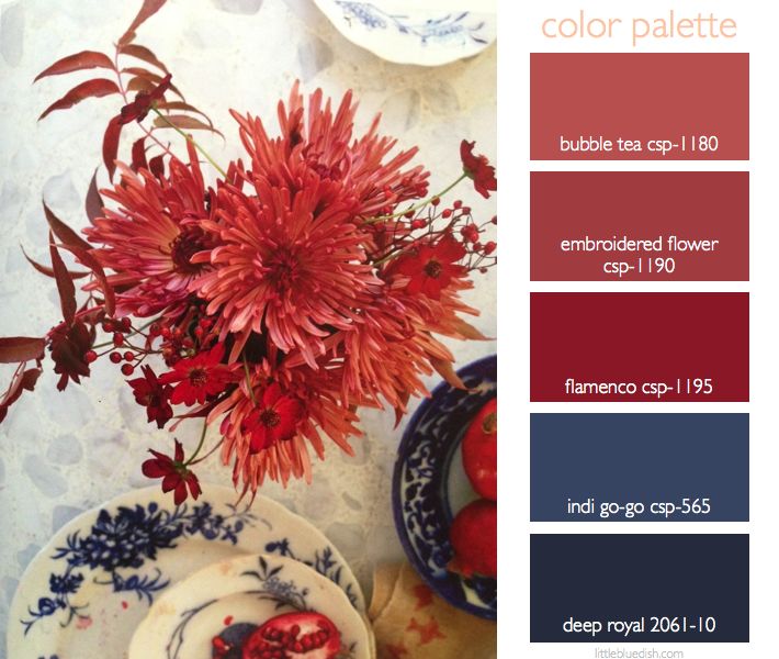
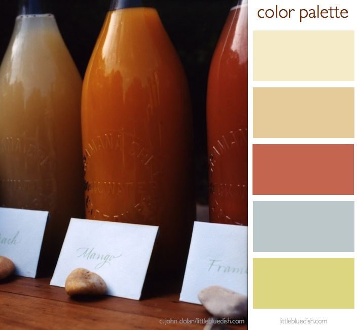
this week’s color palette: rusty reds & royal blues
One of my favorite floral inspiration books is called Bringing Nature Home. Photographed by the amazing Ngoc Minh Ngo, whom I’ve had the pleasure to work with several times on projects, and floral arrangements by Nicolette Owen. Broken up into the four seasons it not only has breathtaking florals with sometimes unexpected pairings but it has beautiful calming interior shots. This is an amazing book to give as a gift or just to treat yourself. – Lynn Butler Beling As we do every Monday we have selected Benjamin Moore paint colors which are listed on the color … Read more
this week’s color palette: fall greens and wispy pink
When we think of fall, I think we all lean towards rust colors, browns and golden hues but with summer not officially over for another week or so greens are still so fresh. Michael George Flowers has beautiful greens available this week like these white anemones (with a touch of pink), green hydrangea and ornithogalum. Green spider mums, autumn hydrangea with roses and kale (pictured below) are a few more options for a beautiful fall arrangement. Benjamin Moore paint colors for this palette are from top to bottom: Wispy Pink 2005-70, Handmade Paper CSP-875, Green Thumb CSP-870 and Chimichurri … Read more
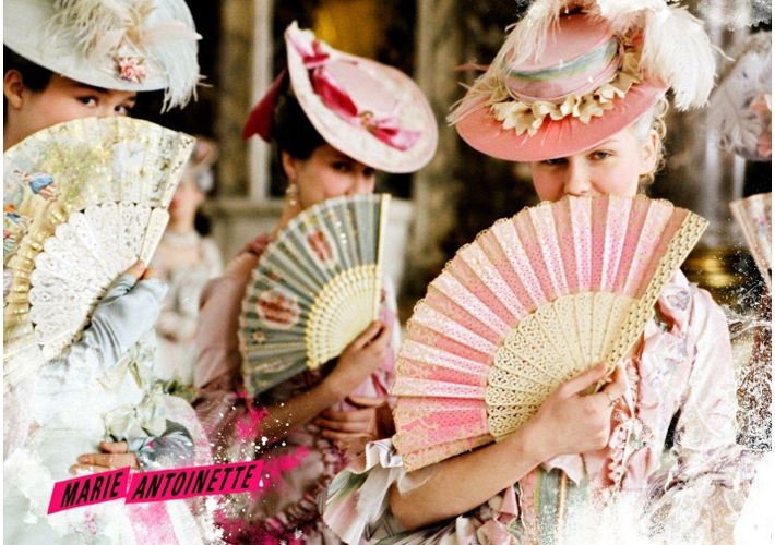
sofia coppola’s marie antoinette carries a gorgeous color palette throughout the film
Sofia Coppola’s film, Marie Antoinette (2006) was overall a gorgeous movie, with actress Kirsten Dunst playing Marie Antoinette. And like a beautiful editorial spread, or a gorgeous home- when you dissect it a bit you realize a color palette was chosen at the beginning of the production and carried throughout. Everything from the stunning gowns to the furnishings to the flowers followed a color story and the result is magical and beautiful. If you have never seen this movie I’d highly recommend watching it. Sofia Coppola weaves modern day nuances and music into the historical movie to make it more … Read more
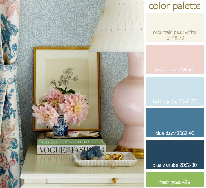
this week’s color palette: cream, peach, blues.. with a dab of green and gold
I’ve had this inspirational color palette on my pinterest page for awhile now and I just keep coming back to it. I love the layering of color and pattern of creams, a peachy pink and shades of blue. To me as a stylist that pop of green in the book is a great reminder… a reminder that a little pop of bright color in an otherwise very tight color palette is that layer that makes this a very interesting palette rather than a quiet, pretty palette. All colors listed above are Benjamin Moore Paints. Gold and brass… over the … Read more
this week’s color palette: end of summer hydrangeas
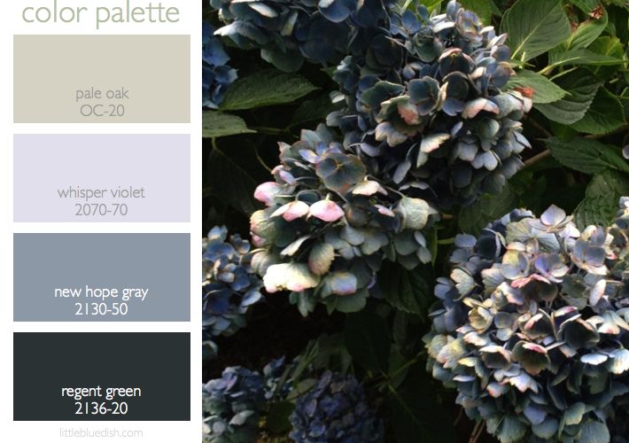
This picture does not do the color of these hydrangeas justice. A combination of deep deep greens, a pale violet-blue, gray-blues and a bit of pale browns where the sun has burnt the edges make up this amazing color palette. Against an aged cedar shingled home with deep green trim- it is absolutely beautiful. This is one that I just stood back and was amazed at the different changing colors in nature. This is a gorgeous palette to start with for the exterior of a home or an interior of a home and/or a garden. This is also a sophisticated … Read more
this week’s color palette: pastel pinks & golds
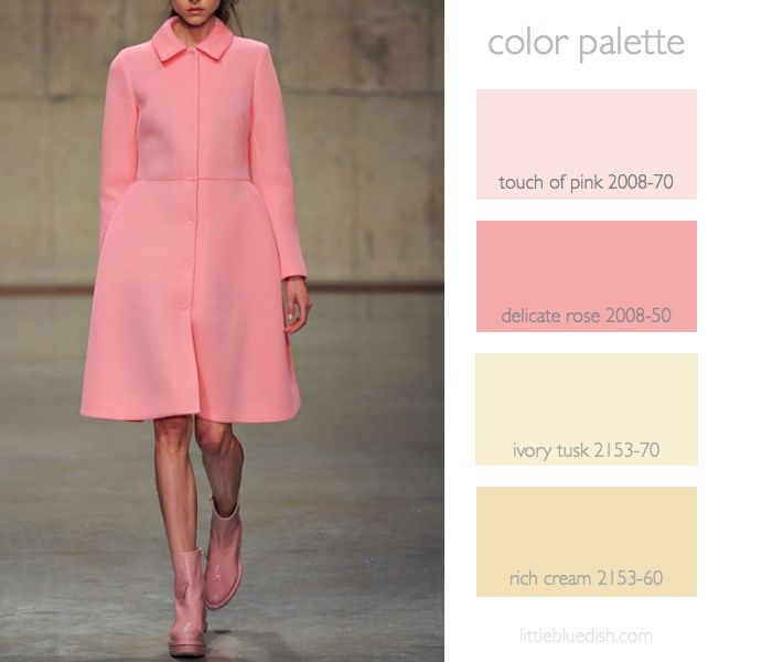
This fall’s trend in coats is pastels, like this pink coat from Rochas. Together with gold this is a great color palette for celebrations, weddings and even rooms that you’d like to feel warm. If you aren’t keen on painting your walls pink, pink can come in the way of accessories like pillows and your walls can be a color like Benjamin Moore’s Ivory Tusk. Your main pieces like a sofa, rug or headboard can be in neutrals as well. I usually like to paint trim white, Benjamin Moore’s Decorator’s white to be exact. Gold hardware or lighting really would … Read more
this week’s color palette: sandy neutrals
Creating a color palette for your home can be a bit easier if you choose something you are inspired by… like the sea, sand, a forest, even a farmer’s market. I always like to keep in mind the flow from room to room. As you are sitting in one room you will be looking into the adjacent rooms, so it’s a good idea to consider what colors are next to each other as you travel throughout your home. Pale shades of neutral colors for your walls are always a good investment and you can bring in color or keep within … Read more
this week’s color palette: pink and green
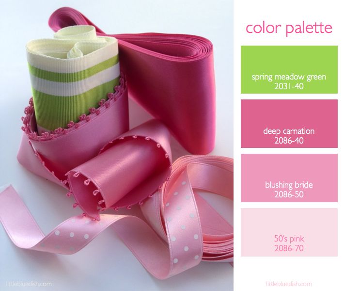
Pink and green always seems like a summertime color palette to me…or at least a color palette that wants you to feel like it’s summer all year long. Images of iconic Florida bungalows, Lily Pulitzer dresses and fresh bouquets of pink flowers immediately come to mind. What does this color palette make you think of? Here are a few pink and green floral arrangements to inspire your Monday as well as my Benjamin Moore paint picks above for this palette to guide you in any decorating or party planning you might be doing this summer. -Lynn Butler Beling Sources: Opening … Read more