Archive for the ‘Blacks’ Category

October 2nd, 2013 No Comments

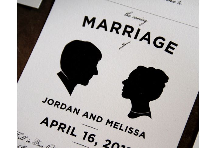
silhouettes for weddings, celebrations and family trees

The art of silhouettes is said to date back to the 1600’s when artists entertained royalty by cutting silhouettes of them in their hair pieces and fancy dress. Silhouettes became very popular in America in the late 18th century as portraits up until the invention of the photograph. Now there are only about 10-15 silhouette artists in the country. One of them I had the pleasure of meeting this past weekend, Ms. Deborah O’Connor. She cut my daughters’ profiles and I was so impressed with her detail. Having a silhouette cut for your wedding, anniversary or a special celebration … Read more

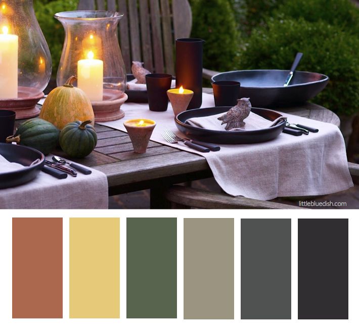
September 30th, 2013 No Comments

this week’s color palette: a fall harvest palette

The leaves are starting to change here in New York and pumpkin fields are full. This time of year I love bringing out my Black Clay Pottery, black tumblers, flatware and decorative owls. Also setting the table with Terra Cotta Hurricanes and votives on our outside patio brings that garden feeling to the tabletop and act as a centerpiece.  I like selecting muted color pumpkins for the table instead of the bright orange (which I usually save for pumpkin carving). Natural color linen table runners keep the table soft against the dark plates … Read more

August 13th, 2013 No Comments

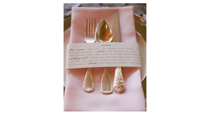
create a menu card from your own computer

I love this idea -originally by Project Wedding (I believe). Simply center your text, make the word “menu” a larger size and even play with different fonts to highlight courses. Copy as many that can fit on your standard printer paper and print! Then cut into strips and place the paper menu cards around your napkins and utensils, securing the backs with double stick tape. How easy is that? On a Mac computer, try downloading the apps “keynote” or “pages” to allow you to choose different colors for your fonts. This is a great detail that elevates a table setting … Read more

July 26th, 2013 No Comments

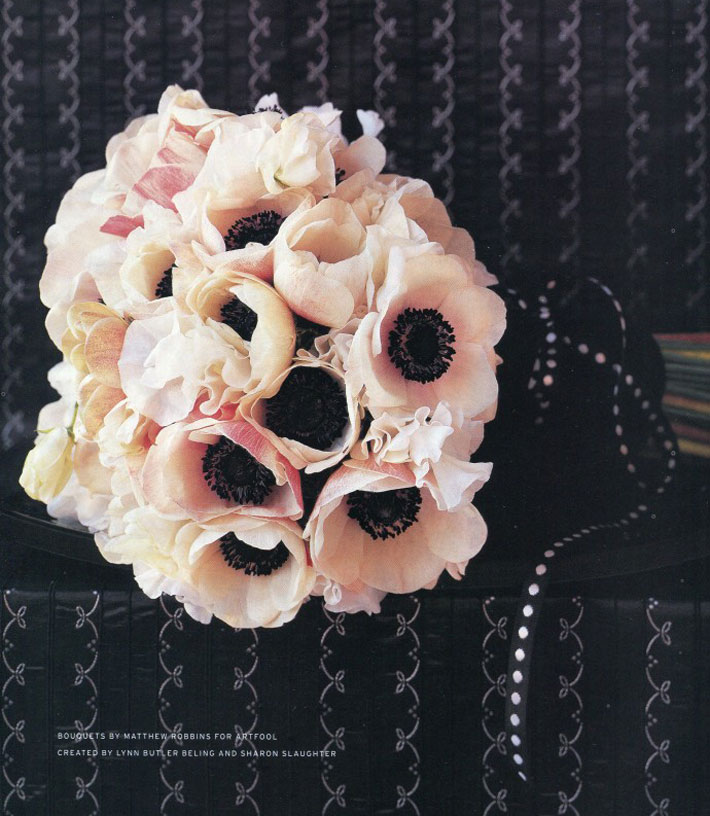
anemone bouquet

It is a nice idea to incorporate the same flower (or flowers) in your bouquet into the design of your cake or vise versa. This anemone bouquet I styled for Martha Stewart Weddings would make a wonderful compliment to the anemone cakes I posted. (Bouquet flowers by Matthew Robbins) Lynn’s TIP: having a color palette decided on in the beginning of your wedding planning process (or any celebration for that matter) is a great place to start. This will narrow down your decision making process when you are faced with thousands of choices. Black, peach, pale pink and … Read more

July 25th, 2013 No Comments

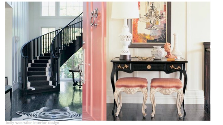
a colorful (high-gloss) painted door can make a big first impression

Designer kelly wearstler has several books that I often reference- Modern Glamour and Hue (available on amazon). I like her mix of colors and textures and her attention to detail. One of my favorite spaces designed by her is the restaurant BG at Bergdorf Goodman.  Above is an example of how she incorporates color through details at a residential home. She starts with basics and builds from there- white walls, a dark floor, select pieces of black furniture, but then layers in coral /peach upholstered stools, accessories, a gorgeous coral painted door- it all comes together effortlessly and her … Read more

July 24th, 2013 1 Comment

weddings: anemone cakes by elisa strauss of confetti cakes

(photographed by Monica Buck) I have collaborated and styled so many wedding cakes over the years and one of my favorites is a cluster of 3 little floral cakes I designed with the very talented Elisa of Confetti Cakes for InStyle Weddings. I had a craftsman make 3 black cake stands, varying in height. I was inspired by a vase and we worked from a snapshot I had taken of it. Usually you wouldn’t think of black cake stands for a wedding, but I think the light colored cakes and the anemone flowers with black centers keep it classic in style … Read more

July 23rd, 2013 No Comments

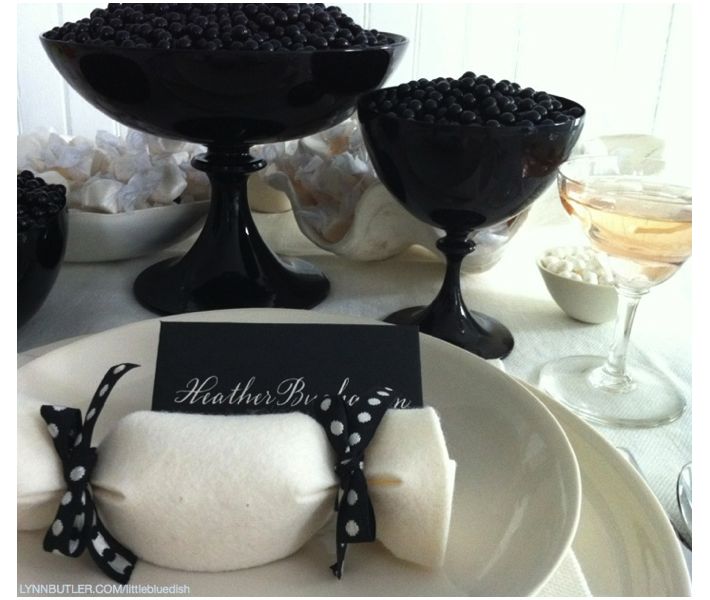
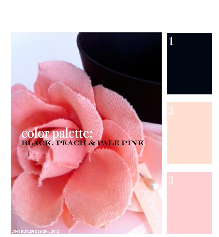
create a dramatic table setting with black, peach and pale pink

I love these black compotes and bowls that I have on my online store, little blue dish. (They are made by an Italian glass company called Nason Moretti.) I like to fill vessels with candy for quick and easy centerpieces and also fill the felt favors you see tied with black polka dot ribbon with candy as well for guests to take home. This color palette could really work for any season and any occasion- and for more formal gatherings add a calligraphed place card for each guest within the palette. I alternated black cards with cream calligraphy and … Read more

July 22nd, 2013 No Comments

let’s go back to the beginning… color palette: black, peach, pale pink

This was my first post back on April 9th, 2012 and since it was, there weren’t too many readers. It’s one of my favorite color combinations though, so I thought I’d re-post it for those of you who have now joined my blog. Thank you for your weekly support and I hope you keep coming back!  – Lynn Butler Beling I love this color palette. I keep coming back to this color combination because I think it’s both masculine and feminine. Chanel included this palette in their spring 2012 runway show. (see below) The flower in the photograph above is … Read more

June 25th, 2013 1 Comment

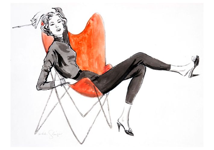
fashion illustrations on your table? yes! a daughter breathes new life into her mother’s passion in a very unexpected way

Liz Glasgow, daughter of fashion illustrator Hilda Glasgow was admiring her mother’s illustrations one day. After her mothers passing at age 91, Liz kept the illustrations all together in a white cabinet which she had moved to her Long Island home. Her mother was one of the top fashion illustrators from 1940-1970 for the likes of everyone from Vogue to Glamour to Saks Fifth Avenue. “The idea that people should enjoy Mom’s drawings again came to me out of the blue in June 2010. Her drawings had always been stored in the white cabinet in our (Manhattan) apartment. She … Read more

June 24th, 2013 No Comments

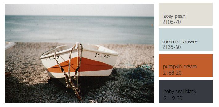
this week’s color palette: sea blue, gray and a nautical black-gray and orange

Last week we talked about a nautical color palette, but what most people would consider a more tradition palette of navy, creams, white and a little red. This week I wanted to feature a different nautical inspired palette based off this photograph of a boat and rocks and a more hazy sky. The colors I chose this week from Benjamin Moore all have a bit more red in them to compliment the orange in the palette better. Instead of a black- black the baby seal black looks different in different types of light.. sometimes it looks deep blue, others … Read more