Posts Tagged ‘Benjamin Moore’

June 10th, 2013 No Comments

kitchens & baths: a neutral color palette and brass accents create a timeless style

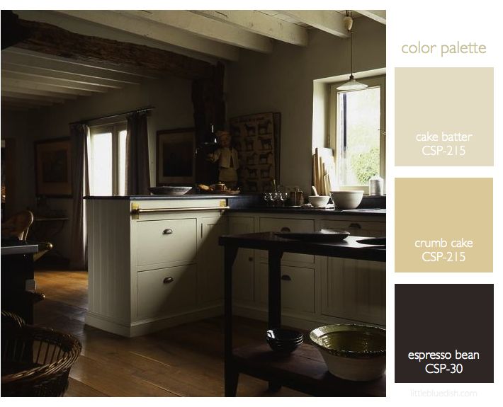
Your kitchen and your bathrooms usually get the most return when renovating your home. It’s hard to know where to start when renovating your kitchen. But if you are planning to sell your home anytime in the near future you might want to consider a classic neutral color palette for your cabinets and countertops. Above, the kitchen has dark counters, while below the bath shows a neutral cream counter, showing you how both can be classic in style.  I mentioned before in our post “6 emerging kitchen trends” that brass was becoming more popular again for kitchen hardware. Now … Read more

May 17th, 2013 No Comments

Benjamin Moore introduces a new paint line: The Williamsburg Color Collection

Exciting news for paint and design enthusiasts. Benjamin Moore and The Colonial Williamsburg Foundation have collaborated on a new collection of paints, featuring 144 colors that were actual hues from the 18th and 19th century called The Williamsburg Color Collection. Together they researched historic paint production methods and relied on 90 years of paint research that has been done to recreate colors that appeared more than 250 years ago. Sales of the Williamsburg products support the preservation, research and educational programs of The Colonial Williamsburg Foundation, the not-for-profit center for history and citizenship. This foundation was responsible for the restoration … Read more

May 13th, 2013 No Comments

this week’s color palette: blueberry blues

Blue is my favorite color, so I love experimenting with blues. I think I mentioned my whole beach house is in shades of blues, whites and gray, with my dining room and TV room painted in Benjamin Moore’s blue note 2129-30, which you can see in my kitchen palette post. Shades of blue from room to room or dark blues used for doors or molding trim can be very striking. Consider outdoor furniture in blue too, it can look crisp and clean with white or a shade of blue cushions and less harsh than black patio furniture. My painter taught … Read more

May 6th, 2013 No Comments

color palette: daffodil yellows & stem greens

The daffodils have been blooming here in New York for the past week or so. I brought these in from my garden and laid them on my counter… and this beautiful still- life was begging to be snapped. I love when this happens, it so rarely does, especially on photo shoots- where you lay something down and just the natural way that you put it down is stunning; You don’t want to touch it- you just want to capture the image with a photograph. I wish I was a better photographer but that’s something I’ll have to learn from some … Read more

April 29th, 2013 No Comments

color palette: gray, greens & neutrals

Inspiration can come from anywhere. It can come from nature, a piece of fabric, art, fashion.. and in this case a little bit of all of those. Turning through magazines you might run into an ad that you just stop and stare at for a moment. When I turned to this Celine ad I immediately loved the color palette. First the strong gray paired with a neutral bag. Then as I studied a little more it was also the greens, both light and very deep that framed the model that I loved. As I selected Benjamin Moore paints that … Read more

April 22nd, 2013 No Comments

this week’s color palette: orange and red with gold, pink and green accents

This week’s color palette is inspired by a ‘street style’ photo from Elle. Orange and red, being wonderful warm colors can look beautiful with gold accessories, like you see here with the model’s jewelry. But if you love this palette for your home, think about gold accents, like hardware, lights, decor accents or even gold end tables.  When you find a photo that really inspires you, look closely because it’s usually something about all the elements together that attract you. So take for instance her light gray bag, the dark brown buttons, the dark green foliage and even the … Read more

April 11th, 2013 No Comments

interiors: 2 great paint color tools from benjamin moore

If you are planning on a renovation or just like to paint rooms, furniture etc. every so often, I find a very helpful tool to have on hand is the Benjamin Moore Color Preview Fan Deck. For $25 it can save you trips to your local store for swatches and keeps them all together by color family for years and years. Also available in Fan Decks are their Color Stories, Classics & Historical and Affinity collections. You don’t have to be a designer or set decorator to keep one of these on your desk! Another great tool is the … Read more

April 2nd, 2013 No Comments

this week’s color palette: gray, yellow and cream- straight from photographer liz banfield’s cheerful studio

Photographer, Liz Banfield shared the gray paint color with us in her lovely studio- it’s Benjamin Moore’s Wickham Gray. Her designer, Janet Gridley, layered in creams, golds with pops of fun and energetic yellow. We’ve selected Benjamin Moore‘s Banana Yellow and Bavarian Cream for the remainder of the paint palette for you to work off of if you love this combination.  A cream sofa piped in yellow is a wonderful way to introduce color without a huge commitment. The designer’s use of natural fibers like sisal & jute make the cool gray color look and feel more approachable … Read more

March 11th, 2013 No Comments

this week’s color palette: mint & basil greens

If you’ve been reading my blog you might know I love the Donna Hay cookbooks. Her book Flavors might be one of my favorites. It takes you through classic flavors and devotes an entire chapter for each one, like vanilla, salt & pepper, chocolate…and this week’s inspiration- mint & basil. She has so many creative recipes for these flavors, I highly recommend her books. The photography by Australian photographer Petrina Tinslay is gorgeous and the recipes are simple and clear. As I do weekly I select Benjamin Moore paint colors to coincide with our inspirational photo & color … Read more

February 7th, 2013 No Comments

paint unexpected pops of color to brighten up your home this spring

Sometimes you might love a color but don’t want to commit to an entire room or wall. Painting underneath a table, doors, inside drawers, a closet… these are all unexpected places where pops of color can personalize your home. I painted the inside of our hallway closet in Benjamin Moore’s Calypso Blue 727 and it makes me happy everyday we open it to get our coats and bags. I also added a very inexpensive little lantern that hangs from the ceiling vs. the standard unattractive flush mount light that you usually find in closets. Our color palette this week … Read more