Posts Tagged ‘Benjamin Moore’

January 28th, 2013 No Comments

this week’s color palette: reds & pinks

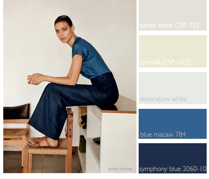
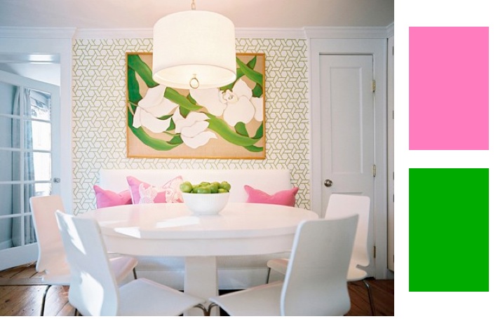
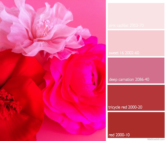
Since Valentine’s Day is coming up fast, I thought we’d talk about reds and pinks this week. These silk flowers in the photo are actually pins from Dulken and Derrick. They are great to wear on a lapel to add a bit of color. For interiors, even though I pulled out these Benjamin Moore paint colors- it doesn’t mean you have to paint your walls these colors. I personally like reds and pinks in splashes of color in accessories.  The softer pinks are wonderful for walls, but the bold colors can be great to paint end tables, chairs etc. to … Read more

January 21st, 2013 No Comments

Color Palette: Navy Blues and Mediterranean Blues Anchored with Neutrals

I try to keep a variety of colors in the color palettes I feature each week but lately I’ve been posting many shades of blues and neutrals. Seeing this photo from the Hermes Spring 2013 this weekend I just kept coming back to it again and again. It just feels so elegant, easy, crisp and understated. You can read the entire article “The Discreet Charm of Chistophe Lemaire” on online.wsj.com. I pulled out a few Benjamin Moore paint colors from this inspirational photo as a more useful tool if you love this palette for your home. You can … Read more

December 27th, 2012

6 of my favorite new neutral paints from benjamin moore’s color stories line

As much as we talk about color and what the new ‘it’ color trend will be this year, I started talking about whites and creams at the beginning of the week to close the year.  Neutrals are a great backdrop for these pops of color that all the shelter magazines endorse and realistically what most homes are painted. Not many people venture out to paint a room a bold red, or a cobalt blue or a sunflower yellow I have found during my work. Most people ask for a calming, perfect neutral color. And really, if you plan to sell … Read more

October 11th, 2012 No Comments

beach house color palette

Throughout the beach house I used Benjamin Moore’s, Blue Note, Westcott Navy, Seafoam, Ice Mist, Ocean Air, Gossamer Blue, Jamestown Blue, Rendezvous Bay and Calypso Blue. The formal dining/living/family room is painted in blue note- it’s warm and cozy and the black flat screen tv disappears against it. You almost feel like you are in a movie theatre. The casual breakfast room is painted in decorator’s white but the painter dropped about 2 drops of blue note into the white to make a beautiful blue gray. The hallways are painted in sea foam. The kitchen and … Read more

September 13th, 2012 No Comments

interiors: purple haze

Designer David Kaihoi’s apartment which was featured in House Beautiful has creative ideas for small spaces. Here you can see using color can still be done in a small space. He used Benjamin Moore‘s “Purple Haze” on the walls and for the floor he painted a pattern to look like a rug with “Hale Navy”. His deep color corner banquette also makes the most use of his small space, and he had storage built-in underneath. To see more of the apartment click here for the slideshow. Ngoc Minh Ngo photographed the story (don’t forget- I mentioned Ngoc has … Read more

July 12th, 2012 No Comments

interior designer darryl carter creates 24 colors for benjamin moore paints

Interior designer, Darryl Carter, teamed up with Benjamin Moore Paints to create Darryl Carter Colors by Benjamin Moore. The paints start with DC-1 and go to DC-24. Darryl Carter frequently is featured in the major shelter magazines and has his own decorating books called “The New Traditional” and a new book launching this October titled “The Collected Home: Rooms with Style, Grace and History”. Both are available to buy and pre-order on Amazon. I wanted to include this paint collection in this week’s color palette of white, neutrals and browns because Darryl is an expert on these neutral … Read more

May 13th, 2012 No Comments

color palette: pink and green

There’s still nothing quite as fun as pink and green. Usually associated with ‘preppy’ many designers feature these colors in their lines still, usually with a modern take, like John Robshaw’s cotton Ikat prints (see pillow below) or a design like this inspirational photo that appeared in Lonny. But there’s still your tried and true brands like Lily Pulitzer to get your pink and green prep going. Whether for home or fashion, pink and green are always a happy, friendly color palette. Stripes, solids, patterns in anything from towels to painted walls, pink and green is still … Read more

May 10th, 2012 1 Comment

yellow & white: rugs, pillows and doors

I used to have my living room painted yellow at our beach house. Although it was always lively and energetic, I did tire of it after a year or so. I now prefer when rooms are more neutral and you can add pops of color seasonally with pillows and flowers. A rug though makes a huge statement in a room and I’ve always loved patterned yellow rugs. This photo and rug are from The Rug Company. I think it’s a great example of how much impact a colorful rug can make in your room and completely change the look … Read more