Posts Tagged ‘place settings’

December 4th, 2013 No Comments

lavender themed weddings & celebrations

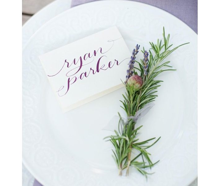
Lavender as a theme for weddings and celebrations can be really beautiful. Paired with soft whites, grays and even navy, lavender can take on a very romantic and charming presentation. Whether it’s just infused in small bits, like in this place setting above or as accents to the bouquet below or used as a flavor in cocktails or desserts there are so many options once you have decided on lavender. A small bouquet of lavender for each guest makes a beautiful presentation whether it’s for a wedding or a holiday table setting. A classic lavender decorated cake. Just because you … Read more

July 9th, 2013 No Comments

set a casual summer table with our Jars bowls and plates from france

Our feathered bowls and plates from Jars and made in France have a subtle pattern reminiscent of water- perfect for a summer table setting. Cream and blue colors transport you to the sea even if you’re not by the beach.  A simple floral centerpiece of hydrangeas is classic and elegant.  See the Jars stoneware collection on our Little Blue Dish Shop. (Featured in Architectural Digest July issue and shot by Pieter Estersohn)

June 11th, 2013 No Comments

tabletop: scrabble alphabet “place cards”

On a recent weekend I hosted guests I used wood scrabble pieces as place cards. The family I hosted also had two young boys, so these were great for both adults and children. I spread the pieces out on the table for the kids to spell out the names themselves. It involved them in the table setting and it was just a fun idea for a casual table setting. I found these alphabet pieces through Save On Crafts– 60 pieces for $3.99. I purchased five sets to make sure I had enough letters for everyone’s name. You could also … Read more

December 19th, 2012 No Comments

weddings with matthew robbins: there’s a wonderful boldness that happens when you allow green to be paired with crisp white

This ultrarefined palette of green and white is fresh. You’ll be amazed at how much we can do with a seemingly limited range of tones. There’s a wonderful boldness that happens when you allow green, which normally finds itself in a supporting role, to be paired with crisp whites. I’m rather obsessed with the green and white color palette. It can be challenging to work within an extremely tight palette like this, but in general it forces you to be more creative and to dig a little deeper that you would have otherwise. This palette can work just about anywhere, … Read more

December 4th, 2012 No Comments

tabletop: 2 ways to liven up your place setting

One wooden button, used two different ways. I found these simple wood buttons at Michael’s and painted them red (this took less than 15 minutes using “craft smart” metallic paint in red). The first idea is a classic red and white place setting using white round plates, red linen napkins and red grosgrain ribbon tied through the button holes to make 2 bows. The second idea uses favor boxes at each place setting. Each box is wrapped in wrapping paper, and the button is bound on top of the box with two pieces of burgundy velvet ribbon. I … Read more

September 19th, 2012 No Comments

weddings: a tiffany inspired table setting

Event designer and florist, Michael George and I worked on this story for InStyle. Inspired by Tiffany Blue, we used the color in small details and accents throughout vs. draping everything in blue. We selected white flowers, cloths, chairs, china etc. as our backdrop for the blue to pop. Using different sized vases in blues and whites from Middle Kingdom we placed them running down the center of long rectangular tables keeping them low so guests can see each other.  Notice to add interest to the centerpieces we used all different types of white flowers- but did not mix … Read more