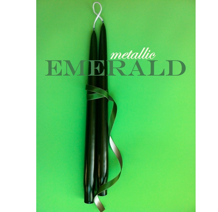
As usual the owners of Creative Candles, Ken Weiner and Pam Fleischer are right on trend. As Pantone announced Emerald Green as 2013’s color of the year, Creative Candles was already selling and shipping their new color “Emerald” green in their new Metallics line, also consisting of Silver, Gold and Ruby. In the new year Copper, Pearl and Sapphire will be introduced in Metallics- giving you a glimpse of future color trends perhaps? Founded in 1961 by Duane and Nancy Benton, the Benton’s sold the company in 1998 to two business men, and then in 2005 husband and wife, … Read more
Search Results for: candles
candles don’t just have to be for birthdays
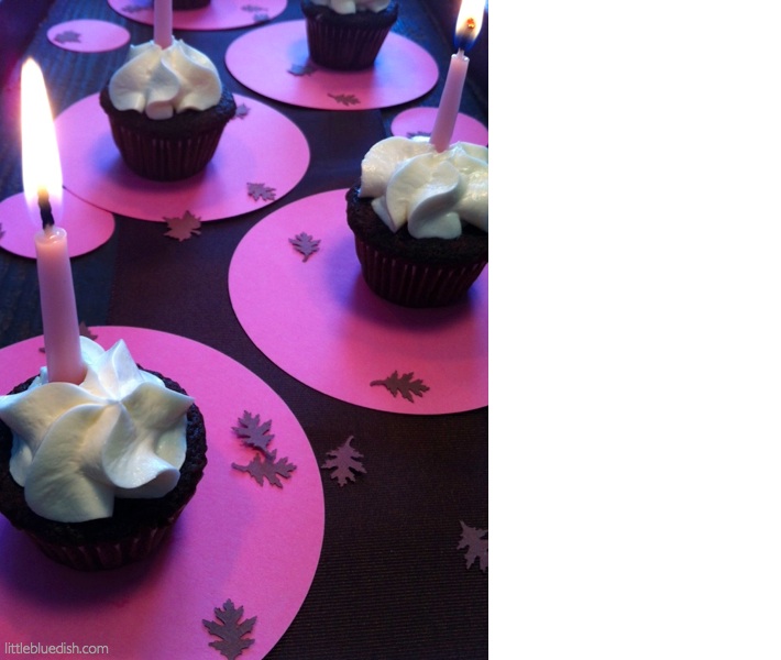
Using candles, especially in the fall and winter when days are shorter, always add excitement and warmth to gatherings. Whether it’s just an afternoon of sweets & coffee with your friends or a dinner party, candles make it seem extra special. We carry candles in over 15 colors and range in sizes from 6″ to 18″ to go with most any color palette. We had mini cupcakes yesterday in the office with hot chocolate. In keeping with our neapolitan color palette this week I put them out on a dark wood vintage tray and used pink paper circles … Read more
use beeswax as a place card holder for cold winter dinners
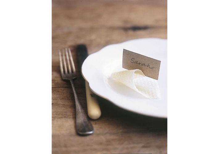
A simple, but fantastic idea for place cards is to take a piece of beeswax and roll into an instant holder. Most taper candles come with a small sheet of plain beeswax to help secure the candles in your candlestick holder. We carry taper candles over on the Little Blue Dish Shop, which come with small rectangular beeswax sheets and the best thing is our tapers are all on sale! We have over 16 colors to choose from and they are all made in Kansas City. Use the coupon “freeshipping” at check out to save even more. If you have … Read more
this week’s color palette: golden yellows & green -perfect for thanksgiving
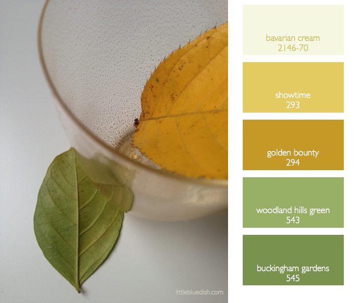
As the leaves fall and everyone is preparing for Thanksgiving there’s a transition in color palettes going on for the holidays. Most think of rust colors and oranges for October and Halloween. So a great transitional color palette for these weeks leading up to thanksgiving is a golden yellow and green. Fresh greens, herbs, wreaths can all adorn your home for Thanksgiving without looking like Christmas yet. Small punches of yellow or gold, with your glassware, a velvet ribbon tied around napkins etc. can elegantly adorn a November table setting or decor. The gold glasses I carry at the … Read more
inspiration for your holiday table: mckenzie powell’s enchanting florals
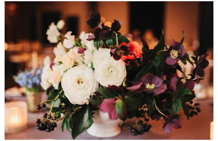
Mckenzie Powell, floral and event designer based in Seattle, has such romantic and organically beautiful florals. Mckenzie trained as a graphic designer which clearly has an impact on both her floral and event design. Her blog is charming. It features so many of her elegant celebrations and snippets of her personality and travels. When I asked her what advice she had for creating holiday centerpieces Mckenzie told me, “While I obviously love a lush floral centerpiece, something on the simpler side can still be really lovely. One of my go-to’s is using a collection of small potted plants, a … Read more
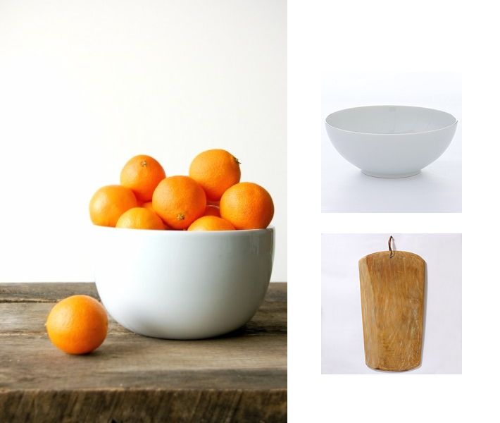
need a fast centerpiece idea? it’s as simple as a bowl of oranges
Having friends over at the last minute or just looking for a different table setting idea other than flowers? Pick up fruit, like a bag of oranges and place them in a white bowl (like above) or a wire bowl (see below). Fruit in multiples is the key to it looking abundant and stylish. Fruit alone can be very beautiful and minimal- whether it’s apples, grapes, limes etc. – it all depends on your color palette, but keep to one type of fruit for the biggest visual impact. If your table is very large, group in several bowls or one … Read more
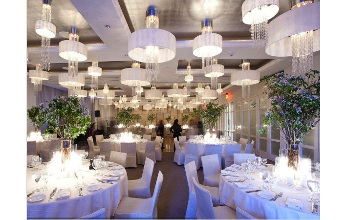
weddings: marrying your style to your location- here are our tips for a happy union
Sometimes trying to decide on the decor of a location for a celebration can be very tricky. The obvious is have the decor mirror the design aesthetic of the building but the location might not represent your style 100%. Here is an great example of a modern location but with natural branches as centerpieces- the opposite of what you might expect. By keeping the centerpieces all the same and all the table decor in a neutral color palette the execution is more modern in feel but the organic silhouette of the branches softens the modernity of the space. Simple hurricanes … Read more
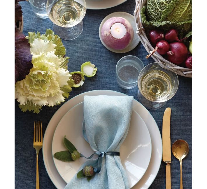
summer table settings made up of bountiful vegetables (and where those glasses should actually be placed)
This table setting caught my eye. As I noted yesterday golds are still making a showing for tabletop items, from candles to candle sticks to flatware. It’s slowly been folded into the trend market for the past 5 years and it’s still holding tight. But let’s talk about summer vegetables for centerpieces, votives and even salt cellars. How creative this is to use lettuce as individual salt and pepper cellars- and a radish hollowed out for a votive holder. These are clever ideas and using vegetables as your centerpiece in late summer certainly can be elegant and seasonal. Using a … Read more
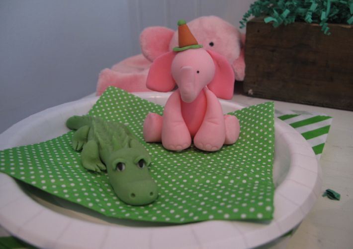
pink elephants and green alligators make for a very happy birthday
For my girls’ 3rd birthday I found these fondant animals on etsy.com from “The Cupcake Stylist” and knew we had to do their whole birthday theme around these little animals. So the entire party became pink and green. Here’s a few personal snapshots of the details from our family cake party. -Lynn Butler Beling Simple white buttercream cakes from our local Tate’s Bakery were adorned with the fondant animals I ordered from the shop The Cupcake Stylist on etsy.com. A serve yourself bar of pink lemonade with plastic bottles which were safe for little ones. Pink and … Read more
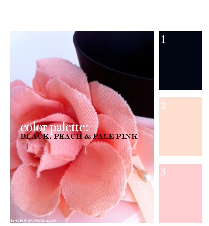
let’s go back to the beginning… color palette: black, peach, pale pink
This was my first post back on April 9th, 2012 and since it was, there weren’t too many readers. It’s one of my favorite color combinations though, so I thought I’d re-post it for those of you who have now joined my blog. Thank you for your weekly support and I hope you keep coming back! – Lynn Butler Beling I love this color palette. I keep coming back to this color combination because I think it’s both masculine and feminine. Chanel included this palette in their spring 2012 runway show. (see below) The flower in the photograph above is … Read more