This week’s color palette is based on periwinkle blue and natural golden wood or grass tones. Hawthorn green by Benjamin Moore has a mix of brown and yellow and green, like fall grasses might appear. They all work wonderfully together as a palette. We’re seeing periwinkle pop into spring palettes and we love revisiting this color. This palette could work for just about any room in your home as it’s both restful and classic.
Archive for the ‘Browns’ Category
nautical and rope wedding details
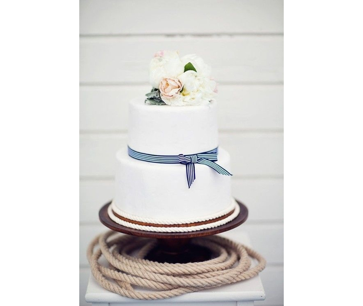
Again our inspirational photo from Monday’s post is influencing us. We love these nautical and rope inspired wedding details, like this cake with a sugar rope detail at it’s base or these oars that act as menu displays. Knot table and place cards from Karensweddingshop via Etsy.com Use a boat as a cooler for drinks. Most rental companies have unique props like this, it’s worth it to actually go to the rental company and look around at what they have. These type of one-of-a-kind items are not always on their website. Rope chair markers for the bride and groom, … Read more
nautical inspired home accessories
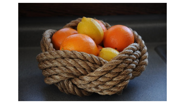
We’re loving the nautical influence this spring from fashion and home accessories, like this Rope Bowl, $40, from OKKNOT on etsy.com or this Top Rope Mirror, $219, from Land of Nod. Rope Table Lamp (base), $150, from Pottery Barn. Rope Tie Back, $14, from Ballard Designs. Or these Rope Tie Backs, $56-$80, from Restoration Hardware that come in different shades and with different color hardware. There are lots of nautical home accessories to choose from on Hand Crafted Nautical Decor, like rowing oars in various shades, patterns and painted colors.
this week’s color palette: blues, rust and buff
As winter starts to fade away and we’re seeing small signs of spring we were inspired by this image and a color palette fitting of a crisp climate. I personally love working with the 2129 family of paints from Benjamin Moore. Soot and Blue Note (2129-30) are a few of my favorite deep dark blues to use, for doors, dining rooms and media rooms. If you want a happy, feminine dressing room, girls room or sitting room the light peach shades are wonderful especially in a light drenched room. When we were looking at this palette, my team and I … Read more
If you love design, you’ll love pouring over McAlpine Tankersley’s work
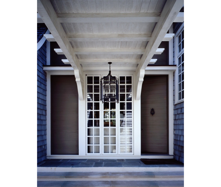
Although I’ve always heard of the firm McAlpine Tankersley and seen them in all our favorite shelter magazines like Architectural Digest, Elle Decor, Veranda etc., I didn’t intently peruse their work on their website until I was recently researching porte cocheres for a home I was consulting on in Southampton. Insead of giving you a long history of their firm and accomplishments, I urge you just to go over to their site and devour their work. Make sure you have a large cup of coffee and sit back and get ready to be completely and utterly inspired. – Lynn … Read more
country inspired wedding details
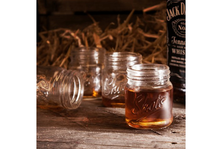
A sure way to make your wedding celebration (or any party for that matter) memorable is to take the time to infuse some of your interests or background into the event. Even if you are having a black tie reception in the city it doesn’t mean you can’t bring in a few unique details to personalize it, even if it’s a bit of country (or vise versa). We love these Mini Mason Jar Shot Glasses that can also be personalized from HomeWetBar.com, set of 4, $12.95. Directing your guests is always a good idea for any event, whether with … Read more
kit kat cheesecake bars, we’re in love
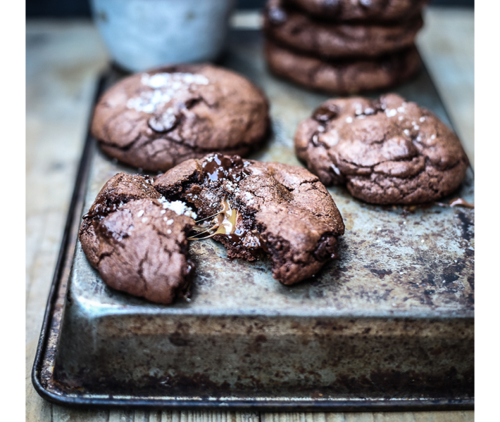
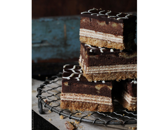
We just couldn’t resist sharing this recipe for Kit Kat Cheesecake bars via Bakers Royal. Remember a color palette doesn’t just have to lend itself to decorating your home. You can make your party look like the pages out of a magazine by weaving in your color palette where possible, not only with tablecloths and flowers but with desserts and drinks. And with Saint Patrick’s Day coming up soon, these Black and Tan Beer Pops from Betty Crocker are a great alternative rather than just serving up everything green.
this week’s color palette inspired by wild gazelle at the Natural History Museum
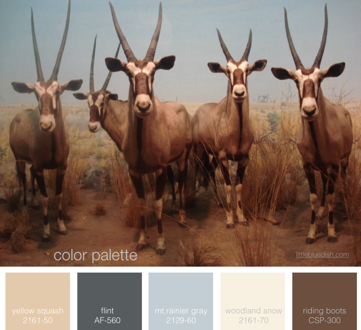
A trip to New York’s Natural History Museum inspired our color palette this week. The coloring on these gazelles was so stunning. I centered around Benjamin Moore’s Mt. Rainier Gray and Flint, part of their 2014 color trends and filled in the neutrals from there for one of our new favorite color palettes! (this photo was taken by Lynn Butler personally on her iPhone and it is NOT a stock photograph)
this week’s color palette: pale neutrals
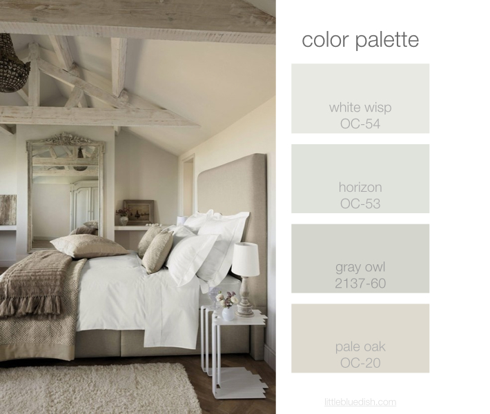
I was working with a client this weekend, beginning to discuss the color palette for the interior of his new beach home. We decided on this pale neutral palette to start and as we go on we can interject some deeper colors or soft blues but this was a great jumping off point. He wanted to go a bit more gray than brown. Above are the Benjamin Moore paint colors I selected for him as an overall base palette. When you are faced with deciding on colors for an entire house it’s always good to pull out photo tears from … Read more