Search Results for: benjamin moore

May 9th, 2013 No Comments

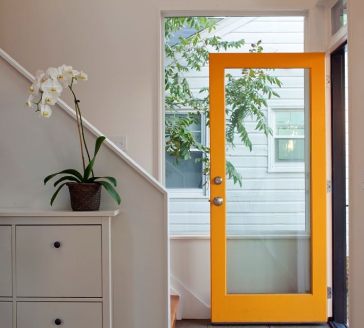
what would a yellow door say about you?

A yellow door is said to channel positive energy and foster your mental sharpness. Yellow represents joy, happiness, imagination and hope. This door shown above has a bit more orange to it and orange can denote creativity, enthusiasm and success.  Yellow attracts attention, so you may want to use a bright color like this if your door is hard to find or maybe you just want to be the house that is most noticed on your block. You can see what an impact yellow can have when it’s a solid door vs. the glass door with very little area of color, … Read more

May 6th, 2013 No Comments

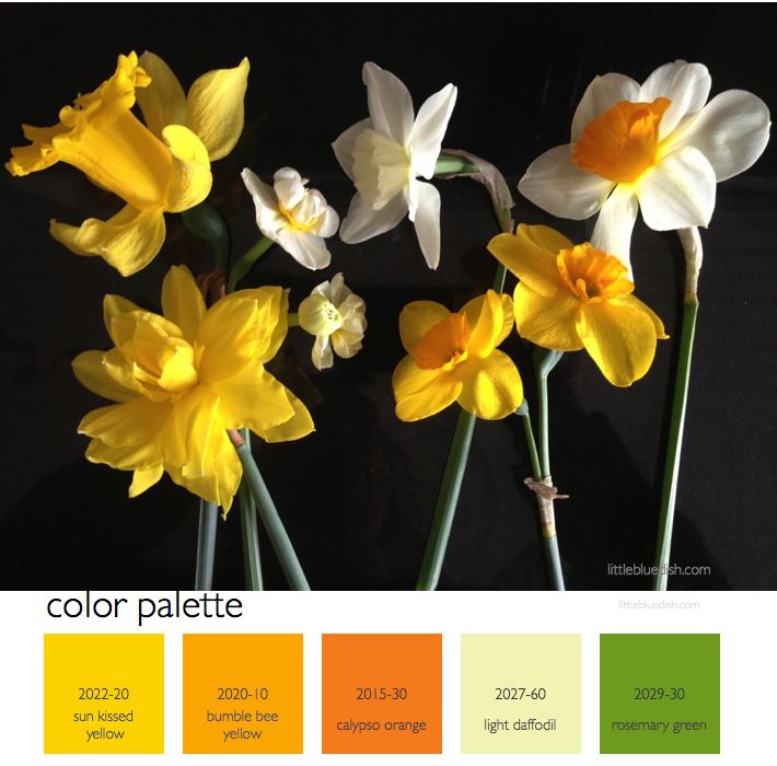
color palette: daffodil yellows & stem greens

The daffodils have been blooming here in New York for the past week or so. I brought these in from my garden and laid them on my counter… and this beautiful still- life was begging to be snapped. I love when this happens, it so rarely does, especially on photo shoots- where you lay something down and just the natural way that you put it down is stunning; You don’t want to touch it- you just want to capture the image with a photograph. I wish I was a better photographer but that’s something I’ll have to learn from some … Read more

April 29th, 2013 No Comments

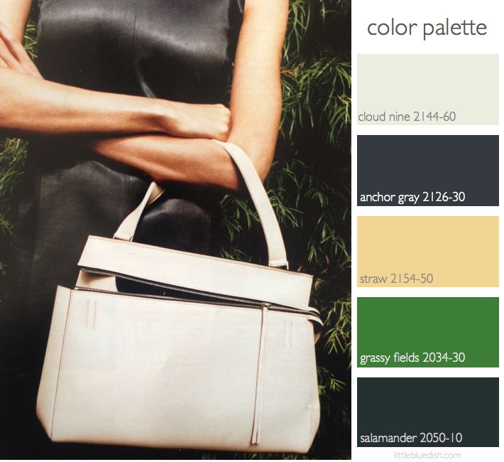
color palette: gray, greens & neutrals

Inspiration can come from anywhere. It can come from nature, a piece of fabric, art, fashion.. and in this case a little bit of all of those. Turning through magazines you might run into an ad that you just stop and stare at for a moment. When I turned to this Celine ad I immediately loved the color palette. First the strong gray paired with a neutral bag. Then as I studied a little more it was also the greens, both light and very deep that framed the model that I loved. As I selected Benjamin Moore paints that … Read more

April 22nd, 2013 No Comments

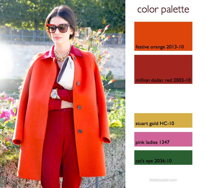
this week’s color palette: orange and red with gold, pink and green accents

This week’s color palette is inspired by a ‘street style’ photo from Elle. Orange and red, being wonderful warm colors can look beautiful with gold accessories, like you see here with the model’s jewelry. But if you love this palette for your home, think about gold accents, like hardware, lights, decor accents or even gold end tables.  When you find a photo that really inspires you, look closely because it’s usually something about all the elements together that attract you. So take for instance her light gray bag, the dark brown buttons, the dark green foliage and even the … Read more

April 15th, 2013 No Comments

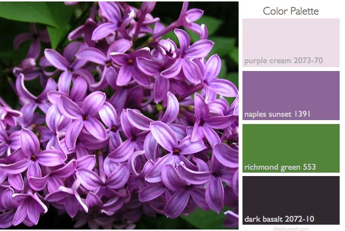
this week’s color palette: inspired by lilacs

This week’s color palette was inspired by our floral contributor, Michael George, and his garden in upstate NY (His arrangement on his table shown below). Once Lilacs are done flowering you should snip the blooms off. Then keep watering and fertilize so that each spring you will have very fragrant blooms. Lilacs need a period of cold to bloom. So if you live in a locale that is warm all year, you should stop watering after September to force it into dormancy. Note: As we do every week with our color palettes, the names and numbers above are from Benjamin Moore … Read more

April 7th, 2013 No Comments

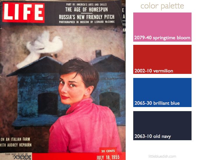
this week’s color palette: pink, red & blues inspired by a 1955 Life magazine cover

This week’s color palette is inspired by Life Magazine’s July 18, 1955 cover of Audrey Hepburn. A few weeks ago I found some old magazines and books. I love pouring over the old ads too. (I guess it’s fitting to include it this week when AMC’s Madmen series returns for it’s 6th season.) The article was short and no photographers name was given for the photographs. Here is what it said: “An Idyl for Audrey: In Italy she relaxes down on a plush farm. Peace and privacy are hard to come by for any movie star, but Audrey Hepburn … Read more

April 2nd, 2013 No Comments

this week’s color palette: gray, yellow and cream- straight from photographer liz banfield’s cheerful studio

Photographer, Liz Banfield shared the gray paint color with us in her lovely studio- it’s Benjamin Moore’s Wickham Gray. Her designer, Janet Gridley, layered in creams, golds with pops of fun and energetic yellow. We’ve selected Benjamin Moore‘s Banana Yellow and Bavarian Cream for the remainder of the paint palette for you to work off of if you love this combination.  A cream sofa piped in yellow is a wonderful way to introduce color without a huge commitment. The designer’s use of natural fibers like sisal & jute make the cool gray color look and feel more approachable … Read more

March 25th, 2013 4 Comments

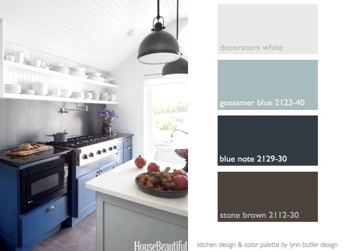
this week’s color palette: seaside blues and white in my farmhouse kitchen by the beach

House Beautiful published my kitchen in their April 2013 issue. I’m honored that they chose it as their “Kitchen of the Month”. I thought I’d share with you the photos from the magazine & link you to the story so you can read it yourself. There are several tips for small spaces- like under-counter refrigeration and a vent for the stove that pops up from behind the range- freeing the space of a giant hood.  I’d also like to share with you the Benjamin Moore paint colors of this kitchen in case you like the blues. … Read more

March 21st, 2013 No Comments

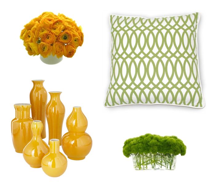
bored with a neutral room? citrus colored accessories & flowers are a fast, simple solution

Do you have a room in your home that all of a sudden looks really bland now that spring is here? Painting or purchasing a large piece of furniture can be timely and costly. And what if you realize on Monday morning that the green walls that took you all weekend to paint- just isn’t for you? If you are looking for quick interjections of color just try adding pillows, throws and even flowers in the color you’d like to test out. This is far less of a commitment and it’s a small step if you are afraid of making … Read more

March 18th, 2013 No Comments

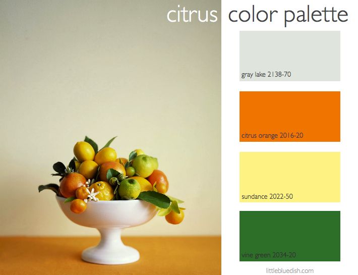
this week’s color palette: citrus- orange, lemon & lime…with gray

This week’s color palette was inspired by a story I styled for Martha Stewart Weddings about citrus. Photographer Sang An shot this beautiful image. We used a slightly pale gray background to allow the bright colors to pop. Which just as in a room, a neutral color is always a good base to allow bright colors to shine. These Benjamin Moore paint color selections are very true to the vibrant citrus. I chose Gray Lake because it has a slight green tint to it and works within this color family. I’ll keep sharing the citrus story I styled this … Read more