Search Results for: book

September 13th, 2013 1 Comment

How to plan the perfect baby shower (hint: start with the mom-to-be’s favorite colors)

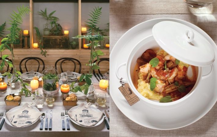
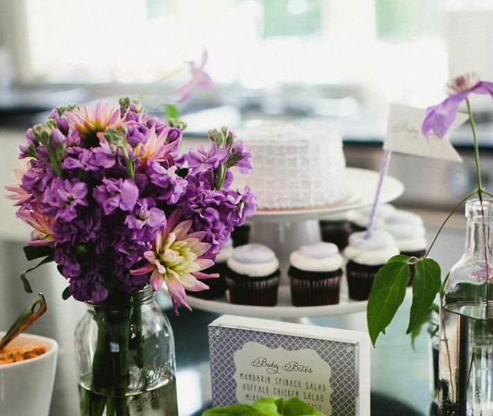
An outdoor baby shower luncheon hosted by her best friends and family is any girls dream. White Peacock Events planned and styled this pretty shower, they said, “we wanted it to be girly and elegant”, and the talented Melissa Mlejnek photographed all the fun. (Don’t forget to hire a professional photographer for such a memorable occasion so you and your guests can just relax and enjoy!) What’s the best way to start to plan a party like this? By starting with a color palette. The momma to be’s favorite colors are gray and lavender so that became the … Read more

September 11th, 2013 1 Comment

how would floral & event designer matthew robbins plan his own wedding?

You can finallly find out! Matthew Robbins‘ gorgeous wedding is featured this month in Martha Stewart Weddings. Matthew, a brilliant floral and event designer and a long time contributor at Martha Stewart Weddings (a contributor to our blog too!) also has a book to help you plan your wedding entitled Matthew Robbins Inspired Weddings. Although you can view Matthew’s wedding online in the link above this is one print issue you’ll want to actually have in your hands and scour over. Issues are on sale now so best to pick up your copy before they are gone!  – Lynn … Read more

August 26th, 2013 No Comments

this week’s color palette: cream, peach, blues.. with a dab of green and gold

I’ve had this inspirational color palette on my pinterest page for awhile now and I just keep coming back to it. I love the layering of color and pattern of creams, a peachy pink and shades of blue. To me as a stylist that pop of green in the book is a great reminder… a reminder that a little pop of bright color in an otherwise very tight color palette is that layer that makes this a very interesting palette rather than a quiet, pretty palette. All colors listed above are Benjamin Moore Paints. Gold and brass… over the … Read more

August 20th, 2013 No Comments

summer table settings made up of bountiful vegetables (and where those glasses should actually be placed)

This table setting caught my eye. As I noted yesterday golds are still making a showing for tabletop items, from candles to candle sticks to flatware. It’s slowly been folded into the trend market for the past 5 years and it’s still holding tight. But let’s talk about summer vegetables for centerpieces, votives and even salt cellars. How creative this is to use lettuce as individual salt and pepper cellars- and a radish hollowed out for a votive holder. These are clever ideas and using vegetables as your centerpiece in late summer certainly can be elegant and seasonal. Using a … Read more

July 25th, 2013 No Comments

a colorful (high-gloss) painted door can make a big first impression

Designer kelly wearstler has several books that I often reference- Modern Glamour and Hue (available on amazon). I like her mix of colors and textures and her attention to detail. One of my favorite spaces designed by her is the restaurant BG at Bergdorf Goodman.  Above is an example of how she incorporates color through details at a residential home. She starts with basics and builds from there- white walls, a dark floor, select pieces of black furniture, but then layers in coral /peach upholstered stools, accessories, a gorgeous coral painted door- it all comes together effortlessly and her … Read more

July 24th, 2013 1 Comment

weddings: anemone cakes by elisa strauss of confetti cakes

(photographed by Monica Buck) I have collaborated and styled so many wedding cakes over the years and one of my favorites is a cluster of 3 little floral cakes I designed with the very talented Elisa of Confetti Cakes for InStyle Weddings. I had a craftsman make 3 black cake stands, varying in height. I was inspired by a vase and we worked from a snapshot I had taken of it. Usually you wouldn’t think of black cake stands for a wedding, but I think the light colored cakes and the anemone flowers with black centers keep it classic in style … Read more

July 22nd, 2013 No Comments

let’s go back to the beginning… color palette: black, peach, pale pink

This was my first post back on April 9th, 2012 and since it was, there weren’t too many readers. It’s one of my favorite color combinations though, so I thought I’d re-post it for those of you who have now joined my blog. Thank you for your weekly support and I hope you keep coming back!  – Lynn Butler Beling I love this color palette. I keep coming back to this color combination because I think it’s both masculine and feminine. Chanel included this palette in their spring 2012 runway show. (see below) The flower in the photograph above is … Read more

July 19th, 2013 No Comments

A backyard playhouse full of color and fun…from a kit made by a family business in ohio!

Take a peek at my girls backyard playhouse. I purchased this playhouse kit from the Little Cottage Company (a family owned business located in Ohio) for my kids and what a great find! My girls spend hours in this cottage, which is complete with 2 dutch doors (one for little ones and one for grown-ups), working windows with screens and even flower boxes. It took a friend and I about a day and a half to put the kit together and it was pretty easy to do. (the only thing really not included are roof shingles, but I used the extra ones … Read more

July 12th, 2013 No Comments

a southern wedding chocked full of ideas to inspire you all weekend long

Photographer Liz Banfield and event planner Tara Guerard teamed up to bring us these beautiful images of a Mount Pleasant, South Carolina wedding just full of beautiful details. We usually feature weddings on Wednesdays but we thought we’d give you an inspirational celebration to start your weekend off early. This bride and groom carried their monogram throughout their entire wedding from the programs to the cake. All printed materials are from The Lettered Olive. Liz and Tara have two wedding books available here. For more monogram ideas for your wedding or celebration check out our post on Read more

June 17th, 2013 No Comments

anchors are making a big splash, mostly in a classic navy & neutral color palette

Anchors are appearing everywhere this season-from gift items to tabletop to wrapping paper. We’re seeing most in a classic navy paired with leather, browns, creams, while some accessories are shown in bright red. This inspired our color palette this week with two classic paint colors above from Benjamin Moore. We’ll be covering anchors all week for weddings, interiors and paper but we thought we’d start you off with a few gift items. Above, Mark and Graham’s Anchor Canvas Tote which you can personalize and below their Anchor Key Fobs, Anchor Paperweights, Acrylic Tumblers and Napkins. … Read more