Posts Tagged ‘color palette’

August 5th, 2013 No Comments

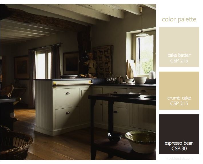
this week’s color palette: sandy neutrals

Creating a color palette for your home can be a bit easier if you choose something you are inspired by… like the sea, sand, a forest, even a farmer’s market. I always like to keep in mind the flow from room to room. As you are sitting in one room you will be looking into the adjacent rooms, so it’s a good idea to consider what colors are next to each other as you travel throughout your home. Pale shades of neutral colors for your walls are always a good investment and you can bring in color or keep within … Read more

July 29th, 2013 No Comments

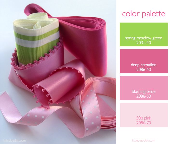
this week’s color palette: pink and green

Pink and green always seems like a summertime color palette to me…or at least a color palette that wants you to feel like it’s summer all year long. Images of iconic Florida bungalows, Lily Pulitzer dresses and fresh bouquets of pink flowers immediately come to mind. What does this color palette make you think of? Here are a few pink and green floral arrangements to inspire your Monday as well as my Benjamin Moore paint picks above for this palette to guide you in any decorating or party planning you might be doing this summer. -Lynn Butler Beling Sources: Opening … Read more

July 22nd, 2013 No Comments

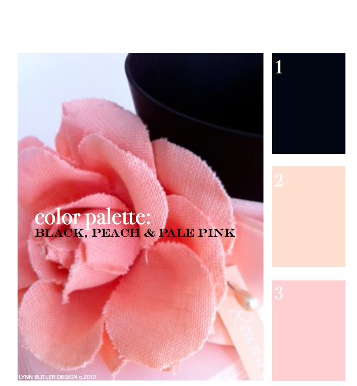
let’s go back to the beginning… color palette: black, peach, pale pink

This was my first post back on April 9th, 2012 and since it was, there weren’t too many readers. It’s one of my favorite color combinations though, so I thought I’d re-post it for those of you who have now joined my blog. Thank you for your weekly support and I hope you keep coming back!  – Lynn Butler Beling I love this color palette. I keep coming back to this color combination because I think it’s both masculine and feminine. Chanel included this palette in their spring 2012 runway show. (see below) The flower in the photograph above is … Read more

July 19th, 2013 No Comments

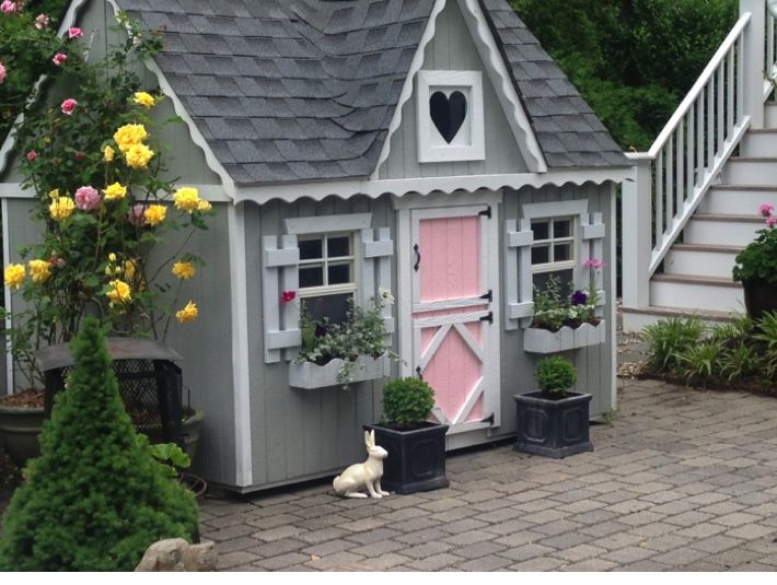
A backyard playhouse full of color and fun…from a kit made by a family business in ohio!

Take a peek at my girls backyard playhouse. I purchased this playhouse kit from the Little Cottage Company (a family owned business located in Ohio) for my kids and what a great find! My girls spend hours in this cottage, which is complete with 2 dutch doors (one for little ones and one for grown-ups), working windows with screens and even flower boxes. It took a friend and I about a day and a half to put the kit together and it was pretty easy to do. (the only thing really not included are roof shingles, but I used the extra ones … Read more

July 15th, 2013 No Comments

color palette: a fun palette for a beach side cottage or even a playhouse

This is a color palette I personally used for my girls playhouse. It took a little while to select the right shades of blue, pink and yellow that would look fresh and fun, but these are the exact Benjamin Moore paints I used. I’ll show you the playhouse on Thursday when we post about interiors. I have since then found these straws from Ikea that fit in the palette perfectly. Only a $1.49 for a pack of 100! -Great for smoothies and cool summer drinks. For a ‘grown-up’ take on this palette, see how Miles Redd incorporated these … Read more

July 8th, 2013 No Comments

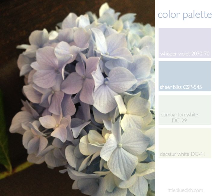
this week’s color palette inspired by faded hydrangea / And benjamin moore announces the winning 20 towns from their main street matters contest

Some hydrangeas are so vibrant in color and others are very pale, washed out blues and lavenders, which is what has inspired our color palette this week. We scatter ashes from our fireplace around the soil of our hydrandreas to change the PH balance and the color to more of a blue.  But most all of your questions about planting and growing hydrangea can be answered on the United States National Arboretum webpage. Above we selected Benjamin Paint colors for our palette that you can use as a guide. And speaking of Benjamin Moore, today they announced their 20 … Read more

July 1st, 2013 No Comments

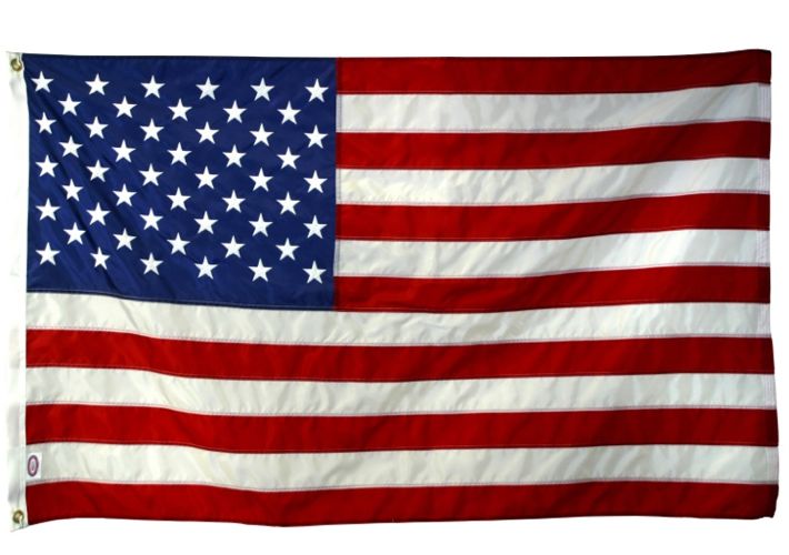
all american color palette- red, white & blue

As we celebrate our nation this week with the 4th of July, the color palette of red, white and blue can conjour up a lot of different emotions for many of us. Most of us associate it immediately with our flag and others as a classic, maybe even a country (as in rural) association. Others may associate it with our military. Charity Navigator guides you through the best charities for our heroes. So if you have been meaning to support your police, firemen or veterans this may be the week to search out either a local or national charity. Read more

June 24th, 2013 No Comments

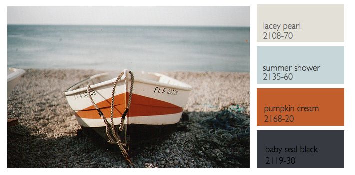
this week’s color palette: sea blue, gray and a nautical black-gray and orange

Last week we talked about a nautical color palette, but what most people would consider a more tradition palette of navy, creams, white and a little red. This week I wanted to feature a different nautical inspired palette based off this photograph of a boat and rocks and a more hazy sky. The colors I chose this week from Benjamin Moore all have a bit more red in them to compliment the orange in the palette better. Instead of a black- black the baby seal black looks different in different types of light.. sometimes it looks deep blue, others … Read more

June 17th, 2013 No Comments

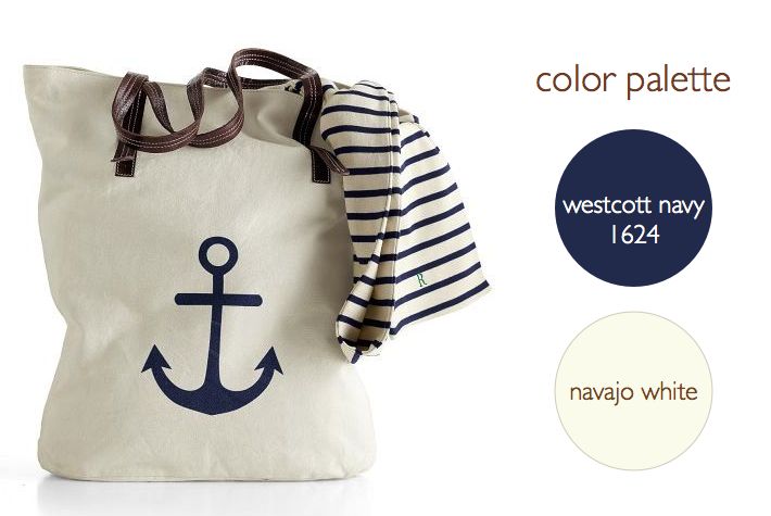
anchors are making a big splash, mostly in a classic navy & neutral color palette

Anchors are appearing everywhere this season-from gift items to tabletop to wrapping paper. We’re seeing most in a classic navy paired with leather, browns, creams, while some accessories are shown in bright red. This inspired our color palette this week with two classic paint colors above from Benjamin Moore. We’ll be covering anchors all week for weddings, interiors and paper but we thought we’d start you off with a few gift items. Above, Mark and Graham’s Anchor Canvas Tote which you can personalize and below their Anchor Key Fobs, Anchor Paperweights, Acrylic Tumblers and Napkins. … Read more

June 10th, 2013 No Comments

kitchens & baths: a neutral color palette and brass accents create a timeless style

Your kitchen and your bathrooms usually get the most return when renovating your home. It’s hard to know where to start when renovating your kitchen. But if you are planning to sell your home anytime in the near future you might want to consider a classic neutral color palette for your cabinets and countertops. Above, the kitchen has dark counters, while below the bath shows a neutral cream counter, showing you how both can be classic in style.  I mentioned before in our post “6 emerging kitchen trends” that brass was becoming more popular again for kitchen hardware. Now … Read more