Posts Tagged ‘tabletop’

March 26th, 2013 No Comments

time to update your kitchen? new dishes can freshen things up, here are my favorite picks

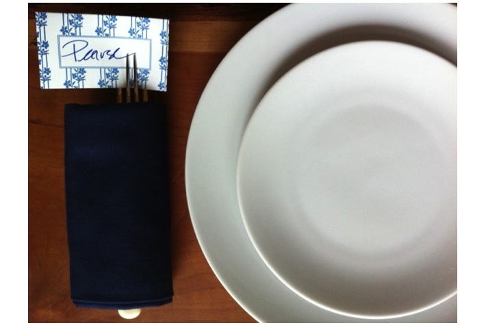
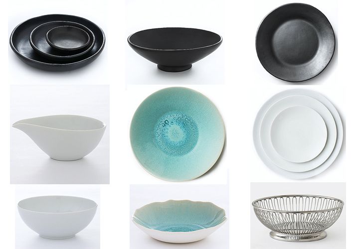
I have spent years covering the tabletop and entertaining markets and on my shop I carry my favorite pieces. If you saw my kitchen in yesterday’s post, you can see that you can make a big impact with dishes- even white dishes when displayed as a collection. You might have also noticed the black deep dishes, bowls etc. in the photos too and wondered where I got them. I sell those too on the shop! They are amazing. They are Black Clay Pottery from Columbia. You can take these dishes from oven to table and the presentation with food is … Read more

March 19th, 2013 No Comments

tabletop: citrus details bring a table to life

In continuation from yesterday’s post, I mentioned I would share more of the citrus story I created and styled for Martha Stewart Weddings. Above, a floral centerpiece incorporating citrus is the focal point, while a soft orange/yellow cloth lets it stand out.  White china, chairs and clear votives and glassware keep the table light and airy. Below, details of the table, like citrus lollipops covered in clear cellophane with a numbered round sticker to denote the table number. Attached to the lollipops with waxed twine are rectangular calligraphed place cards to personalize each pop (add a bit of … Read more

February 26th, 2013 No Comments

personalize your table setting with monogram chair covers & matchbooks

To continue with our monogram theme this week I wanted to share with you a table I styled for InStyle magazine. First I had Gail Brill (our weddings contributor this month on the blog!) design a personal monogram for the couple. We then gave the monogram design to Penn & Fletcher in Long Island City to embroider chair covers in a blue that was in our color palette. Now I did these here for a wedding reception, just for the bride and groom, but you can do this idea for your own chairs at home too. We simply … Read more

February 19th, 2013 No Comments

tabletop: have fun with your setting by using a bright spring palette

I love minimal tables and design (as you can see from my shop), but now that I have children I’m finding that bright pops of color and whimsy is fun and can be just as pretty when setting a table, especially for the holidays. Adding little touches like small bowls of lollipops, candy sticks and cupcakes are inexpensive but effective to make your table look festive.  A table like this is very easy to pull together, so let’s break it down to make it easy for you. If you’d like to work from this specific palette then make sure to … Read more

January 29th, 2013 No Comments

tabletop: scalamandre teams with lenox to bring their iconic patterns to the table

Scalamandre textile house is collaborating with manufacturer, Lenox, to bring five of their fabric & wallpaper patterns to the table. Bloomingdale’s just debuted the collection. Among the five patterns is the iconic Zebras that was originally a wallpaper that adorned the walls of the legendary New York City restaurant, Gino’s. Gino’s has since closed but Scalamadre has resurrected the wallpaper in it’s line and now in a china pattern. The Bouvier pattern (picutred directly below) was also originally a wallpaper that was in the private home of Averell and Marie Harriman. Jacqueline Kennedy stayed with the Harriman’s in Washington after her … Read more

January 22nd, 2013 No Comments

tabletop: try using cutting boards as a placemat at each setting for a casual atmosphere

To achieve the same color palette as our inspiration photo from yesterday with blues, neutrals and woods, try bringing in cutting boards to use as placemats. This usually works wonderfully for casual lunches or dinners. Each cutting board doesn’t have to be the same either to mix things up. Pictured above I have a cutting board that still has the bark on the edge which visually makes the place setting very textural. (I bought this one at abc carpet & home) I just used my plain white everyday white plates, vintage bakelite flatware and navy napkins. The place … Read more

January 18th, 2013 1 Comment

Meet Kaminer Haislip: My Interview with the Extraordinary Silversmith from Charleston

If you haven’t realized from my shop or my posts, I’m a bit obsessed with tabletop and design. So I was so thrilled and elated when I discovered Kaminer Haislip’s designs for the first time. I just love her coffee and tea services that combine wood and silver… as well as most everything else she designs! And of course wouldn’t you know it, she’s as gracious as she is talented. Kaminer recently granted me an interview and I wanted to share it with you today as well as show you a sampling of her work. She shares a lot of … Read more

January 15th, 2013 No Comments

tabletop: mix old & new, metallics with black & white to create a very personalized setting

Pull out your favorite things from your cabinets….maybe even your grandmother’s china that’s been boxed in the attic to create an eclectic mix of old and new. Look around your house too, maybe you have a collection of small boxes, a gold leaf plate on your nightstand that holds your earrings- pull it all together to group on your table or sideboard. That little dish could now hold candy or sugar cubes, boxes could hold tea bags.. and so on. Black and white are so classic that the color palette is a great cohesive glue to allow you to combine … Read more

January 8th, 2013 No Comments

nordic table inspiration: personal decanters at each place setting…and it’s ok to move your dining table to a different room

One of my favorite tableware companies is Royal Copenhagen. This simple but beautiful table is set with a crisp white linen cloth and their Blue Fluted Plain pattern. The pattern was first adopted in 1775 as their very first porcelain dinner service. It is still painted and glazed by hand. Even though this pattern is 238 years old it still has a fresh design appeal.  I pair the pattern with their White Fluted porcelain to break things up a bit. This photo is from the book The Nordic Table. I loved that each place setting was personalized … Read more

December 19th, 2012 No Comments

weddings with matthew robbins: there’s a wonderful boldness that happens when you allow green to be paired with crisp white

This ultrarefined palette of green and white is fresh. You’ll be amazed at how much we can do with a seemingly limited range of tones. There’s a wonderful boldness that happens when you allow green, which normally finds itself in a supporting role, to be paired with crisp whites. I’m rather obsessed with the green and white color palette. It can be challenging to work within an extremely tight palette like this, but in general it forces you to be more creative and to dig a little deeper that you would have otherwise. This palette can work just about anywhere, … Read more