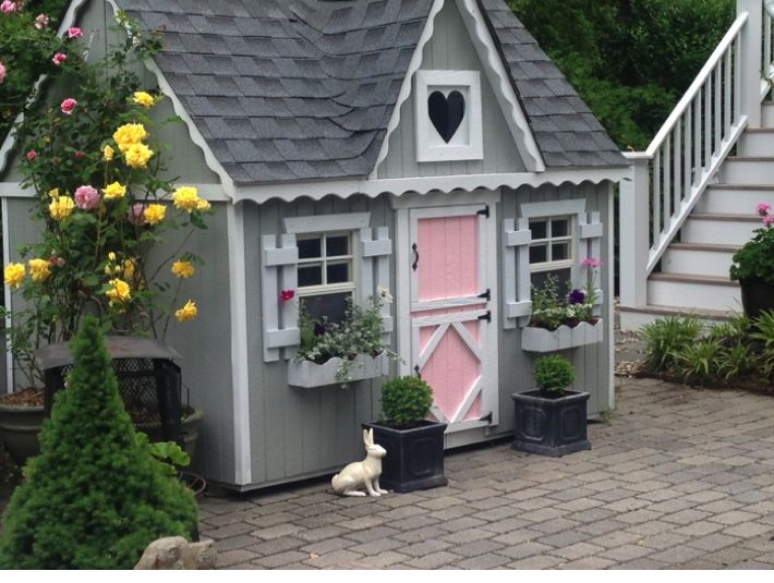
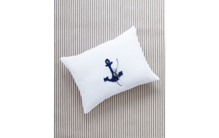
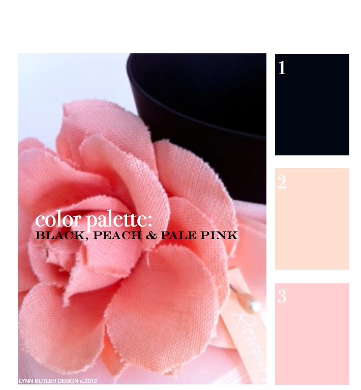
This was my first post back on April 9th, 2012 and since it was, there weren’t too many readers. It’s one of my favorite color combinations though, so I thought I’d re-post it for those of you who have now joined my blog. Thank you for your weekly support and I hope you keep coming back! – Lynn Butler Beling I love this color palette. I keep coming back to this color combination because I think it’s both masculine and feminine. Chanel included this palette in their spring 2012 runway show. (see below) The flower in the photograph above is … Read more
Search Results for: pillow
weddings: photographer laura billingham captures a pretty pale blue, gray and violet wedding in barnardsville, nj
Renowned wedding photographer, Laura Billingham captured the essence of this pretty blue, lavender and gray wedding in the bride and groom’s details. Above, the bride’s bouquet of cream roses and pale blue delphinium, belladonna done by florist Jardiniere Fine Flowers of Far Hill, New Jersey. It’s important to go over all the details of your flowers before your big day, like how your bouquet will be tied and what type of ribbon will be used. This bride chose a very neat band of cream ribbon secured with pearl pins in lieu of a large cascading bow. All the … Read more
an elegant southern wedding: kaminer haislip to matthew quinn, charleston, south carolina
A few months ago I introduced you to silversmith Kaminer Haislip. (read the full post here) She designs the most beautiful pieces so it’s no surprise that her wedding was elegant and sophisticated too. Kaminer and her husband, Matthew were married in the month of September in Charleston, South Carolina, so a color palette of gray, orange, creamy whites and blues was just perfect. (see our color palette this week that we introduced on Monday for your color guide) They were married at First Scots Presbyterian Church and held their reception at the William Aiken House … Read more
weddings: anchors aweigh! nautical details that will make a splash at your celebration
Since we’ve been talking about anchors this week, why wouldn’t we give you some anchor inspiration for celebrations? If you are thinking of a nautical wedding (or party this summer) this post might be just for you! Tying your theme (or color palette) into even the smallest details makes all the difference like this anchor embroidered ring pillow, above or these seating cards with anchor charms, below. via Martha Stewart Weddings Your invitations give your guests a glimpse of what style your wedding with be. Below, Printable Anchor Wedding Invitation Set from Mikio Design on Etsy.com. There are so many invitations … Read more
interiors: this week’s color palette used in big splashes and small accents
Sometimes there’s nothing better than just looking at inspirational photos to get ideas for your own home. A hot pink might be too much for your walls, but a sofa makes a big splash. Paired with shades of pink, coral and yellow pillows it brings this white room to life. (notice the gray stained beams.. part of our color palette this week with the pinks and yellows) Slip covers for you sofa are a great idea if you don’t want to invest in an expensive sofa in such a bold color. Below, sometimes just adding a bright comforter to a … Read more
we’re loving these tubs for organizing just about everything!
TUBTRUGS containers have been our new best friends lately. From large tubs that can hold wood to all different sized tubs to hold toys, games, pillows, blankets, food… anything you want really and they come in great colors! Our last purchase was the little Microtubs for $2.50 each which we plan to use to hold each of the fixings on our Memorial Day sundae bar. Because they are food safe we think we can use them this weekend to hold dips and salsa too. They could also be great to hold the kids ice-cream, popcorn for outdoor movies, snacks … Read more
color palette: gray, greens & neutrals
Inspiration can come from anywhere. It can come from nature, a piece of fabric, art, fashion.. and in this case a little bit of all of those. Turning through magazines you might run into an ad that you just stop and stare at for a moment. When I turned to this Celine ad I immediately loved the color palette. First the strong gray paired with a neutral bag. Then as I studied a little more it was also the greens, both light and very deep that framed the model that I loved. As I selected Benjamin Moore paints that … Read more