Search Results for: benjamin moore

July 22nd, 2013 No Comments

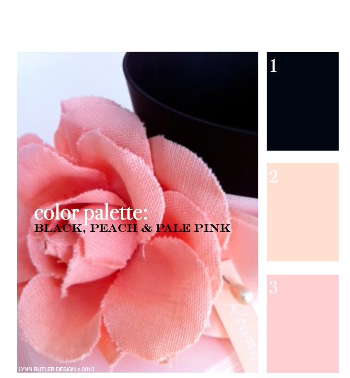
let’s go back to the beginning… color palette: black, peach, pale pink

This was my first post back on April 9th, 2012 and since it was, there weren’t too many readers. It’s one of my favorite color combinations though, so I thought I’d re-post it for those of you who have now joined my blog. Thank you for your weekly support and I hope you keep coming back!  – Lynn Butler Beling I love this color palette. I keep coming back to this color combination because I think it’s both masculine and feminine. Chanel included this palette in their spring 2012 runway show. (see below) The flower in the photograph above is … Read more

July 19th, 2013 No Comments

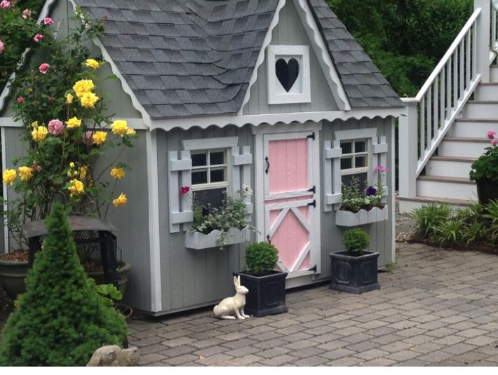
A backyard playhouse full of color and fun…from a kit made by a family business in ohio!

Take a peek at my girls backyard playhouse. I purchased this playhouse kit from the Little Cottage Company (a family owned business located in Ohio) for my kids and what a great find! My girls spend hours in this cottage, which is complete with 2 dutch doors (one for little ones and one for grown-ups), working windows with screens and even flower boxes. It took a friend and I about a day and a half to put the kit together and it was pretty easy to do. (the only thing really not included are roof shingles, but I used the extra ones … Read more

July 15th, 2013 No Comments

color palette: a fun palette for a beach side cottage or even a playhouse

This is a color palette I personally used for my girls playhouse. It took a little while to select the right shades of blue, pink and yellow that would look fresh and fun, but these are the exact Benjamin Moore paints I used. I’ll show you the playhouse on Thursday when we post about interiors. I have since then found these straws from Ikea that fit in the palette perfectly. Only a $1.49 for a pack of 100! -Great for smoothies and cool summer drinks. For a ‘grown-up’ take on this palette, see how Miles Redd incorporated these … Read more

June 24th, 2013 No Comments

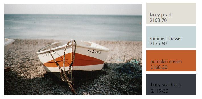
this week’s color palette: sea blue, gray and a nautical black-gray and orange

Last week we talked about a nautical color palette, but what most people would consider a more tradition palette of navy, creams, white and a little red. This week I wanted to feature a different nautical inspired palette based off this photograph of a boat and rocks and a more hazy sky. The colors I chose this week from Benjamin Moore all have a bit more red in them to compliment the orange in the palette better. Instead of a black- black the baby seal black looks different in different types of light.. sometimes it looks deep blue, others … Read more

June 17th, 2013 No Comments

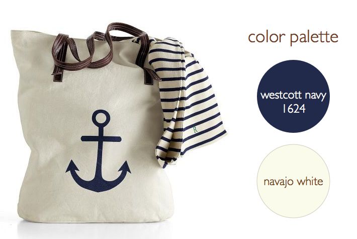
anchors are making a big splash, mostly in a classic navy & neutral color palette

Anchors are appearing everywhere this season-from gift items to tabletop to wrapping paper. We’re seeing most in a classic navy paired with leather, browns, creams, while some accessories are shown in bright red. This inspired our color palette this week with two classic paint colors above from Benjamin Moore. We’ll be covering anchors all week for weddings, interiors and paper but we thought we’d start you off with a few gift items. Above, Mark and Graham’s Anchor Canvas Tote which you can personalize and below their Anchor Key Fobs, Anchor Paperweights, Acrylic Tumblers and Napkins. … Read more

June 10th, 2013 No Comments

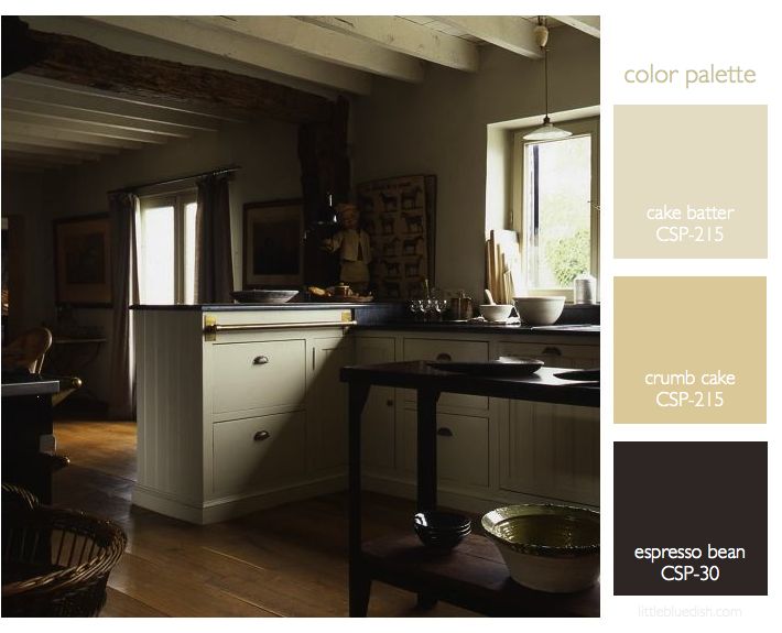
kitchens & baths: a neutral color palette and brass accents create a timeless style

Your kitchen and your bathrooms usually get the most return when renovating your home. It’s hard to know where to start when renovating your kitchen. But if you are planning to sell your home anytime in the near future you might want to consider a classic neutral color palette for your cabinets and countertops. Above, the kitchen has dark counters, while below the bath shows a neutral cream counter, showing you how both can be classic in style.  I mentioned before in our post “6 emerging kitchen trends” that brass was becoming more popular again for kitchen hardware. Now … Read more

June 3rd, 2013 No Comments

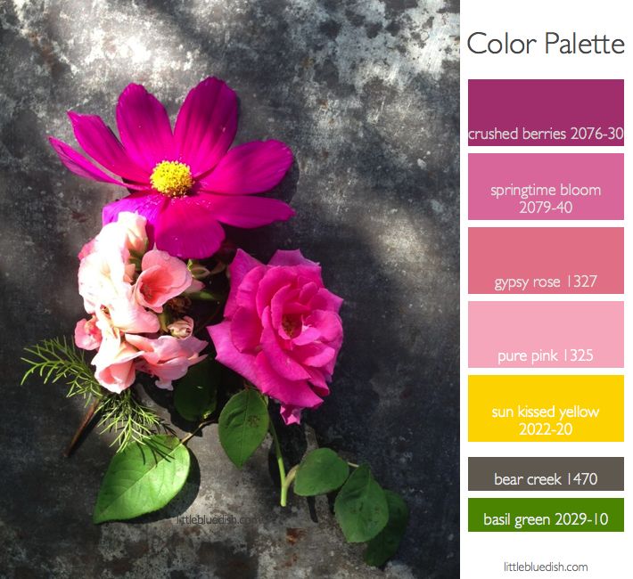
this week’s color palette: spring pinks with bright yellow, gray and green

The roses are in bloom now as well as the cosmos and geraniums, each one with their own shade of pink…the geranium being a bit more coral in color. The bright yellow, the greens of the stems and leaves and the gray background all can act as pops of accent color or in the case of the gray, a grounding color for floors or your furniture palette. I have maple floors in my own home that are pre-stained a gray, so it is possible to have a gray floor apart from the obvious rugs. Benjamin Moore paint colors guide … Read more

May 27th, 2013 No Comments

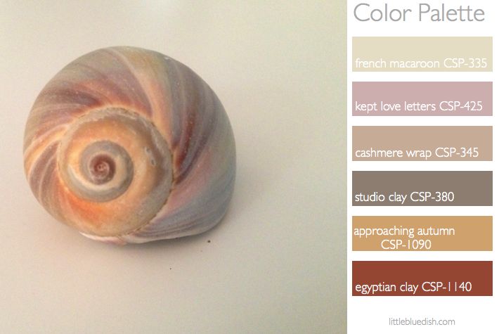
this week’s color palette: seashell inspired tans, pinks & neutrals

As the official start of the summer season starts today we were inspired by seashells. Nature is a wonderful place to start when you are looking for a color palette. It can be from the colors in an object, like this shell, or a larger landscape in general- for instance if you are looking at the ocean you have the sky, the many colors of blue in the sea, the white or tan sand, the green or straw beach grass- these can all inspire a palette. We have selected Benjamin Moore colors to help you apply this palette to … Read more

May 23rd, 2013 No Comments

main street matters, 20 towns will be chosen, painted and revitalized-cast your vote!

Benjamin Moore has launched an initiative to revitalize 20 Main Streets. It is called “Main Street Matters”. More than 100 cities have been nominated in North America and you get to vote on which 20 will be revitalized. Go to www.paintwhatmatters.com for more information, to see the cities and to vote up to once a day until June 30th, 2013 for your favorite. Once the cities are chosen the work will begin this summer and go throughout the year. You will be able to follow along on the site. Many partners are involved with Benjamin Moore from local Chamber … Read more

May 13th, 2013 No Comments

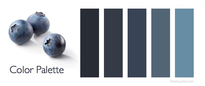
this week’s color palette: blueberry blues

Blue is my favorite color, so I love experimenting with blues. I think I mentioned my whole beach house is in shades of blues, whites and gray, with my dining room and TV room painted in Benjamin Moore’s blue note 2129-30, which you can see in my kitchen palette post. Shades of blue from room to room or dark blues used for doors or molding trim can be very striking. Consider outdoor furniture in blue too, it can look crisp and clean with white or a shade of blue cushions and less harsh than black patio furniture. My painter taught … Read more